How bad UI design caused me to withdraw an extra $80

Nov 08, 2008 17:53

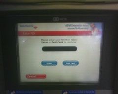
So I was at the ATM today, wanting to withdraw $20 for a quick lunch. I went up to the ATM, inserted my card, and, as usual, saw the following screen.

Read more... )

Leave a comment

Comments 7

intralimina November 9 2008, 03:31:35 UTC
Wow. That's just... wow. I'm actually kind of in awe of this, in the literal sense of feeling simultaneously horrified and amazed.

I wonder if there is any way it can get reported?

Reply

codeman38 November 9 2008, 03:56:47 UTC
I'm honestly amazed nobody had discovered this issue yet... the ATMs have been set up like this for a while! Maybe it's just that nobody had been using an ATM that responded that slowly to input?

Reply

intralimina November 9 2008, 04:51:09 UTC
Maybe... it's a pretty serious problem though if it were to happen again--someone could possibly overdraw their account.

Reply

xuande November 9 2008, 04:55:04 UTC
In which case the bank would make extra money in fees. They fail to see the downside in this.

Reply


literalgirl November 9 2008, 08:12:53 UTC
This fascinates me. Firstly, because I have *never* had anything even remotely like this happen, and I almost exclusively bank with BofA ATMs that look exactly like this one. But moreso because I am constantly saying to people how I don't believe any voter touch-screen machines could legitimately malfunction, and I use my many years of error-free ATM use and lack of friends' complaints as my reason. Clearly, I can no longer make that claim, so I guess now I have to concede that perhaps all these voting machine problems (at least the touch-screen ones) might be legit and not due to any consipracy.

Bummer.

Reply

codeman38 November 9 2008, 08:17:46 UTC
I've had problems with parallax on the same ATMs, where because of where I was standing, it looked like I was pressing $20 but it actually registered as pressing $30. (And I've mentioned this in any DKos thread where someone pipes up and claims that touch-screen ATMs don't have the same parallax issues as voting machines...)

Reply


asdquefty December 8 2008, 02:10:17 UTC
The machine could/should also have a light that flashes when you press, to show the deaf that a touch has registered.

But, yes, that is horrible UI design.

Reply


Leave a comment

Up