[tutorial]: 02 Tutorials
Kids, as I promised, here are the tutorials. Tut #01 is not translatable. I am sorry, I tried, but couldn't make it work the way it was for PSP users. Tut #02 is translatable and is very cute for those who like these trendy thing of the gray textures. Have fun, enjoy. You may credit cokeandmint for the tuts, or if you want to use the icons. Feel free to join cokeandmint and show me your results! Remember - results may vary according to your images, so try to be inventive! :P
TUTORIAL #01 : THE TRIO & THE FANTASTIC WORLD OF SELECTIVE COLORS
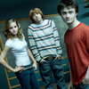
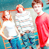
from this
to this
TUTORIAL #02: HARRY & THE MIGHTY MIGHTY TEXTURES
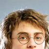
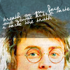
from this
to this
As requested by lizabeth0606
TUTORIAL #01 : THE TRIO & THE FANTASTIC WORLD OF SELECTIVE COLORS

This is your base, cropped, resized and NOT sharpened.
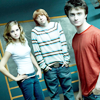
Duplicate base and set it to screen.
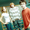
Add a Color fill layer #DAA56D ans set it to soft light. This will make
the icon brighter. The following steps involving color fill layers are more
or less all the same: illuminate the icon and 'pop' some colors up.
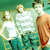
Add a Color fill layer #97F3AC and set to soft light.
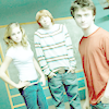
Add a Color fill layer #E9D2FF and set to soft light.
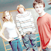
Add a Color balance layer +17 / -19 / +27. This step fixes the
colors and prepares the icon for the selective colors layer that comes next.
Don't worry that it seems too washed up. The icon will suffer some
Saturation process later, so at this point it is good that the color are not
strong.
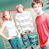
Add a Selective colors layer with the following adjustments:
REDS -100 / +66 / -36 / +76
YELLOWS -100 / +76 / +84 / +100
GREENS +93 / +100 / +100 / +78
CYANS +100 / +93 / +100 / -34
NEUTRALS +29 / -5 / +10 / +3
See what we've done? We worked mainly to make Dan's t-shirt look pinkish
rather than red, changed yellows ( because of Emma's and Rupert's hair
), fixed the cyans and greens of the background. You may want to try
different color combinations. Feel free to experiment.
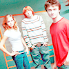
Now that you have the colors you really want, let's work on the
intensity of them. Add a Hue/ Saturation Layer and increase the saturation
to +28
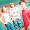
Add another Hue/Saturation layer, increase saturation to +13. We
do this because if you try to saturate too much only one layer it normally
will look awkward. So, instead, saturate one layer and if you want more,
saturate another layer.
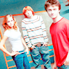
This step is pretty much optional. I did it because this tut was made on
request, so I wanted to approximate the colors to the original icon ( here ). Basically, I changed greens and cyans.
Selective colors:
REDS +50 / +10 / +06 / 0
GREENS +93 / +100 / -69 / +68
CYANS +67 / +50 / 0 / 0
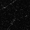
Apply texture and set it to screen. This beautiful one is by toybirds

This is the final result! You could even Saturate it a little more, or
add a soft light near the base to make it darker. But I kinda like this
result, so I stay with it!
TUTORIAL #02: HARRY & THE MIGHTY MIGHTY TEXTURES

This is your base, cropped and not
changed. It is from
DanRadcliffe.co.uk

1. Duplicate base, set to screen
at 48%.
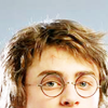
2. Duplicate the screen layer and
set it to soft light at 48%.

3. Create a new
Color fill # 73FF9E set to soft
light. This will make
the icon bright and increase the 'greeness' of Harry's eyes.

4. Create a new
Color fill # C38854 set to soft
light, again, this will
soften the colors of the icon.

5. Now, we'll fix the excess of
colors. Create a
Color
Balance layer: -41 / -64 / +64 .Take a quick look at your base
and check the difference. Your colors now are much smoother.
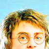
6. Create a new
Hue/Saturation layer, and put
saturation to + 60.
You need to have a very strong coloring, because of the texture we'll apply
later, otherwise your icon will be too pale.
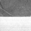
This is the texture we'll be using,
byloveicon
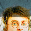
7. Apply texture
by loveicon
set it to multiply.

,
8. To finish,
create a new layer and apply a
text brush of your
choice, or add your own text, even a flower brush. And you're done! How easy was that? :)
TUTORIAL #01 : THE TRIO & THE FANTASTIC WORLD OF SELECTIVE COLORS


from this
to this
- Selective colors
- Photoshop CS only; not translatable.
- Under request to lizabeth0606.
TUTORIAL #02: HARRY & THE MIGHTY MIGHTY TEXTURES


from this
to this
- Beginner friendly.
- Translatable to all programs.
As requested by lizabeth0606
TUTORIAL #01 : THE TRIO & THE FANTASTIC WORLD OF SELECTIVE COLORS

This is your base, cropped, resized and NOT sharpened.

Duplicate base and set it to screen.

Add a Color fill layer #DAA56D ans set it to soft light. This will make
the icon brighter. The following steps involving color fill layers are more
or less all the same: illuminate the icon and 'pop' some colors up.

Add a Color fill layer #97F3AC and set to soft light.

Add a Color fill layer #E9D2FF and set to soft light.

Add a Color balance layer +17 / -19 / +27. This step fixes the
colors and prepares the icon for the selective colors layer that comes next.
Don't worry that it seems too washed up. The icon will suffer some
Saturation process later, so at this point it is good that the color are not
strong.

Add a Selective colors layer with the following adjustments:
REDS -100 / +66 / -36 / +76
YELLOWS -100 / +76 / +84 / +100
GREENS +93 / +100 / +100 / +78
CYANS +100 / +93 / +100 / -34
NEUTRALS +29 / -5 / +10 / +3
See what we've done? We worked mainly to make Dan's t-shirt look pinkish
rather than red, changed yellows ( because of Emma's and Rupert's hair
), fixed the cyans and greens of the background. You may want to try
different color combinations. Feel free to experiment.

Now that you have the colors you really want, let's work on the
intensity of them. Add a Hue/ Saturation Layer and increase the saturation
to +28

Add another Hue/Saturation layer, increase saturation to +13. We
do this because if you try to saturate too much only one layer it normally
will look awkward. So, instead, saturate one layer and if you want more,
saturate another layer.

This step is pretty much optional. I did it because this tut was made on
request, so I wanted to approximate the colors to the original icon ( here ). Basically, I changed greens and cyans.
Selective colors:
REDS +50 / +10 / +06 / 0
GREENS +93 / +100 / -69 / +68
CYANS +67 / +50 / 0 / 0

Apply texture and set it to screen. This beautiful one is by toybirds

This is the final result! You could even Saturate it a little more, or
add a soft light near the base to make it darker. But I kinda like this
result, so I stay with it!
TUTORIAL #02: HARRY & THE MIGHTY MIGHTY TEXTURES

This is your base, cropped and not
changed. It is from
DanRadcliffe.co.uk

1. Duplicate base, set to screen
at 48%.

2. Duplicate the screen layer and
set it to soft light at 48%.

3. Create a new
Color fill # 73FF9E set to soft
light. This will make
the icon bright and increase the 'greeness' of Harry's eyes.

4. Create a new
Color fill # C38854 set to soft
light, again, this will
soften the colors of the icon.

5. Now, we'll fix the excess of
colors. Create a
Color
Balance layer: -41 / -64 / +64 .Take a quick look at your base
and check the difference. Your colors now are much smoother.

6. Create a new
Hue/Saturation layer, and put
saturation to + 60.
You need to have a very strong coloring, because of the texture we'll apply
later, otherwise your icon will be too pale.
This is the texture we'll be using,
byloveicon

7. Apply texture
by loveicon
set it to multiply.

,
8. To finish,
create a new layer and apply a
text brush of your
choice, or add your own text, even a flower brush. And you're done! How easy was that? :)