(no subject)
Writing this tutorial has reminded me of how haphazard I work.
I hope this is of some use to someone.
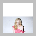
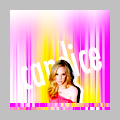
>>>
I started with the following which is a white background and the original picture as a new layer.

(Note to self: in future use the original large image for a better cut-out.)
Eraser, soft brush, 5 px and zoomed in at least 300%. Brushed away until the following result.
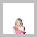
(I used the white background because at that point I wasn't sure what background I was going to use.)
Inverted the layer to see where I didn't erase some of the original background. Erased what was left.
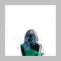
(Some people fill the background with a contrasting colour to make sure they get everything, I do this.
I made sure I didn't get too close to the subject with the eraser, the finishing touches I left till later.)
Picked a background from one of my texture batches and pasted it on a new layer behind the cut-out layer.

(Originally I was planning on using a b/w background but then I saw this one and it just completely fit the icon.
The cut-out is not completely done but this way I can see how it fits on the background and what still needs erasing and what not.)
Erased some more using a soft 5 px brush set on 50%.
Also erased her right arm and part of the background to create that white line next to her shadow.
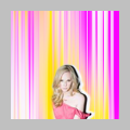
(I started on her arm erasing more of the original background but it didn't look good so I erased it completely.
One thing I always do when making a cut-out is going back and forth, using the eraser on different levels of opacity, duplicating the cut-out so parts where I maybe erased too much appear again, erasing on the duplicate, merging it, erasing, duplicating again, erase parts on the duplicate I'm not happy with, I should not be allowed to write a tutorial...
Started on the shadow but by accident I erased part of the background and it looked quite good, creating a silhouette line, so I went with that.
Note to self: Next time create a new layer and use a brush to paint a white line instead of erasing the background.)
Merged the layers. Duplicated the base, moved the top layer down, flipped the layer underneath horizontally.
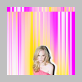
(I didn't like the bottom part of her left arm with the sleeve of the dress so I wanted to move the cut-out down but since the white silhouette line was not painted but erased from the background I couldn't just move the cut out, I had to move the background with it.
Of course I could have simply taken the original texture, made that into the new background and painted the silhouette line on a new layer behind the cut-out then merging it so the cut-out has the white line behind it. Too simple, people.
Anyway, I figured creating the strip would add something exciting.
Moved the top layer up, duplicated the flipped layer and moved the duplicate down to create the strip at the bottom.
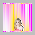
(The strip at the top was distracting from the subject which was at the bottom, so I created the second one to counter that.)
Curves. Brightness/Contrast. Hue/Saturation. Sharpening.
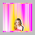
(This is a whole other tutorial but in a nutshell the following:
Two Curves layers, just a slight wavy S. Two layers, because I like making changes in several small steps instead of one big step.
Brightness/Contrast: Brightness -10, Contrast +10.
Hue/Saturation: Hue +1, Saturation +20
Sharpening: Merged layers, duplicated base, sharpened, played with opacity and erased parts that didn't need sharpening.)
Wrote the name in Futura. Used the Move Tool to free rotate the text and stretch it vertically.

(Added the text to draw more attention to Candice.)
Erased the part of the text covering Candice.
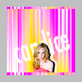
(Note to self: if you hadn't merge all the layers, you could have put the text behind the cut-out.)
Merged all layers. Duplicated the layer and moved the duplicate up. Flipped the underneath layer horizontally.
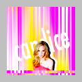
(Although I liked the strip at the top I felt it was still drawing attention away from the subject too much.
If you look closely you'll see a slight difference in contrast. My memory of what I did there is quite blurry, because like I said I go back and forth doing different things, experimenting, etc. so the following is what sort of happened.
What I did was I duplicated the base for the next step, using Blur (either Gaussian or Motion) on the duplicate and then I thought 'Why not put the blurred layer on Soft Screen.' I sometimes do this as part of colouring and contrast.
I think I also used a new Brightness/Contrast layer and I must have played with the opacity of the blurred Soft Screen layer.)
Merged the layers. Duplicated the base and blurred the duplicate using Motion Blur again.
Erased the bottom part of the blurred layer. Using a soft brush I painted the white at the top.

(Again, all this to draw attention away from the top of the icon to the subject.)
Any questions, just ask and I'll do my best to answer them. :)
I hope this is of some use to someone.

>>>

I started with the following which is a white background and the original picture as a new layer.

(Note to self: in future use the original large image for a better cut-out.)
Eraser, soft brush, 5 px and zoomed in at least 300%. Brushed away until the following result.

(I used the white background because at that point I wasn't sure what background I was going to use.)
Inverted the layer to see where I didn't erase some of the original background. Erased what was left.

(Some people fill the background with a contrasting colour to make sure they get everything, I do this.
I made sure I didn't get too close to the subject with the eraser, the finishing touches I left till later.)
Picked a background from one of my texture batches and pasted it on a new layer behind the cut-out layer.

(Originally I was planning on using a b/w background but then I saw this one and it just completely fit the icon.
The cut-out is not completely done but this way I can see how it fits on the background and what still needs erasing and what not.)
Erased some more using a soft 5 px brush set on 50%.
Also erased her right arm and part of the background to create that white line next to her shadow.

(I started on her arm erasing more of the original background but it didn't look good so I erased it completely.
One thing I always do when making a cut-out is going back and forth, using the eraser on different levels of opacity, duplicating the cut-out so parts where I maybe erased too much appear again, erasing on the duplicate, merging it, erasing, duplicating again, erase parts on the duplicate I'm not happy with, I should not be allowed to write a tutorial...
Started on the shadow but by accident I erased part of the background and it looked quite good, creating a silhouette line, so I went with that.
Note to self: Next time create a new layer and use a brush to paint a white line instead of erasing the background.)
Merged the layers. Duplicated the base, moved the top layer down, flipped the layer underneath horizontally.

(I didn't like the bottom part of her left arm with the sleeve of the dress so I wanted to move the cut-out down but since the white silhouette line was not painted but erased from the background I couldn't just move the cut out, I had to move the background with it.
Of course I could have simply taken the original texture, made that into the new background and painted the silhouette line on a new layer behind the cut-out then merging it so the cut-out has the white line behind it. Too simple, people.
Anyway, I figured creating the strip would add something exciting.
Moved the top layer up, duplicated the flipped layer and moved the duplicate down to create the strip at the bottom.

(The strip at the top was distracting from the subject which was at the bottom, so I created the second one to counter that.)
Curves. Brightness/Contrast. Hue/Saturation. Sharpening.

(This is a whole other tutorial but in a nutshell the following:
Two Curves layers, just a slight wavy S. Two layers, because I like making changes in several small steps instead of one big step.
Brightness/Contrast: Brightness -10, Contrast +10.
Hue/Saturation: Hue +1, Saturation +20
Sharpening: Merged layers, duplicated base, sharpened, played with opacity and erased parts that didn't need sharpening.)
Wrote the name in Futura. Used the Move Tool to free rotate the text and stretch it vertically.

(Added the text to draw more attention to Candice.)
Erased the part of the text covering Candice.

(Note to self: if you hadn't merge all the layers, you could have put the text behind the cut-out.)
Merged all layers. Duplicated the layer and moved the duplicate up. Flipped the underneath layer horizontally.

(Although I liked the strip at the top I felt it was still drawing attention away from the subject too much.
If you look closely you'll see a slight difference in contrast. My memory of what I did there is quite blurry, because like I said I go back and forth doing different things, experimenting, etc. so the following is what sort of happened.
What I did was I duplicated the base for the next step, using Blur (either Gaussian or Motion) on the duplicate and then I thought 'Why not put the blurred layer on Soft Screen.' I sometimes do this as part of colouring and contrast.
I think I also used a new Brightness/Contrast layer and I must have played with the opacity of the blurred Soft Screen layer.)
Merged the layers. Duplicated the base and blurred the duplicate using Motion Blur again.
Erased the bottom part of the blurred layer. Using a soft brush I painted the white at the top.

(Again, all this to draw attention away from the top of the icon to the subject.)
Any questions, just ask and I'll do my best to answer them. :)