Icon progression post 2013
Coding by rocketgirl2 :)
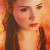

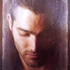
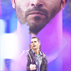
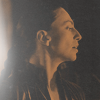
In January I mostly tried to practise grungy texture use in icons. I experimented a lot with all kinds of things trying to find my own style.
J A N U A R Y
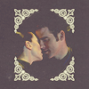
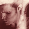
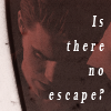
In February I used a lot of midnight_road textures, and made a lot of monochrome icons.
F E B R U A R Y
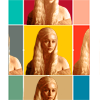
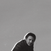
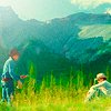
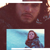
I focused on complexity and replaced backgrounds in March. These sets aren't very cohesive :D
M A R C H
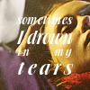
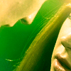
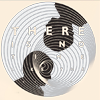

In April I used two very different styles: first I made some really bright and vibrant icons, and then some muted grunge icons, and I tried some more creative crops. I like my icons from April a lot :)
A P R I L
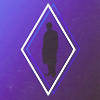



My May icons were experimental with lots of complexity and texture use.
M A Y

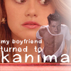
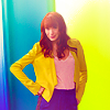
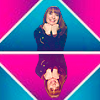
I made two sets this month; in the first one I mostly practised text use, and in the second I focused on really vibrant colorings. This was a really good month again.
J U N E
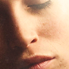

I may have developed some sort of style this month, with lots of close crops and lighting focus. These icons are simple but I like them.
J U L Y
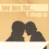
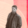

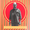
My first round at 20inspirations! I was so happy to get to make icons for it. I loved that it was a texture round, and tried to use them in many different ways.
A U G U S T

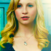

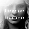
Mostly coloring and lighting focus this month.
S E P T E M B E R
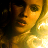
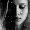


I continued my shiny lighting style, and also was invited to the7days which made me really happy :)
O C T O B E R

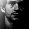
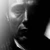
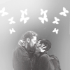
I only made one set this month, cause I suffered from some inspiration loss. Lots of black and white icons and again lighting focus.
N O V E M B E R
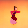
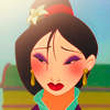
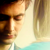
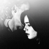
I made my first animation set, with my Mulan claim for character20n20. I focused on vibrant colors. Then there was a couples20in20 set that I just posted, where I played with lighting some more.
D E C E M B E R


In January I mostly tried to practise grungy texture use in icons. I experimented a lot with all kinds of things trying to find my own style.
J A N U A R Y


In February I used a lot of midnight_road textures, and made a lot of monochrome icons.
F E B R U A R Y


I focused on complexity and replaced backgrounds in March. These sets aren't very cohesive :D
M A R C H


In April I used two very different styles: first I made some really bright and vibrant icons, and then some muted grunge icons, and I tried some more creative crops. I like my icons from April a lot :)
A P R I L


My May icons were experimental with lots of complexity and texture use.
M A Y


I made two sets this month; in the first one I mostly practised text use, and in the second I focused on really vibrant colorings. This was a really good month again.
J U N E


I may have developed some sort of style this month, with lots of close crops and lighting focus. These icons are simple but I like them.
J U L Y


My first round at 20inspirations! I was so happy to get to make icons for it. I loved that it was a texture round, and tried to use them in many different ways.
A U G U S T


Mostly coloring and lighting focus this month.
S E P T E M B E R


I continued my shiny lighting style, and also was invited to the7days which made me really happy :)
O C T O B E R


I only made one set this month, cause I suffered from some inspiration loss. Lots of black and white icons and again lighting focus.
N O V E M B E R


I made my first animation set, with my Mulan claim for character20n20. I focused on vibrant colors. Then there was a couples20in20 set that I just posted, where I played with lighting some more.
D E C E M B E R