Ask the maker tutorials #3

to >>

asked by partitioning
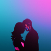
For this icon I worked on a bigger canvas (500 x 500px) to be able to get all the details I wanted. And the first thing was to crop the cap to make a center crop and negative space on top.
Step 1. I cutted-out their silhouette as the background is really busy.

Step 2. I painted the top of Isaac’s head as it was missing from the original cap and painted some strands of hair on Allison to “repair” my cut-out of her hair.

Step 3. I dupplicated that layer 4 times. The 1st one has an incrustated black color effect on it, to create a black silhouette.


Step 4. Each of the 3 other layers are a part of the painting on their body and Allison’s underwear. I cutted each element out so they would show on the black silhouette.

Step 5. I picked a blue color (#116775) on the painting on Isaac’s head to make a solid background color.

Step 6. Then, I applied a curves layer to lighten it up.


Step 7. To add some depth to it I created a black & white gradient layer (90°), put it on soft light 100%.

Step 8. I don’t remember when I resized it to 100x100px but let’s say here! I painted a pink blob on the top right to make a reminder of Allison’s outfit, blurred it with gaussian blur to make it diffused. The layer is on normal mode 100%.

Step 9. I made a new a black & white gradient layer (90°), that I put on soft light 30%, to have a bit more contrast and light. Then I made a vibrancy layer +100 on color mode 100%.

Step 10. Finally, I stamped all the layers onto a new one (ctrl + shift + alt + E), sharpened it, and lower the opacity of the layer down to 30%. And done!

Once again, tell me if something isn't clear and I'll get back to you!

Ask The Maker 6.0 || My Thread