Bright Colouring and Contrast: Icon Tutorial
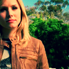
Go from this to 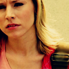
.
Using Photoshop 7. I have no knowledge of PSP, but I hear it can usually be translated across.
First tutorial, so bear with me here. You will need a relatively sound knowledge of photoshop to follow this, if anything doesn't make sense just ask and I'll attempt to clarify it for you.
Step #1:
take your cap, sharpen once and crop it to size. This should give you a relatively high quality base to work with.
Filter > Sharpen > Sharpen Image
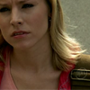
Step #2:
Duplicate your base twice, and set both layers to 'screen'.
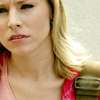
Step #3:
Create a New Adjustment layer. Layer> New Adjustment Layer> Brightness/Contrast, and set contrast to +12.
Create another New Adjustment layer. Layer> New Adjustment Layer> Hue/Saturation, and set saturation to +15.
Create a third New Adjustment Layer. Layer> New Adjustment Layer> Curves.
RGB:
I = 167 O=194
I = 102 O=115
R:
I=182 O=193
I=99 O=108
G:
I=176 O=184
I=117 O=115
B:
I=159 O=194
Set the curves layer to soft light, at 75%.
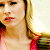
Step #4:
Make new fill Layer with colour OE1249 (dark blue) and set to exclusion.
Create a second fill layer with colour DFF5FD (peach) and set to multiply.
Third new fill layer with colour FDEADF (pale blue) and set to colour burn.
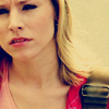
Step #5:
Finally, duplicate your base layer again, and drag it to the top of all your layers, now set it to soft light.

And you're done. Obviously, changes will be necessary depending on the base you are using. Good Luck, I'd love to see what you get.
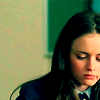
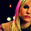
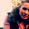
These are other icons, made using a similar method:


.
Using Photoshop 7. I have no knowledge of PSP, but I hear it can usually be translated across.
First tutorial, so bear with me here. You will need a relatively sound knowledge of photoshop to follow this, if anything doesn't make sense just ask and I'll attempt to clarify it for you.
Step #1:
take your cap, sharpen once and crop it to size. This should give you a relatively high quality base to work with.
Filter > Sharpen > Sharpen Image

Step #2:
Duplicate your base twice, and set both layers to 'screen'.

Step #3:
Create a New Adjustment layer. Layer> New Adjustment Layer> Brightness/Contrast, and set contrast to +12.
Create another New Adjustment layer. Layer> New Adjustment Layer> Hue/Saturation, and set saturation to +15.
Create a third New Adjustment Layer. Layer> New Adjustment Layer> Curves.
RGB:
I = 167 O=194
I = 102 O=115
R:
I=182 O=193
I=99 O=108
G:
I=176 O=184
I=117 O=115
B:
I=159 O=194
Set the curves layer to soft light, at 75%.

Step #4:
Make new fill Layer with colour OE1249 (dark blue) and set to exclusion.
Create a second fill layer with colour DFF5FD (peach) and set to multiply.
Third new fill layer with colour FDEADF (pale blue) and set to colour burn.

Step #5:
Finally, duplicate your base layer again, and drag it to the top of all your layers, now set it to soft light.

And you're done. Obviously, changes will be necessary depending on the base you are using. Good Luck, I'd love to see what you get.
These are other icons, made using a similar method:

