i dont really have a lot to say about these layouts but i thought that i would share. i thought that i liked the papers until i actually put them to use and then i realized that the colors were really kind of strange.
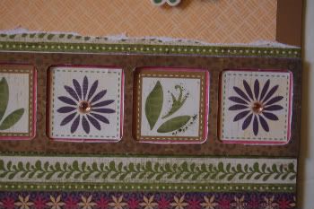
The borders are great, the colors are very vivid - love the swirly-flowly backgrounds =) The stitches on the last one, and ribbons with beads on the engagement one are lovely.
The only thing I don't like is actually the use of photos on the husband-infant pages. On the very first layout 60% of photo are depicting white wall. And it takes time and concentration to find the baby, the one to whom this layout is devoted. If I were dealing with a photo like that I definitely would cut off the upper half - it's absolutely useless and adds no information to the page. The same thing about the "1st birthday" layout. The left photo has only 20% of a baby and the rest shows something that shouldn't be there, why not to crop it properly?.. Sorry for criticism, just wanted to be honest ;)
It seems that you do all your scrapbooking "for someone" or only for money not caring about your own point of view. I thought that at least your husband's photos were used for your private layouts... If I were in your pair of shoes I would convice those "who asked to use them as is" that cropped would look better, don't they see it themselves?..
It's really very sad =( such a great layout with such poor photos and absolutely no care about how it looks.
i never said that someone was paying for these layouts... please think again before you say that i do all of my scrapbooking for money and not caring about my own artistic interpretation.
how many layouts have i posted in the past 3 years? lets take it into perspective before you throw stones.
I love the patterns and colors of the first couple layouts (not that I dislike the rest). The pastels and flowers totally remind me of what all our wallpaper looked like when we moved into our house, and just seems vintage-y in general, which captures the feel of the photos.
Favorite LO is the5th one though, I love how you framed the photo.
Also, the covered chipboard gives great dimension, and it's different to see the accents set back from their "background" instead of the other way around.
I had more to say than I usually do about these layouts--just reflects a great job overall I suppose! :)
thank you. i have scrapped the reader one before but that was part of a gift album that i gave to my parents. this was for an all about me layout for my own albums :)
the 1st birthday was totally stepping out of my comfort zone. thanks for saying you like it.
Re: I LOVE the colors!commit2paperApril 2 2010, 13:16:02 UTC
i dont always cut apart hambly... sometimes i think they are great as is. but this one was atrocious. i got it in a kit about a year ago and could not use it until i started to cut it apart.
These are so beautiful, Amy. You really have an eye for putting together patterns and colors. I love all the stitching and ribbon details. I'm going to be lifting that one of you at age 14! Great use of near-vintage photos. (You can't be old enough for these to be true vintage, LOL!)
Comments 14
The stitches on the last one, and ribbons with beads on the engagement one are lovely.
The only thing I don't like is actually the use of photos on the husband-infant pages. On the very first layout 60% of photo are depicting white wall. And it takes time and concentration to find the baby, the one to whom this layout is devoted. If I were dealing with a photo like that I definitely would cut off the upper half - it's absolutely useless and adds no information to the page.
The same thing about the "1st birthday" layout. The left photo has only 20% of a baby and the rest shows something that shouldn't be there, why not to crop it properly?..
Sorry for criticism, just wanted to be honest ;)
Reply
Reply
It's really very sad =( such a great layout with such poor photos and absolutely no care about how it looks.
Reply
how many layouts have i posted in the past 3 years? lets take it into perspective before you throw stones.
Reply
Favorite LO is the5th one though, I love how you framed the photo.
Also, the covered chipboard gives great dimension, and it's different to see the accents set back from their "background" instead of the other way around.
I had more to say than I usually do about these layouts--just reflects a great job overall I suppose! :)
Reply
Reply
Reply
the 1st birthday was totally stepping out of my comfort zone. thanks for saying you like it.
Reply
Reply
Reply
Reply
Reply
Leave a comment