tutorial #1
i know how frustrating it is to work with dark caps so i thought i'd share this :)

to
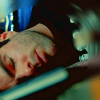
#1. alright, so here's the base
TIP: if your base is a little 'off' then use the variation tool (image > adjustments > variations) for prepping it beforehand

duplicate the base layer twice and set them both to screen, set the opacity to the first one at 100% and 37% on the second. you should now have a lighter image, like so:

#2. go to layer > new fill layer > solid color > #fee0e2 and set that to soft light 44%

#3. solid color layer > #000040 at exclusion 100%

#4. solid color layer > #dec3ae on multiply 100%

#5. solid color layer > #acd373 on soft light 46%

#6. last color layer! #fff568 on color burn 49%

#7. duplicate your base and bring it to the top, set it to screen 100%

#8. duplicate that screen layer again and set the opacity to 23%

#9. layer > new adjustment layer > selective color:
reds;
cyan: -100
magenta: +12
yellow: +5
yellows;
cyan: -100
black: +28
neutrals;
cyan: +14
yellow: -15
and now you have this:

#10. layer > new adjustment layer > hue/saturation layer: saturation: +22

tah dah!
if you think your picture's too light then play around with the curves layer, this works best with really dark blue-ish caps. this is my layer palette incase anything confused you
other icons made with the similar settings:


to

#1. alright, so here's the base
TIP: if your base is a little 'off' then use the variation tool (image > adjustments > variations) for prepping it beforehand

duplicate the base layer twice and set them both to screen, set the opacity to the first one at 100% and 37% on the second. you should now have a lighter image, like so:

#2. go to layer > new fill layer > solid color > #fee0e2 and set that to soft light 44%

#3. solid color layer > #000040 at exclusion 100%

#4. solid color layer > #dec3ae on multiply 100%

#5. solid color layer > #acd373 on soft light 46%

#6. last color layer! #fff568 on color burn 49%

#7. duplicate your base and bring it to the top, set it to screen 100%

#8. duplicate that screen layer again and set the opacity to 23%

#9. layer > new adjustment layer > selective color:
reds;
cyan: -100
magenta: +12
yellow: +5
yellows;
cyan: -100
black: +28
neutrals;
cyan: +14
yellow: -15
and now you have this:

#10. layer > new adjustment layer > hue/saturation layer: saturation: +22

tah dah!
if you think your picture's too light then play around with the curves layer, this works best with really dark blue-ish caps. this is my layer palette incase anything confused you
other icons made with the similar settings:


