Tutorial Time!
Requested by erisnx
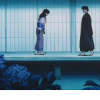
to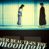
01: Start off by cropping your image. For this, I knew I wanted negative space, so I left myself room at the bottom.

02: I added a dark bar at the bottom, about were the line was already set, and then went in and painted over some of the things that overlapped onto the lighter color.
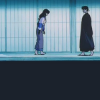
03: I wanted to show depth, so I used my favorite texture on Overlay to get that.
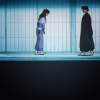
04: New from Visible layer, on Screen at about 30 Opacity.

05: Another New from Visible layer, this time I used Gaussian Blur, and put it on Hard Light at about 25 Opacity. The results are very minor, but the brightness and contrasts are slowly improving.
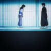
06: New from Visible layer, and now things get tricky. Go to Colors >> Components >> Channel Mixer. I just fiddled until I was pleased with the results. I honestly have no idea how exactly to replicate the results, but my best tip for this is to just switch between the RGB layers, and don't worry too much about how it looks right away, because after you fiddle for awhile, you might come across something that looks really cool.
This is how it looked when I was done fiddling with the Channel Mixer:
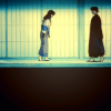
Then I put it down to about 65 Opacity.
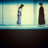
07: New from Visible, on Hard Light at about 25 Opacity.

08: At this point, I was satisfied with the coloring, so I started to fiddle with the bottom half of the icon. I needed to fill up the space, so I added this square texture, inverted the colors, duplicated it, and put them at about 15 Opacity on Screen.
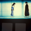
09: Then I added the text. In this case, I used Times New Roman Bold, and Times New Roman Bold Italic. I pulled colors from the other areas of the icon, and then tilted it to add some movement.

10: Then, to balance all of the colors together, I messed around a bit with the Hue-Saturation tool until everything looked balanced. There's a bit more yellow in the final icon now.

And that's finished.
If you have any questions, just let me know. I'm sorry the coloration process is so sketchy.

Ask The Maker || My Thread
to
01: Start off by cropping your image. For this, I knew I wanted negative space, so I left myself room at the bottom.
02: I added a dark bar at the bottom, about were the line was already set, and then went in and painted over some of the things that overlapped onto the lighter color.
03: I wanted to show depth, so I used my favorite texture on Overlay to get that.
04: New from Visible layer, on Screen at about 30 Opacity.
05: Another New from Visible layer, this time I used Gaussian Blur, and put it on Hard Light at about 25 Opacity. The results are very minor, but the brightness and contrasts are slowly improving.
06: New from Visible layer, and now things get tricky. Go to Colors >> Components >> Channel Mixer. I just fiddled until I was pleased with the results. I honestly have no idea how exactly to replicate the results, but my best tip for this is to just switch between the RGB layers, and don't worry too much about how it looks right away, because after you fiddle for awhile, you might come across something that looks really cool.
This is how it looked when I was done fiddling with the Channel Mixer:
Then I put it down to about 65 Opacity.
07: New from Visible, on Hard Light at about 25 Opacity.
08: At this point, I was satisfied with the coloring, so I started to fiddle with the bottom half of the icon. I needed to fill up the space, so I added this square texture, inverted the colors, duplicated it, and put them at about 15 Opacity on Screen.
09: Then I added the text. In this case, I used Times New Roman Bold, and Times New Roman Bold Italic. I pulled colors from the other areas of the icon, and then tilted it to add some movement.
10: Then, to balance all of the colors together, I messed around a bit with the Hue-Saturation tool until everything looked balanced. There's a bit more yellow in the final icon now.
And that's finished.
If you have any questions, just let me know. I'm sorry the coloration process is so sketchy.

Ask The Maker || My Thread