this is an iconmaking hiatus, not an LJ hiatus XD
Requested by inventingworlds
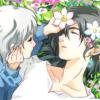
to
1: We start by cropping our image. In this case, it's this piece of fan art by Kogure!

2: The image is a bit pale, so we'll be fiddling with the coloration now. Start by making a new layer from visible, and put it on Overlay at about 40 Opacity.
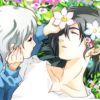
3: Next we create another layer from visible, and play with the curves. I added a good amount of blues, and also darkened the skin more.
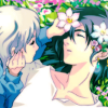
4: New layer from visible, and I really hyped up the Hue-Saturation. We ended up with this, and while I know this is overkill, it's required to making the colors really pop.

We put this layer to about 60 Opacity, and voila!

5: New from Visible, Overlay at about 25 Opacity. Brighten it up, and add some contrast.

6: The skin is really starting to wash out again, and I want to really don't want Howl to be pale, so I added a new from visible layer on Multiply at about 30 Opacity.

7: Now to give it more pop, another new from visible layer on Overlay at about 20 Opacity.
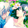
8: My favorite texture on Screen at 7 Opacity to just give a bit of a spot of lightness where I want the focus of the icon to be. It's really subtle, but during the next step it will really make a difference.

9: Duplicate the same texture, this time on Overlay at about 35 Opacity.

10: Create a new layer from visible, and darken the colors with the Curves tool. The contrats are much lower in this, but don't worry!
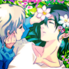
This goes on Screen at about 16 Opacity. Now we're starting to get that nice, soft coloration that I'm looking for.

11: I just want to bring the contrasts back up now, so a quick new from visible layer on Hard Light at about 25 Opacity will fix that!

12: Now add this texture for more of a magenta tinge, and a bit of a gradient as well. A great tip when using these types of light textures, is to resize them a bit to make the focus fall wherever you want! In this case, I made it super-sized until it looked like this.

Overlay at about 55 Opacity this time.
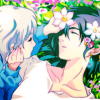
13: The final touch was to add more skin color. I wasn't pleased with the way the skin looked, so I simply used Hue-Saturation, and brought down the Lightness levels a tiny bit. This is a great way to do quick color adjustments and final touches. Just don't go too crazy with the Saturation.

I know most of the changes are really subtle, and there are probably better ways of achieving the same effect without so many layers, but this is the easiest way for me to adjust colors right now XD

Ask The Maker || My Thread
to
1: We start by cropping our image. In this case, it's this piece of fan art by Kogure!
2: The image is a bit pale, so we'll be fiddling with the coloration now. Start by making a new layer from visible, and put it on Overlay at about 40 Opacity.
3: Next we create another layer from visible, and play with the curves. I added a good amount of blues, and also darkened the skin more.
4: New layer from visible, and I really hyped up the Hue-Saturation. We ended up with this, and while I know this is overkill, it's required to making the colors really pop.
We put this layer to about 60 Opacity, and voila!
5: New from Visible, Overlay at about 25 Opacity. Brighten it up, and add some contrast.
6: The skin is really starting to wash out again, and I want to really don't want Howl to be pale, so I added a new from visible layer on Multiply at about 30 Opacity.
7: Now to give it more pop, another new from visible layer on Overlay at about 20 Opacity.
8: My favorite texture on Screen at 7 Opacity to just give a bit of a spot of lightness where I want the focus of the icon to be. It's really subtle, but during the next step it will really make a difference.
9: Duplicate the same texture, this time on Overlay at about 35 Opacity.
10: Create a new layer from visible, and darken the colors with the Curves tool. The contrats are much lower in this, but don't worry!
This goes on Screen at about 16 Opacity. Now we're starting to get that nice, soft coloration that I'm looking for.
11: I just want to bring the contrasts back up now, so a quick new from visible layer on Hard Light at about 25 Opacity will fix that!
12: Now add this texture for more of a magenta tinge, and a bit of a gradient as well. A great tip when using these types of light textures, is to resize them a bit to make the focus fall wherever you want! In this case, I made it super-sized until it looked like this.
Overlay at about 55 Opacity this time.
13: The final touch was to add more skin color. I wasn't pleased with the way the skin looked, so I simply used Hue-Saturation, and brought down the Lightness levels a tiny bit. This is a great way to do quick color adjustments and final touches. Just don't go too crazy with the Saturation.
I know most of the changes are really subtle, and there are probably better ways of achieving the same effect without so many layers, but this is the easiest way for me to adjust colors right now XD

Ask The Maker || My Thread