Yet Another Icon Tutorial
Requested by inventingworlds

to
01: Start off by cropping and extracting your image. In this case, I started with this lovely art by Mokaffe.

02: The theme for this icon was to use this texture, so I started by putting this underneath the extracted image. I wanted to leave the circles larger for this icon.

03: The colors in the background are way too dark for the image, so I duplicated the background texture a few times and fiddled with Screen, and Overlay layers. I won't go into a ton of detail about this, because I used about five layers on varying levels of screen, multiply, and overlay to get the effect, when it would be just as simple to play with Curves, or Hue-Saturation to get the same effect.

04: Next, I used MY FAVORITE TEXTURE to add depth to the layers. One such layer on Screen at about 30 Opacity, and one on Overlay at about 45 Opacity. Remember, you can change the size of the texture~

05: The texture I've been working with is a little more graphic then I'd like for the artwork, so I decided to tone it back with this texture. Hard Light at about 50 Opacity.

06: Now I'm starting to pull out my sparkle textures. I liked this nice big, blobby one. I used it several times, erasing some of them, and rotating it differently.

07: That wasn't quite enough, so I also added this nice one, that kind of looks like an explosion. I like to add this type of texture to areas like near the hair.

08: The icon is nice so far, but it's not quite where I want it to be. Not enough stuff to fill in the space. So I added this frame texture on an angle, underneath some of the light textures, so it works with the overall composition.

09: Now, we need to do something about the frame's background. I'm not so good at making frame textures look nice, so I just added a simple texture on Screen and Overlay, and messed with it behind the frame and character layers until it looked something like this. I can't seem to find the texture I used, but it's a nice, gradual gradient-type texture that I color changed to make it match up with the color scheme.
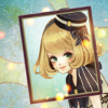
10: Now, this is really starting to look nice, but it's far too dark. So I add a new layer from visible on Screen at about 18 Opacity.
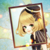
11: You should have seen this coming if you've read any of my other tutorials! Now we add an Overlay layer at about 30 Opacity! This obviously boosts the contrasts, and brightens things up.

12: Return of MY FAVORITE TEXTURE! This time on Overlay at about 50 Opacity.

13: And finally, this texture on Overlay at about 40 Opacity! This added the right amount of color adjustments, so I didn't even have to mess with the curves for this icon!

This icon was an expiriment, and I'm rather surpried with how well it came out. It's fun to just mess around and see what you can come up with, especially with stuff like this with lots of composition.
to
01: Start off by cropping and extracting your image. In this case, I started with this lovely art by Mokaffe.
02: The theme for this icon was to use this texture, so I started by putting this underneath the extracted image. I wanted to leave the circles larger for this icon.
03: The colors in the background are way too dark for the image, so I duplicated the background texture a few times and fiddled with Screen, and Overlay layers. I won't go into a ton of detail about this, because I used about five layers on varying levels of screen, multiply, and overlay to get the effect, when it would be just as simple to play with Curves, or Hue-Saturation to get the same effect.
04: Next, I used MY FAVORITE TEXTURE to add depth to the layers. One such layer on Screen at about 30 Opacity, and one on Overlay at about 45 Opacity. Remember, you can change the size of the texture~
05: The texture I've been working with is a little more graphic then I'd like for the artwork, so I decided to tone it back with this texture. Hard Light at about 50 Opacity.
06: Now I'm starting to pull out my sparkle textures. I liked this nice big, blobby one. I used it several times, erasing some of them, and rotating it differently.
07: That wasn't quite enough, so I also added this nice one, that kind of looks like an explosion. I like to add this type of texture to areas like near the hair.
08: The icon is nice so far, but it's not quite where I want it to be. Not enough stuff to fill in the space. So I added this frame texture on an angle, underneath some of the light textures, so it works with the overall composition.
09: Now, we need to do something about the frame's background. I'm not so good at making frame textures look nice, so I just added a simple texture on Screen and Overlay, and messed with it behind the frame and character layers until it looked something like this. I can't seem to find the texture I used, but it's a nice, gradual gradient-type texture that I color changed to make it match up with the color scheme.
10: Now, this is really starting to look nice, but it's far too dark. So I add a new layer from visible on Screen at about 18 Opacity.
11: You should have seen this coming if you've read any of my other tutorials! Now we add an Overlay layer at about 30 Opacity! This obviously boosts the contrasts, and brightens things up.
12: Return of MY FAVORITE TEXTURE! This time on Overlay at about 50 Opacity.
13: And finally, this texture on Overlay at about 40 Opacity! This added the right amount of color adjustments, so I didn't even have to mess with the curves for this icon!
This icon was an expiriment, and I'm rather surpried with how well it came out. It's fun to just mess around and see what you can come up with, especially with stuff like this with lots of composition.