Text Guide
This was requsted by twinstrike.
I'm calling it a text guide for the sake of a name, but in reality, these are just notes about how I work with fonts, and typography... I'm not claiming to be very good at typography, but I have fun with it anyway XD
I'm going to break this into segments to make it easier to both read, and for me to write and keep my thoughts as organized as possible.
Before I actually go into detail about my different style formats, I'd like to share a few notes on the two basics...
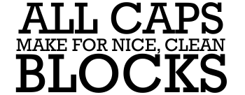
ALL CAPS
Okay, everyone loves all caps. People on the internet seem to have no control when it comes to the capitelized letters of the alphabet. It can signify rage or joy and sometimes it's hard to tell which one.
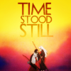
When it comes to typography nothing comes out cleaner and more precise then putting everything into all caps. You can stack text, leave it all on one line, break up one word into choppy, single syllable sections, and many other lovely things that all in all look very clean. It's bold, it's classic, and always a safe bet. I almost always use all caps in my icons.
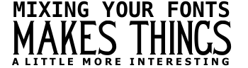
ALL CAPS, SINGLE FONT
Simple, easy, clean, and fast to slap on an icon. Not much needs to be said about this since just about anyone can do it, but I have a few points...
- The size of the font makes a big difference in the look. The text doesn't have to be the same size, and you could also
~s p a c e t h i n g s o u t l i k e t h i s~
if something isn't fitting quite right.
- Rotating the text adds a whole new element, and also helps the flow of the icon sometimes. I love rotating the text when I feel that the icon is just too simple, or too boxy.
- Changing the colors of the text can add a fun element, so just because this is the fastest way to add text, don't let your creativity lay dormant!


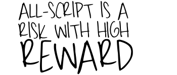
ALL CAPS, MIXED FONTS
Another easy way to get text on an icon without too much fussing. You can go super simple, or very complex without needing to search through your fonts for hours and hours on end.
- Mixing fonts can be dangerous, and I don't usually suggest trying it unless you are confident in your taste... or at very least understand that some people are just going to hate it and you'll either listen to them or do whatever you want. I usualy wouldn't mix more then two fonts together for an icon, because it looks messy and disjointed if not done tastefully.
- The two fonts you choose should be compatible. That's not a very helpful comment if you're looking for compatible fonts, but think about it this way... don't try too hard to get something to work. If it's taking you too long to make it look nice, use a different font. Also, I wouldn't mix really deco fonts together... heavy, grungy, or even a font with funny little decorative elements... usually you would pick one and then use something a little plainer for the second font... don't mix two grunge fonts, or a grunge font with a polka-dot font... it's too messy.


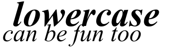
LOWERCASE
Perhaps just as classy as all caps, if not moreso. It's a lot harder to work with though.Where the clean boxy-ness of all caps will line up evenly, the lowercase letters have strange oddities that will get in your way.
Stacking can become a pain, and swoopy y's and g's will often dip into the area where you were going to put the rest of the sentince you're trying to fit onto the page.
The word "I" as in "Myself" will be a challenge to those who don't like to write a sentence like "this is how i roll". Some may not think this is a big deal and roll their eyes, while others inwardly -and sometimes outwardly- cringe every time someone does this.
But while there are many downsides, lowercase is arguably prettier to look at. The swoopy lowercase letters, curves, and dotted i's and j's are hard to beat in the asthetic department. I generally like to use lowercase fonts for an elegant touch, usually on icons with a more pastel palette.
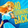
UPPER AND LOWER CASE
The best of both worlds! You can have the ability to stack and still have those swoopy y's that were driving you insane earlier. You write the word "I" properly without ruining the etherial effect of your icon with heavy stacks of all caps. You'll notice that I generally don't have script or lowercase text on my icon without some form of all caps coupled with it. I dare say this is my ~default~ for typography in my graphics.


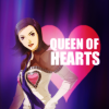
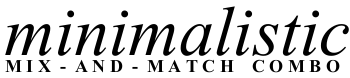
MIXED FONTS, MIXED CASES
I guess you'd call this my trademark classic. Half my icons will be like this. A simple font such as Ariel or Times New Roman in all caps with a lowercase script font. It's so easy, but always looks pretty.
- I like to align the fonts so that they "lock" together. I don't like having any of the loopier letters swoop into the all cap section, so I try to fit things together so that it works into the natural spacing of the text.
- Now, I always use a very simple font for the all cap section, but occasionally I've seen stuff where a very stylistic but still simpler font used, and it's very pretty! Don't discount anything that isn't Ariel or Times just becaue I do... try stuff out!
BLOCK SHAPED TEXT
Make a square, a rectangle, whatever. It's just a block of text. No overlapping ends allowed.
- Any letters that overhang will probably show badly, so make sure you're careful to align your letters so that it matches up as closely as they can. I sometimes look back and cringe at my old block text icons XD
- Mixing sizes works very well for this style. Again, spacing stuff out makes it more interesting, and colors are important as well, and rotating the text does wonders!


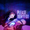
STACKED TEXT
It's really easy to do this, in fact, it's easier then the block. You can use all one size text, or mixed sizes if that looks better. Think of this as stair steps, or if that doesn't work for you, just make sure that all the text either starts, or ends in the same spot on one side.
- Make sure when you do this that the font is large enough to read, and don't try to cram too much text on one line!
- When you break up the sentence, try to do it so that it feels natural when you're reading it.
- Play with changing to colors or the opacity on the different blocks. Going a shade darker as you go down, or using completely different colors will give it a whole new ambiance.


TEXT FOR COMEDY ICONS
I love to do comical icons. Making people laugh is great, and they're often crowd pleasers. Generally I don't get too fussy with the text of a comedy icon. It's usually all caps, one or two fonts, and oversized text to emphasize the joke. Bright colors are usually best for comedy icons too.
- The joke is the most important part of a comical icon, so make sure the text is legible, and the color stands out against all the other elements.
- Expression/Presentation is the second most important thing... obviously humor is subjective and I can't really help you develop a funny bone. Usually I just see the expression and a joke hits me, or I think of a joke and the image hits me, but that's me, and you're you. Do what you think works, and your sense of humor will mature as you continue to use your (insert whatever you believe comes up with the jokes. For me it would be spontaneity, others may actually use their brain though XD)
- As far as actually placing the text, I generally make the text the focal point of the icon so that everything hits you after you read it. That means most of my comedy icons have oversized text in the center of the icon. Of course, there are other ways of doing it, but this is my general rule of thumb.


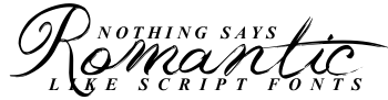
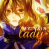
SCRIPT/HANDWRITTEN FONTS
I dislike using script and handwriting style fonts by themselves. I like a cleaner look, so I almost never do this, but here are some examples of what it looks like when I do. Yes, most of them are in all caps! Don't forget that some script and handwriting type fonts work in all caps as well as lowercase!
- I obviously don't use script/handwriting fonts much by themselves. I tend to think they look a little messy with a lot of text. However, if you only need one or two words on an icon, script fonts add a nice touch. I usually like to put script-only blocks at a rotated angle for flow.

SANS-TYPE FONTS
Sans is a nice, clean font that looks good in both all caps and lowercase. It has a nice lean to it when used in italic, and I really like how it looks. There are other fonts that like Sans, have a nice lean to them as well. This section could just as easily be called the italic font section.
- I discovered Sans because it's the default font that starts when you put text on in GIMP. I ended up finally noticing it, and realizing that it wasn't such a bad default font after all... I prefer it in all-caps, but I like almost all the forms that Sans takes. It mixes and matches well, much like Times, which is great.
- I like putting the text on an angle with Sans fonts, because they look nice in italic, and gives the text some movement.
- I also like using this in huge sizes, because it's such a bold-looking font. It works well in all sizes though~


TIMES NEW ROMAN
A classic font. It's amazing in either all caps or lowercase, and is one of the most common fonts in the world. Everyone has Times New Roman somewhere on their computer. While this is often shrugged off as "a default font" don't forget that Times can be a wonderful font for a simple, classy look.
- To start off, I have to say that sumeragi_sei was my inspiration when it came to playing with Times. She does it best, and I suggest checking out her graphics journal sei_cons for examples of what I aim for when I use Times.
- I like to usually mix between the many forms of Times when I use it on icons. Some in all-caps, some without, different sizes, bold, italic, spaced out, and everything else you can do to Times. It all looks good, and it all works, so it's great if you're feeling lazy, or if you just want to mess around without searching for fonts that look good together.


MORE STUFF I LIKE TO DO
- I like to occasionally lock fonts and create a gradient. This adds depth and also helps to carry the lights and colors from the icon into the text. It's simple and easy, but makes a huge difference.
- I often layer several duplicates of a text layer on overlay, screen, hard light, or mixes of those to get a transparent look that still stands out. It's often worth the final result, because it allows textures in the back to shine through the text and make it fit into the icons' flow a little better.
UNDERSTANDING MY TERMS
-When I say angled, I do not mean rotated. I mean putting the text on a bias. I like angling text in italics or script fonts, and usually only two lines of text.
- Locking together separate lines of text like a puzzle gives the text a jointed look that I really like. I try to use the natural breaks of the words to achieve the effect, but sometimes spacing stuff out is required.
- Spacing out refers to adding s p a c e s between each letter. It's a great way to add length to short words or sentences, add more breaks for locking the text, or of course, asthetic appeal~
- Legiblity is something I stress in all graphics. If you put text on something, you should be able to read it. Putting a shadow behind text sometimes helps, but sometimes it actually does the opposite of what you aim for. You just have to mess around and keep testing to figure out your own rule of thumb, but for me I usually try to leave myself a space large enough for the text I want to add. That of course, means at very least having a pretty good idea of what you want the text to say, and often times adjusting the composition to get everything to fit snugly together. Of course, there are some creative ways of getting around a lot of this... the big fad right now is just slapping the text on top of the finished icon. I know there's a science to this method, and I've tried it out, but it's not usually compatible with my style for the most part. You'll notice that usually the text in my icons takes up what would otherwise be negative space.
FAVORITE FONTS
These are some non-default fonts that I love to use.
- Alpha Fridge Magnets
- Cheese Pizza
- Carnevalee Freakshow
- Dear Theo
- Desyrel
- Franklin M54
- Freebooter Script
- Jane Austen
- Kenyan Coffee
- Tagettes
- Uranium Mafia
- Windsong
I'm calling it a text guide for the sake of a name, but in reality, these are just notes about how I work with fonts, and typography... I'm not claiming to be very good at typography, but I have fun with it anyway XD
I'm going to break this into segments to make it easier to both read, and for me to write and keep my thoughts as organized as possible.
Before I actually go into detail about my different style formats, I'd like to share a few notes on the two basics...
ALL CAPS
Okay, everyone loves all caps. People on the internet seem to have no control when it comes to the capitelized letters of the alphabet. It can signify rage or joy and sometimes it's hard to tell which one.
When it comes to typography nothing comes out cleaner and more precise then putting everything into all caps. You can stack text, leave it all on one line, break up one word into choppy, single syllable sections, and many other lovely things that all in all look very clean. It's bold, it's classic, and always a safe bet. I almost always use all caps in my icons.
ALL CAPS, SINGLE FONT
Simple, easy, clean, and fast to slap on an icon. Not much needs to be said about this since just about anyone can do it, but I have a few points...
- The size of the font makes a big difference in the look. The text doesn't have to be the same size, and you could also
~s p a c e t h i n g s o u t l i k e t h i s~
if something isn't fitting quite right.
- Rotating the text adds a whole new element, and also helps the flow of the icon sometimes. I love rotating the text when I feel that the icon is just too simple, or too boxy.
- Changing the colors of the text can add a fun element, so just because this is the fastest way to add text, don't let your creativity lay dormant!
ALL CAPS, MIXED FONTS
Another easy way to get text on an icon without too much fussing. You can go super simple, or very complex without needing to search through your fonts for hours and hours on end.
- Mixing fonts can be dangerous, and I don't usually suggest trying it unless you are confident in your taste... or at very least understand that some people are just going to hate it and you'll either listen to them or do whatever you want. I usualy wouldn't mix more then two fonts together for an icon, because it looks messy and disjointed if not done tastefully.
- The two fonts you choose should be compatible. That's not a very helpful comment if you're looking for compatible fonts, but think about it this way... don't try too hard to get something to work. If it's taking you too long to make it look nice, use a different font. Also, I wouldn't mix really deco fonts together... heavy, grungy, or even a font with funny little decorative elements... usually you would pick one and then use something a little plainer for the second font... don't mix two grunge fonts, or a grunge font with a polka-dot font... it's too messy.
LOWERCASE
Perhaps just as classy as all caps, if not moreso. It's a lot harder to work with though.Where the clean boxy-ness of all caps will line up evenly, the lowercase letters have strange oddities that will get in your way.
Stacking can become a pain, and swoopy y's and g's will often dip into the area where you were going to put the rest of the sentince you're trying to fit onto the page.
The word "I" as in "Myself" will be a challenge to those who don't like to write a sentence like "this is how i roll". Some may not think this is a big deal and roll their eyes, while others inwardly -and sometimes outwardly- cringe every time someone does this.
But while there are many downsides, lowercase is arguably prettier to look at. The swoopy lowercase letters, curves, and dotted i's and j's are hard to beat in the asthetic department. I generally like to use lowercase fonts for an elegant touch, usually on icons with a more pastel palette.
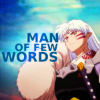
UPPER AND LOWER CASE
The best of both worlds! You can have the ability to stack and still have those swoopy y's that were driving you insane earlier. You write the word "I" properly without ruining the etherial effect of your icon with heavy stacks of all caps. You'll notice that I generally don't have script or lowercase text on my icon without some form of all caps coupled with it. I dare say this is my ~default~ for typography in my graphics.
MIXED FONTS, MIXED CASES
I guess you'd call this my trademark classic. Half my icons will be like this. A simple font such as Ariel or Times New Roman in all caps with a lowercase script font. It's so easy, but always looks pretty.
- I like to align the fonts so that they "lock" together. I don't like having any of the loopier letters swoop into the all cap section, so I try to fit things together so that it works into the natural spacing of the text.
- Now, I always use a very simple font for the all cap section, but occasionally I've seen stuff where a very stylistic but still simpler font used, and it's very pretty! Don't discount anything that isn't Ariel or Times just becaue I do... try stuff out!
BLOCK SHAPED TEXT
Make a square, a rectangle, whatever. It's just a block of text. No overlapping ends allowed.
- Any letters that overhang will probably show badly, so make sure you're careful to align your letters so that it matches up as closely as they can. I sometimes look back and cringe at my old block text icons XD
- Mixing sizes works very well for this style. Again, spacing stuff out makes it more interesting, and colors are important as well, and rotating the text does wonders!
STACKED TEXT
It's really easy to do this, in fact, it's easier then the block. You can use all one size text, or mixed sizes if that looks better. Think of this as stair steps, or if that doesn't work for you, just make sure that all the text either starts, or ends in the same spot on one side.
- Make sure when you do this that the font is large enough to read, and don't try to cram too much text on one line!
- When you break up the sentence, try to do it so that it feels natural when you're reading it.
- Play with changing to colors or the opacity on the different blocks. Going a shade darker as you go down, or using completely different colors will give it a whole new ambiance.
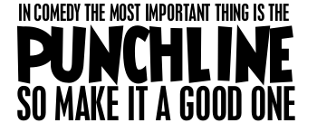
TEXT FOR COMEDY ICONS
I love to do comical icons. Making people laugh is great, and they're often crowd pleasers. Generally I don't get too fussy with the text of a comedy icon. It's usually all caps, one or two fonts, and oversized text to emphasize the joke. Bright colors are usually best for comedy icons too.
- The joke is the most important part of a comical icon, so make sure the text is legible, and the color stands out against all the other elements.
- Expression/Presentation is the second most important thing... obviously humor is subjective and I can't really help you develop a funny bone. Usually I just see the expression and a joke hits me, or I think of a joke and the image hits me, but that's me, and you're you. Do what you think works, and your sense of humor will mature as you continue to use your (insert whatever you believe comes up with the jokes. For me it would be spontaneity, others may actually use their brain though XD)
- As far as actually placing the text, I generally make the text the focal point of the icon so that everything hits you after you read it. That means most of my comedy icons have oversized text in the center of the icon. Of course, there are other ways of doing it, but this is my general rule of thumb.
SCRIPT/HANDWRITTEN FONTS
I dislike using script and handwriting style fonts by themselves. I like a cleaner look, so I almost never do this, but here are some examples of what it looks like when I do. Yes, most of them are in all caps! Don't forget that some script and handwriting type fonts work in all caps as well as lowercase!
- I obviously don't use script/handwriting fonts much by themselves. I tend to think they look a little messy with a lot of text. However, if you only need one or two words on an icon, script fonts add a nice touch. I usually like to put script-only blocks at a rotated angle for flow.
SANS-TYPE FONTS
Sans is a nice, clean font that looks good in both all caps and lowercase. It has a nice lean to it when used in italic, and I really like how it looks. There are other fonts that like Sans, have a nice lean to them as well. This section could just as easily be called the italic font section.
- I discovered Sans because it's the default font that starts when you put text on in GIMP. I ended up finally noticing it, and realizing that it wasn't such a bad default font after all... I prefer it in all-caps, but I like almost all the forms that Sans takes. It mixes and matches well, much like Times, which is great.
- I like putting the text on an angle with Sans fonts, because they look nice in italic, and gives the text some movement.
- I also like using this in huge sizes, because it's such a bold-looking font. It works well in all sizes though~
TIMES NEW ROMAN
A classic font. It's amazing in either all caps or lowercase, and is one of the most common fonts in the world. Everyone has Times New Roman somewhere on their computer. While this is often shrugged off as "a default font" don't forget that Times can be a wonderful font for a simple, classy look.
- To start off, I have to say that sumeragi_sei was my inspiration when it came to playing with Times. She does it best, and I suggest checking out her graphics journal sei_cons for examples of what I aim for when I use Times.
- I like to usually mix between the many forms of Times when I use it on icons. Some in all-caps, some without, different sizes, bold, italic, spaced out, and everything else you can do to Times. It all looks good, and it all works, so it's great if you're feeling lazy, or if you just want to mess around without searching for fonts that look good together.
MORE STUFF I LIKE TO DO
- I like to occasionally lock fonts and create a gradient. This adds depth and also helps to carry the lights and colors from the icon into the text. It's simple and easy, but makes a huge difference.
- I often layer several duplicates of a text layer on overlay, screen, hard light, or mixes of those to get a transparent look that still stands out. It's often worth the final result, because it allows textures in the back to shine through the text and make it fit into the icons' flow a little better.
UNDERSTANDING MY TERMS
-When I say angled, I do not mean rotated. I mean putting the text on a bias. I like angling text in italics or script fonts, and usually only two lines of text.
- Locking together separate lines of text like a puzzle gives the text a jointed look that I really like. I try to use the natural breaks of the words to achieve the effect, but sometimes spacing stuff out is required.
- Spacing out refers to adding s p a c e s between each letter. It's a great way to add length to short words or sentences, add more breaks for locking the text, or of course, asthetic appeal~
- Legiblity is something I stress in all graphics. If you put text on something, you should be able to read it. Putting a shadow behind text sometimes helps, but sometimes it actually does the opposite of what you aim for. You just have to mess around and keep testing to figure out your own rule of thumb, but for me I usually try to leave myself a space large enough for the text I want to add. That of course, means at very least having a pretty good idea of what you want the text to say, and often times adjusting the composition to get everything to fit snugly together. Of course, there are some creative ways of getting around a lot of this... the big fad right now is just slapping the text on top of the finished icon. I know there's a science to this method, and I've tried it out, but it's not usually compatible with my style for the most part. You'll notice that usually the text in my icons takes up what would otherwise be negative space.
FAVORITE FONTS
These are some non-default fonts that I love to use.
- Alpha Fridge Magnets
- Cheese Pizza
- Carnevalee Freakshow
- Dear Theo
- Desyrel
- Franklin M54
- Freebooter Script
- Jane Austen
- Kenyan Coffee
- Tagettes
- Uranium Mafia
- Windsong