Cropping Tut
Once upon a long time ago, someone asked me to write a tut on cropping and text placement, so, here's the tut on cropping! :)
Via wikipedia, cropping is defined as the removal of the outer parts of an image to improve framing, accentuate subject matter or change aspect ratio. So, in short, cropping is basically used to create a focal point, or an emphasis, or to create interest in the image/icon.
But, before we start, here are 2 images for you to consider:
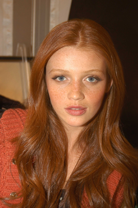
vs.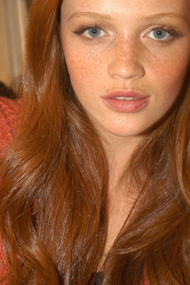
Which do you prefer? And why?
Things to Consider
I’ll use this->
and this->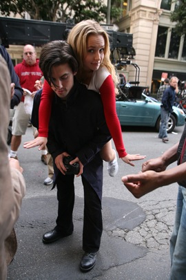
image to explain the things to consider whilst choosing a crop (in these cases, for an icon, though it can be used outside the 100x100 boundary.
In general, cropping is used to add ‘interest’ to an icon, so here are some design principles that generally add towards it.
Emphasis (centre of interest, focal point) - The emphasis of an image is what dominates it, not generally in area, but interest. It is usually placed near, but off centre. Occasionally, an emphasis point is avoided, to make the whole image equally interesting.
Balance - Balance is the contrast of, visually, weight and importance. It compares the left and right, or top and bottom, of an image. Asymmetrical, or informal balance is generally more aesthetically pleasing and interesting to look at. It is more dynamic and leaves the mind's eye to wander.
Cutoffs - a cutoff is basically the area that is cut off, when cropping. This usually defines cropping off part of the focal point, or a whole object (ie. forehead, face, cheek). It does not define cutting off part of the background. Cutting off part of a person’s face/body in an unexpected place generally makes for an interesting crop, because the mind expects to see a whole image, but part of it is cut off, so the mind has to complete image on its own. This type of cropping generally always leads to a result with the golden mean (see below), which is aesthetically pleasing, and offers informal balance. This also looks better with a face that’s facing an angle.
Composition - Composition broadly defines where objects are placed in an image. A rule that should be generally followed is the Golden Mean Rule, or Rule of Thirds. Since the Renaissance, many artists have proportioned their works to match the golden ratio, especially in to the golden rectangle, in which the ratio of the longer side to the shorter is the golden mean. This proportion is generally deemed to be aesthetically pleasing.
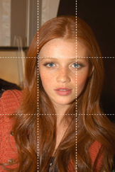
It is generally a ration of 2:3 vs 1:3.
The general idea of this is not to place things front and centre.
Framing - Framing is not technically considered cropping, as it more using cropping to place the whole object in an aesthetically pleasing manner, rather than taking out bits of an object.
Analyzing Cropping
This is so you can see the different aspects that I just explained put into action and why it’s generally aesthetically pleasing or not. :) Don’t take offence if you don’t like my opinions or if you think that the cropping is hideous, it’s just what’s been crammed into me for the past 2 years by my art teachers. :P Everyone has their own point of view and idea of what looks nice :)
1) Finding a Focal Point

vs.
In the first image, there is a lack of focal point, overwhelming sense of balance and the ratio is pretty much 1:1.
However in the second icon, the golden mean is enforced, with her neck being the horizontal 1:3 and her hair being the vertical 1:3. The cropping off of her forehead also lets the viewer create and finish the image. There isn’t really a focal point in the icon, but was intentionally, and could arguably be the nose, which is almost centre.

vs.
In the previous example, there was an obvious good/bad cropping (to myself at least), but these 2 icons of Milo and Hayden, are, in my opinion, good crops, but both with different conventions.
The first icon follows the golden mean, and the obvious focal point is Hayden, with Milo being somewhat part of the background and helping to complete the 2:3. The second icon lacks a focal point, and does not follow the rule of thirds, but is aesthetically interesting to look at because part of Milo’s hair is cut off and so is part of Hayden’s forehead and arm.
2) Losing Balance

vs.
Not really much to say, just that these are examples of formal and informal balance.
3) Take it Off
For this example of cutoffs, I used this -->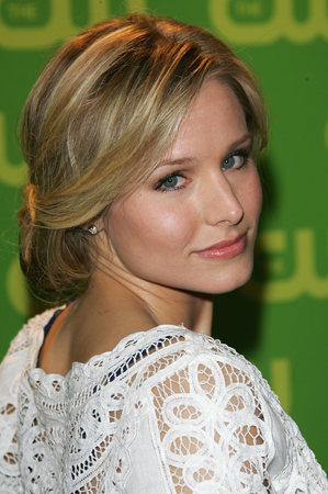
image of Kristen Bell instead, because the Milo/Hayden was not enough of a high res image and the image of Cintia was taken straight up, so it wouldn’t of looked good.
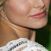
vs.
The former, theoretically, cropping wise, is good, because is uses most of the conventions, but, because KBell’s jaw/lips/cheeks aren’t her most distinctive feature, it shouldn’t be cropped like this, as most people would have trouble figuring out who it is (and therefore completing the image independently. The latter is a good example of cutting off, as it leaves enough for the mind to complete the picture.
4) Frame Me

This is a good example of framing, as the part of the image that is cropped off is one that doesn’t add or take away much from the image, and the remaining image stays pretty much intact. Framing rather than cropping can later give you effects like this later-->
.
Apologies for the length of this tut, but my writing style is generally that of long-windedness and repetition of ideas expressed in different ways. Bad for getting to the point, but good for essays with large word limits.
Anyway, comment with your thoughts and shiz :) If you liked this tut, friend the community, there’s more to come!
Via wikipedia, cropping is defined as the removal of the outer parts of an image to improve framing, accentuate subject matter or change aspect ratio. So, in short, cropping is basically used to create a focal point, or an emphasis, or to create interest in the image/icon.
But, before we start, here are 2 images for you to consider:

vs.

Which do you prefer? And why?
Things to Consider
I’ll use this->

and this->

image to explain the things to consider whilst choosing a crop (in these cases, for an icon, though it can be used outside the 100x100 boundary.
In general, cropping is used to add ‘interest’ to an icon, so here are some design principles that generally add towards it.
Emphasis (centre of interest, focal point) - The emphasis of an image is what dominates it, not generally in area, but interest. It is usually placed near, but off centre. Occasionally, an emphasis point is avoided, to make the whole image equally interesting.
Balance - Balance is the contrast of, visually, weight and importance. It compares the left and right, or top and bottom, of an image. Asymmetrical, or informal balance is generally more aesthetically pleasing and interesting to look at. It is more dynamic and leaves the mind's eye to wander.
Cutoffs - a cutoff is basically the area that is cut off, when cropping. This usually defines cropping off part of the focal point, or a whole object (ie. forehead, face, cheek). It does not define cutting off part of the background. Cutting off part of a person’s face/body in an unexpected place generally makes for an interesting crop, because the mind expects to see a whole image, but part of it is cut off, so the mind has to complete image on its own. This type of cropping generally always leads to a result with the golden mean (see below), which is aesthetically pleasing, and offers informal balance. This also looks better with a face that’s facing an angle.
Composition - Composition broadly defines where objects are placed in an image. A rule that should be generally followed is the Golden Mean Rule, or Rule of Thirds. Since the Renaissance, many artists have proportioned their works to match the golden ratio, especially in to the golden rectangle, in which the ratio of the longer side to the shorter is the golden mean. This proportion is generally deemed to be aesthetically pleasing.

It is generally a ration of 2:3 vs 1:3.
The general idea of this is not to place things front and centre.
Framing - Framing is not technically considered cropping, as it more using cropping to place the whole object in an aesthetically pleasing manner, rather than taking out bits of an object.
Analyzing Cropping
This is so you can see the different aspects that I just explained put into action and why it’s generally aesthetically pleasing or not. :) Don’t take offence if you don’t like my opinions or if you think that the cropping is hideous, it’s just what’s been crammed into me for the past 2 years by my art teachers. :P Everyone has their own point of view and idea of what looks nice :)
1) Finding a Focal Point

vs.

In the first image, there is a lack of focal point, overwhelming sense of balance and the ratio is pretty much 1:1.
However in the second icon, the golden mean is enforced, with her neck being the horizontal 1:3 and her hair being the vertical 1:3. The cropping off of her forehead also lets the viewer create and finish the image. There isn’t really a focal point in the icon, but was intentionally, and could arguably be the nose, which is almost centre.

vs.

In the previous example, there was an obvious good/bad cropping (to myself at least), but these 2 icons of Milo and Hayden, are, in my opinion, good crops, but both with different conventions.
The first icon follows the golden mean, and the obvious focal point is Hayden, with Milo being somewhat part of the background and helping to complete the 2:3. The second icon lacks a focal point, and does not follow the rule of thirds, but is aesthetically interesting to look at because part of Milo’s hair is cut off and so is part of Hayden’s forehead and arm.
2) Losing Balance

vs.

Not really much to say, just that these are examples of formal and informal balance.
3) Take it Off
For this example of cutoffs, I used this -->

image of Kristen Bell instead, because the Milo/Hayden was not enough of a high res image and the image of Cintia was taken straight up, so it wouldn’t of looked good.

vs.

The former, theoretically, cropping wise, is good, because is uses most of the conventions, but, because KBell’s jaw/lips/cheeks aren’t her most distinctive feature, it shouldn’t be cropped like this, as most people would have trouble figuring out who it is (and therefore completing the image independently. The latter is a good example of cutting off, as it leaves enough for the mind to complete the picture.
4) Frame Me

This is a good example of framing, as the part of the image that is cropped off is one that doesn’t add or take away much from the image, and the remaining image stays pretty much intact. Framing rather than cropping can later give you effects like this later-->

.
Apologies for the length of this tut, but my writing style is generally that of long-windedness and repetition of ideas expressed in different ways. Bad for getting to the point, but good for essays with large word limits.
Anyway, comment with your thoughts and shiz :) If you liked this tut, friend the community, there’s more to come!