[outdated] deckmaking - Credits-style
This tutorial is now outdated! Please refer to here for the new deckmaking tutorial.
Last Updated: 30 July 2011
The templates may look a tad intimidating with all the layers, but we promise that they're very easy to work with. |D However, there are some very important points we would like you to take note of, concerning layer opacity of the coloured border and the layer mask. Everything that you need to know about deckmaking at Credits are hopefully covered here - it's incredibly detailed, mainly for my sake because I'm very forgetful... but I hope it'll be useful to you as well!
Things to note:
-Please include a Notepad file with all the details of the deck! The details include the deckname, which series it is from, which OP/ED it is, who the deckmaker is, and who the donator of the images is. Copy/paste this form into a Notepad file and fill out the details for every deck you complete:
Deckname:
Song Name:
Series:
Sequence: Which OP/ED it is [eg: Opening 2. For variant OPs, Opening 1 Variant 2]
Deckmaker: the name of the deckmaker
Images: the name of the donator - if you gathered the images yourself, list your name here
-You need the Legend font! You can get it here.
-You also need Photoshop. I use CS5 Extended, but as long as you have a recent version, you should have no problems! I'm pretty sure this works in CS2 as well, it's just that you'll need to work a little differently. Eg: CS2 doesn't display text effects in the layer dialog, but you can access the Stroke effect under Layer -> Layer Style -> Stroke.
-for regular/special cards, the dimensions of each card are 100x75. The mastery banner is 150x75.
-I will be making puzzle decks, but just for your information, for puzzle cards, you need an image that is 400x400. The mastery banner is 150x80.
1.
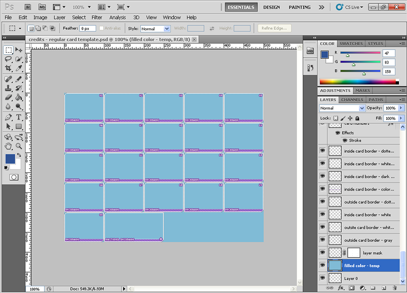
This is what you get when you first open the PSD. There's a temporary layer with filled color - it's just there so that you can see all the borders but you won't be needing this when the deck is completed and the layers are ready to be merged. So if you like, you can even delete this completely from your template.
2.
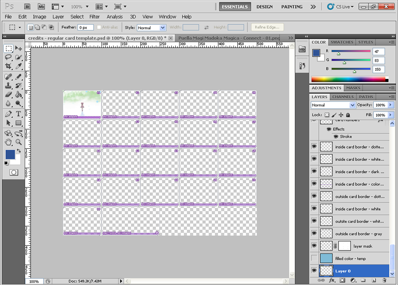
There's really no set way to go about doing things - if you want to change decknames first, you can! Change border colors, sure!
I chose to put in the images first, so here's our first card. Just make sure your image has been resized to 100x75, has its saturation adjusted and is sharpened etc and it looks good and fits properly within the straight borders. Don't worry about the extra edges spilling out of the rounded edges - we'll get to that later when we talk about layer masks. :D Layer 0 is our first layer for cards, so just paste your first image in there and carry on from there.
Also, an important note when you're saving - you'll need to include the PSD together with the deck so that any changes that need to be made can be done quickly. Remember to save the PSD as [deckname].psd.
3.
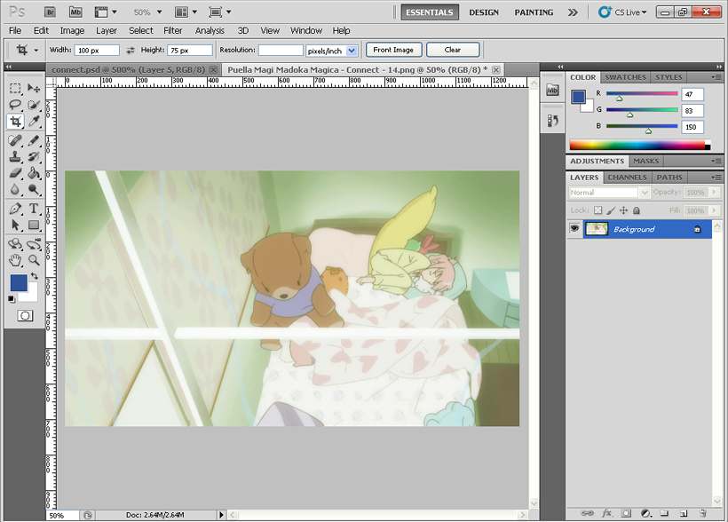
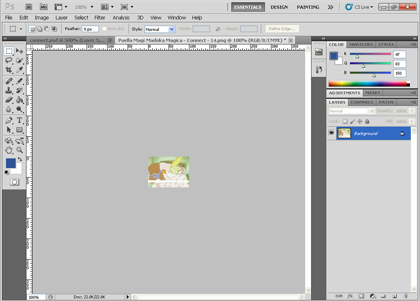
Personally, I prefer to have the entire scene included in the crop, but sometimes doing that makes everything in the image look tiny and weird. If you can't make out the image in the card, then it's not a very nice card, is it? When that happens, feel free to play around with the crop and see what works best. Use your judgment! Like above, If I tried including everything, you wouldn't be able to see Madoka at all. So I chose to focus on her and her soft toys [and Kyubey, but you can still hardly see him XD].
4.
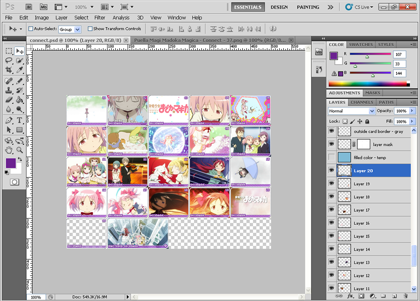
When you're done with your images, this is how it should look like! The 00 card is a filler card, so leave it blank. Also, I was asked if the deck has to contain a card of the anime title - it'd be nice to have, but it's not required. :D
Important Note: I should also mention that this is actually not a very good deck as there're a couple of close-ups placed too closely next to each other. Please have a variety of shots for your card images - many OP/EDs tend to have scenery shots, long shots, action scenes and the likes so be sure to include them instead of focusing solely on the characters. Keep the card images in the order that they appear in the OP/ED clip - for the mastery banner, I personally prefer to use the final scene but you can use any scene as long as it looks good. On that note, I've already edited this deck so the final deck will look a little different from the one shown above.
5.
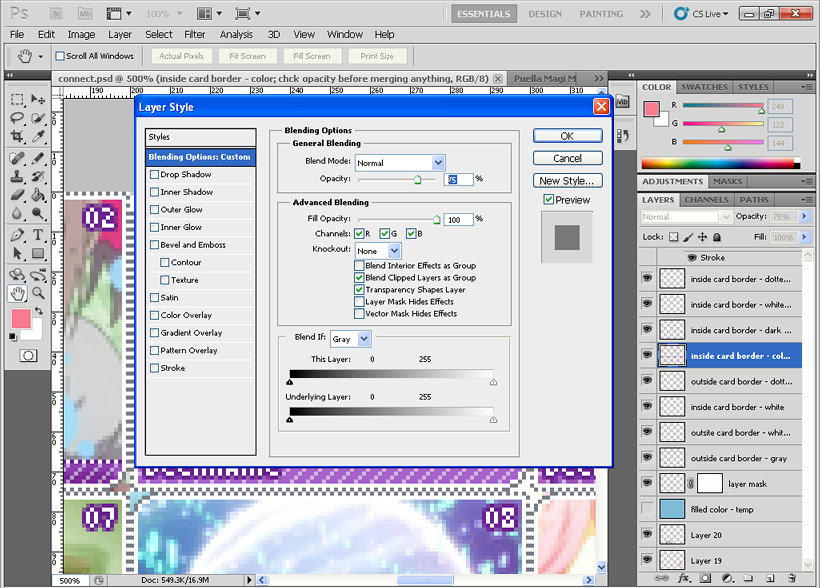
Connect is a colourful opening, so let's pick a more vibrant colour for the coloured border at the bottom of the card!
Important note: As shown above, when you open the PSD, the layer opacity of the relevant layer [inside card border - color] is at 75%. When you want to change the colour, crank the opacity up to 100% first, and then fill all the borders with your colour. To fill the whole color bar layer with a new color, you can just hold Ctrl and click on the layer "icon" (the tiny preview picture) to select the whole layer. Then press Alt+backspace to fill it with your foreground color. When you're done, tweak the layer opacity back down to 75%.
It might seem pretty roundabout but there's two reasons for this. First, if you just filled the border with a different colour without adjusting the layer opacity, the colour will actually come out lighter than what you want. A more useful reason is that if we ever need to remake decks [[for example, you made a deck using a clip with credits, and then a few weeks later, you found a creditless one D:]], you'll be able to reuse the original colour you used for the original deck by just increasing the layer opacity to 100%, and then grabbing the colour from the border. Very simple.
tl;dr, to change the color of the borders,
-Increase layer opacity to 100%
-Fill all the colored borders with your desired color - hold Ctrl, click the layer 'icon' to select the whole layer, press Alt+Backspace to fill them with your foreground colour
-Decrease layer opacity back down to 75% [important!]
When you're done, you should have something like this!
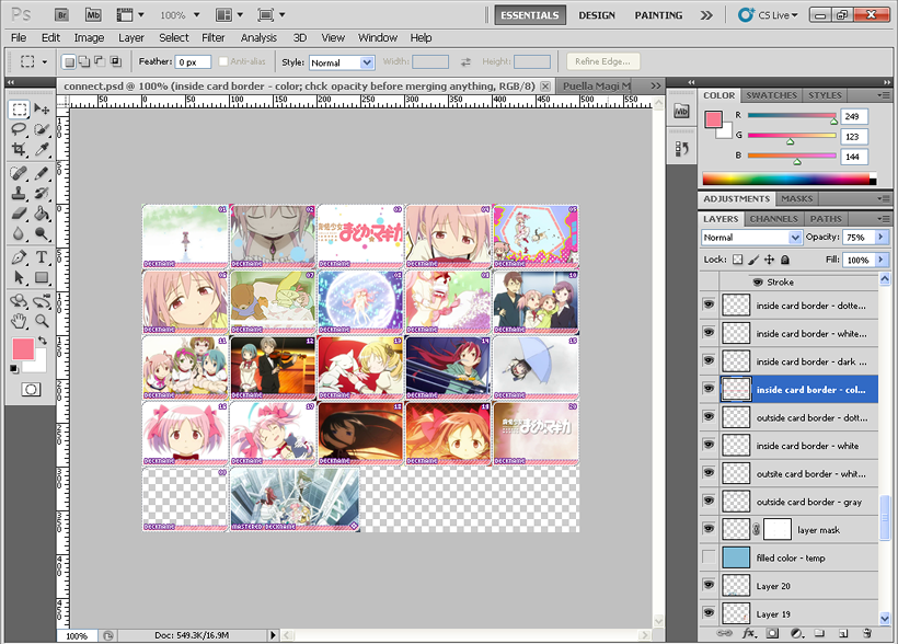
Looks better now, right?
The colour is up to the deckmaker - if a player donates a deck and requests a specific colour, then we'll use the requested colour for the deck. But if you think the deck will look better with another colour, feel free to use the colour you've chosen instead.
6.
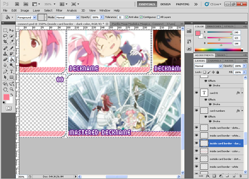
Using the same colour as your coloured border, fill up the solid-colour dotted line now. The lines are on another layer [inside card border - dark color]. Good thing is these don't need any tweaking, so you can just fill it up with the colour. It used to be purple before, but now it's a nice pink. /o/
7.
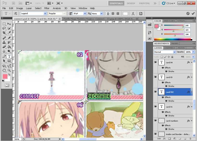
Time to change the deckname! Select your Text tool, select any of the 'deckname' and merrily change them to the actual deckname. We use the font Legend at 10 pt.
Make sure that you're changing the 'deckname' word, and not creating a whole new layer! That happens to me a lot... And the numbers won't need any changing so don't worry about them.
8.
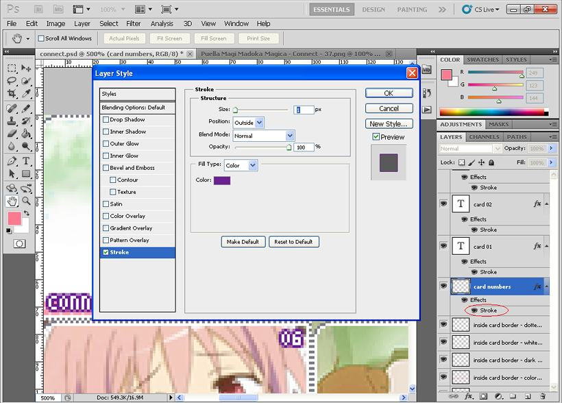
When you're done replacing the 'deckname' with the actual deckname, it's time to change the border of the text and numbers! Double click on Stroke and you should get this. For the colour, use a colour that is deeper than the colour of the border, so that it's easier to read the deckname and numbers.
9.
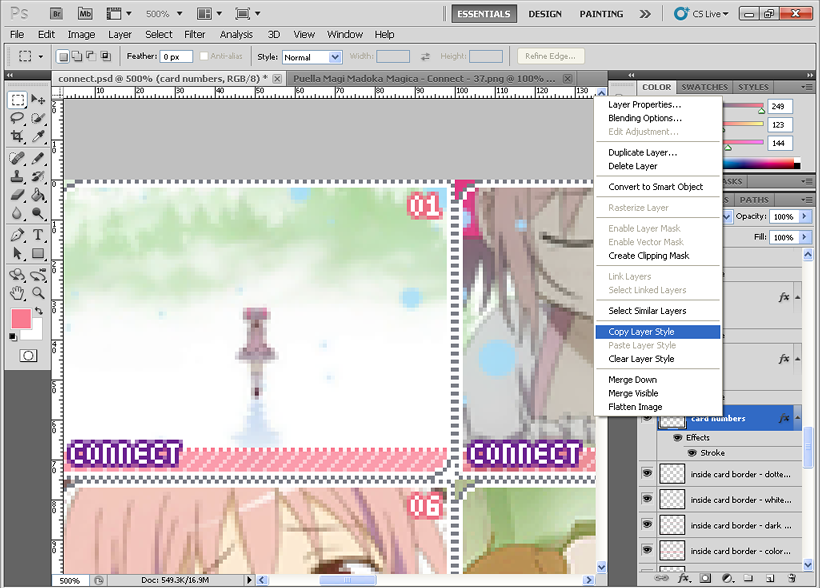
When you're satisfied with the colour you've picked, just right click on the layer [for me, it's 'card numbers'], pick Copy Layer Style.
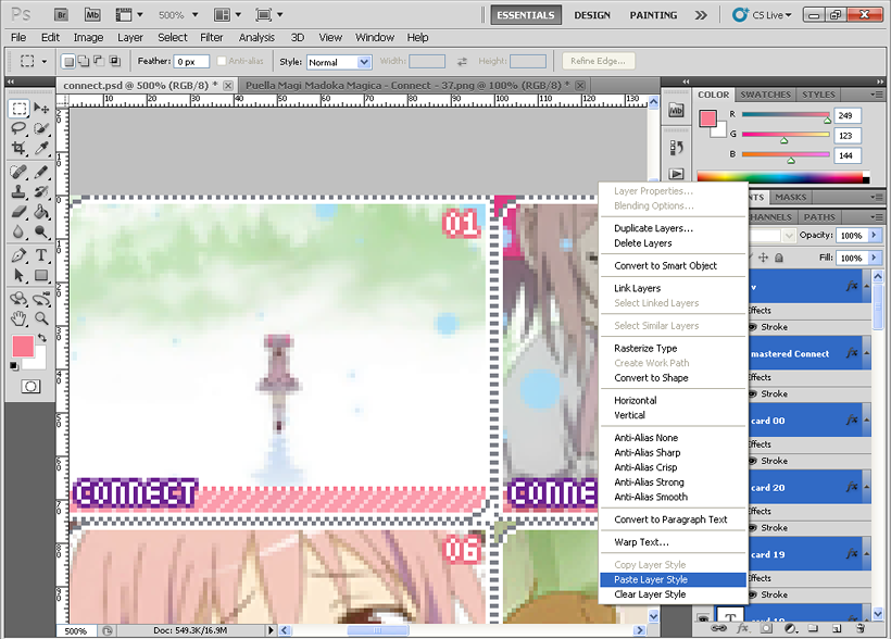
Then select all the text layers above ['card 01' all the way to 'v'], right click on the layers, and choose Paste Layer Style.
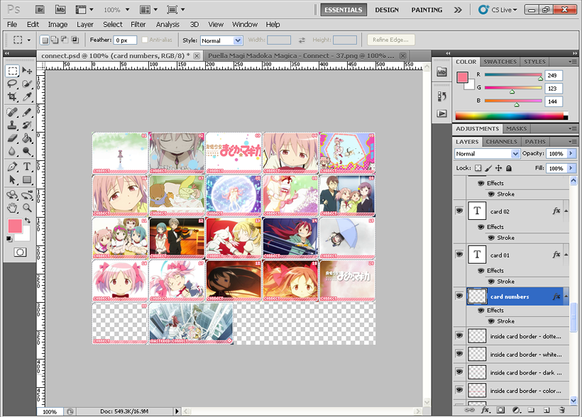
Almost there! /o/
10.
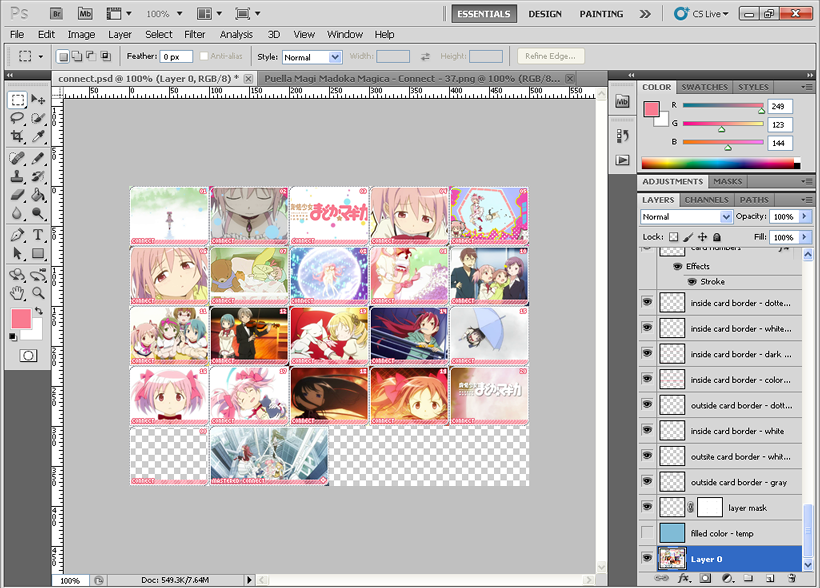
Time to talk about the layer mask I mentioned earlier! Merge only your images into one layer first.
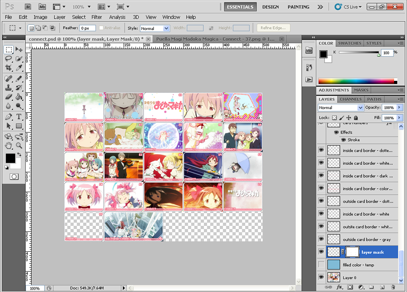
Hold the Alt key, click on the layer mask, and drag it onto the layer with your images...
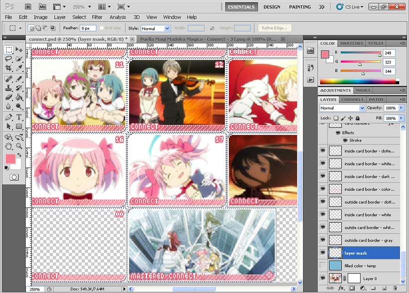
And all the extra edges on your images are gone! Neat!
Important Note: One of our deckmakers had to unlink the layer mask from the original layer before dragging the layer mask onto the layer with the images. If my method doesn't work, try unlinking it first before dragging. Just click on the chain between the layer and the mask to unlink them, drag the layer mask down to the layer with the images, and link them again by clicking between them. I hope that helps!
11.
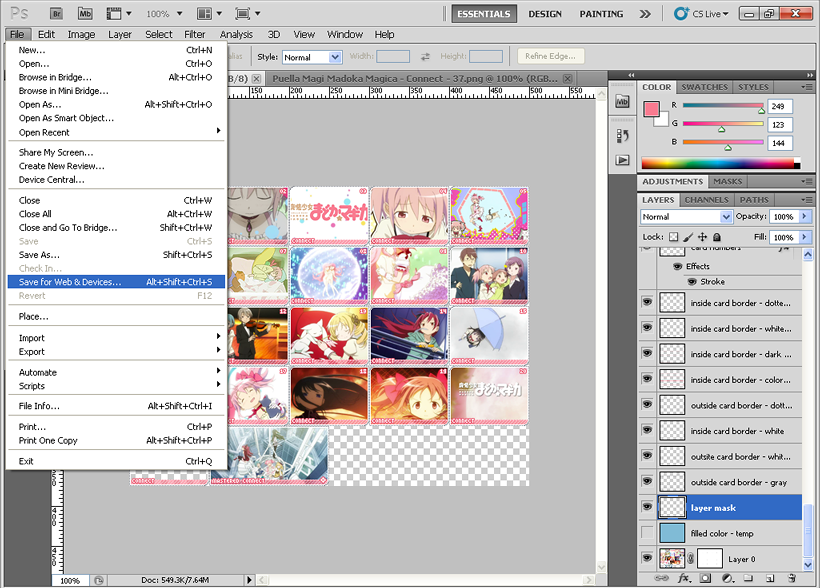
When saving, use "Save for Web & Devices". Also, if you're not asked to merge layers before saving, then there's no need to merge layers. I'm not sure if that's specific to CS5, but it'd be great to have all the layers intact in the PSD for easy editing.
Important Note: If you do have to merge layers, remember to make sure that the filled color layer you first see isn't merged as well!
12.
Important Note: Totally ganking this from Colors, but perarduaadast found a way to name the splices without the underscore. *__*
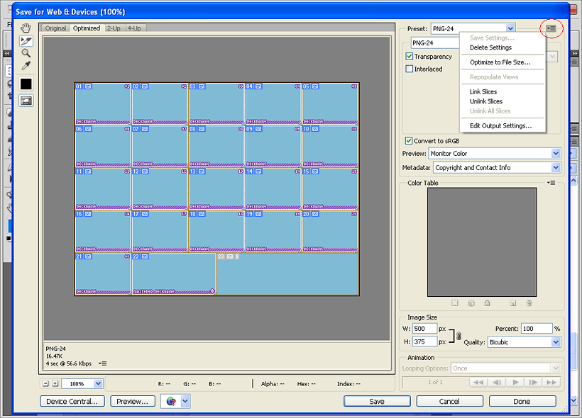
When you've clicked "Save For Web", open up "Edit Output Settings".
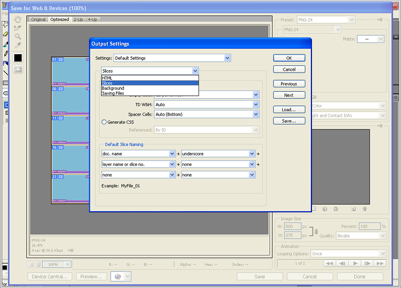
In that section, click and open the second drop-down bar and select "slices".
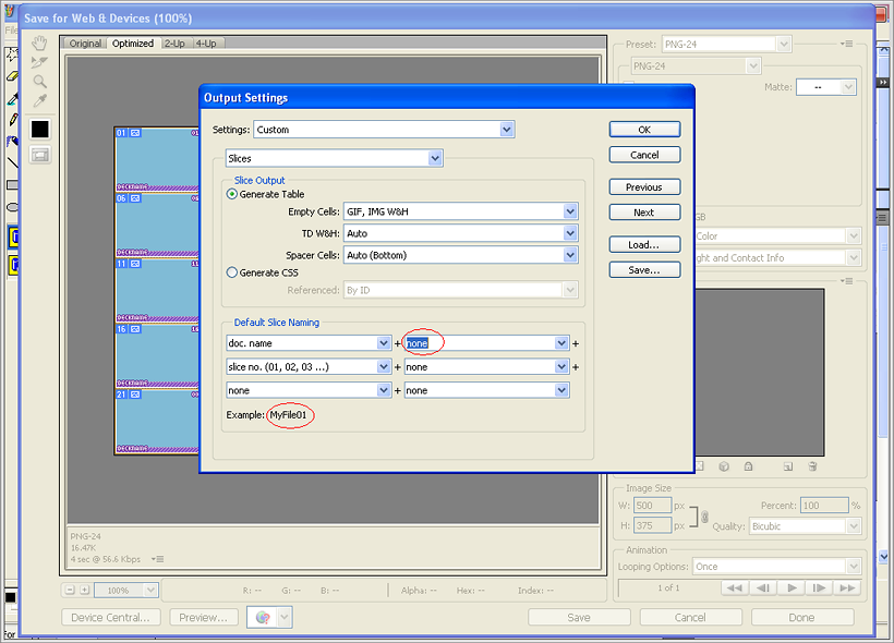
Change "underscore" and any others that are unimportant to "none" and leave only the following two: "doc.name" and "slice no. (01, 02, 03 ...)". There's an example filename included at the bottom [circled!].
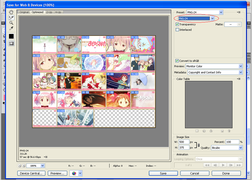
The template has already been sliced beforehand, so this is what you'll get. Select all the slices by clicking and dragging, and select PNG-24 from the second drop-menu. Click 'Save'!
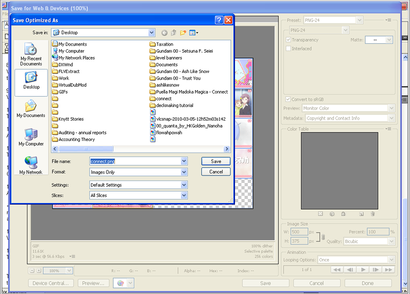
The filename should be the deckname. Save "All Slices". "Selected Slices" can be used when you want to replace certain cards and have already selected those cards in the above step.
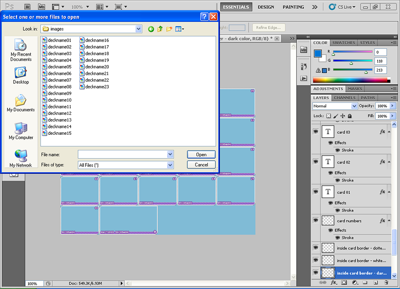
If your PSD file was named after the deck name, you're good! It'll export perfectly named cards. You just have to rename the 00 and the master badge.
13.
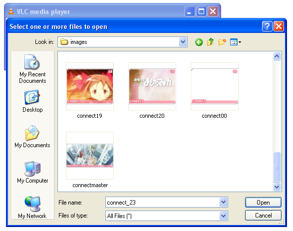
Once you're done, a folder called "images" will show up on your desktop. In that folder is your card images. Run through your cards to see if there're any errors - decknames being too close or too far from the borders, typos, that sort of thing. If you have edited the settings correctly, there should be no underscore. deckname21 is your filler card, so name it to deckname00. deckname22 is your mastery banner - that should be renamed to decknamemaster. deckname23 is blank, it's an extra splice that Photoshop automatically generates, so just delete that.
Chuck in the PSD file for the deck into the folder and rename the folder to the deckname [eg: connect]. Zip up the folder, name the zip file the deckname again, send it my way and you're done!
tl;dr:
-check to make sure your cards are in .png format
-check your cards for errors
-deckname21 should be renamed deckname00
-deckname22 should be renamed decknamemaster
-deckname23 should be deleted
-include the PSD file and the Notepad file with all the deck details in the folder
-rename the folder to the deckname
-Zip up the folder, rename the zipfile to the deckname and upload it
This was something which we realized is necessary. Sometimes, if you download just the OP/ED clips from Youtube or other sites, the OP/ED clips are in the wrong aspect ratio. Always grab caps in the right aspect ratio - otherwise, you're going to end up with cards that look distorted.
As an example, I grabbed a Slam Dunk ED clip off Youtube, and it was in 16:9.
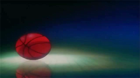
Are basketballs oval?
VLC Player has an option for you to tweak aspect ratio of the video [I'll cover that in a minute] - after adjusting to a ratio of 4:3;

Our basketball is perfectly round now! :D
To adjust the aspect ratio, just head to Video, Aspect Ratio and then choose the right ratio:
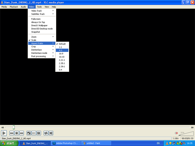
My example was in 16:9 when it was supposed to be 4:3, the other way round is 100% possible too. As a general rule, newer OP/EDs tend to be in 16:9 while older ones are in 4:3, but there are always exceptions so you have to look out for it. @_@ When in doubt, ask Chuu grab a screencap and ask a friend [or a fellow fan] to see if the image looks strange. It's really up to your judgment in the end. x_o;
Tips:
-Decknames: We use song names, part of it, or part of song lyrics [in Japanese] for decknames. For OSTs, we use themes from the show or one of the tracknames - eg: a Code Geass OST would probably be named 'Britannia' ["All Hail Britannia"] or 'Rebellion' [the full title of the anime is Code Geass: Lelouch of the Rebellion]. While we don't have a character limit for decknames, no one wants to deal with overly long filenames so stick to around 16~17 characters as your max. Also ensure that the deckname including the stroke doesn't touch the right white border. Always make sure there is at least ONE pixel of space between both ends of the deckname and the white borders.
-This goes without saying, but play around with the saturation and vibrance of your images! Also, Smart Sharpen is your best friend.
-Vary your shots, if there are a lot of closeups, you can replace some of the card images with full-body shots, far shots...that kind of thing.
-Think of it as 'reverse storyboarding' - you already have the animation clip, so all you have to do is to find nice sequences to capture as cards in a deck. Don't just focus on certain parts or certain people; include scenery, movement, different sequences etc.
-If you're not sure if your deck looks okay, make a screenshot of your work in progress and ask for either a fellow deckmaker or a player's suggestions! A little critique goes a long way.
-We're all here to help each other out, so never be afraid to ask for help. :D
And that's all! I hope that was helpful! /o/
Last Updated: 30 July 2011
The templates may look a tad intimidating with all the layers, but we promise that they're very easy to work with. |D However, there are some very important points we would like you to take note of, concerning layer opacity of the coloured border and the layer mask. Everything that you need to know about deckmaking at Credits are hopefully covered here - it's incredibly detailed, mainly for my sake because I'm very forgetful... but I hope it'll be useful to you as well!
Things to note:
-Please include a Notepad file with all the details of the deck! The details include the deckname, which series it is from, which OP/ED it is, who the deckmaker is, and who the donator of the images is. Copy/paste this form into a Notepad file and fill out the details for every deck you complete:
Deckname:
Song Name:
Series:
Sequence: Which OP/ED it is [eg: Opening 2. For variant OPs, Opening 1 Variant 2]
Deckmaker: the name of the deckmaker
Images: the name of the donator - if you gathered the images yourself, list your name here
-You need the Legend font! You can get it here.
-You also need Photoshop. I use CS5 Extended, but as long as you have a recent version, you should have no problems! I'm pretty sure this works in CS2 as well, it's just that you'll need to work a little differently. Eg: CS2 doesn't display text effects in the layer dialog, but you can access the Stroke effect under Layer -> Layer Style -> Stroke.
-for regular/special cards, the dimensions of each card are 100x75. The mastery banner is 150x75.
-I will be making puzzle decks, but just for your information, for puzzle cards, you need an image that is 400x400. The mastery banner is 150x80.
1.

This is what you get when you first open the PSD. There's a temporary layer with filled color - it's just there so that you can see all the borders but you won't be needing this when the deck is completed and the layers are ready to be merged. So if you like, you can even delete this completely from your template.
2.

There's really no set way to go about doing things - if you want to change decknames first, you can! Change border colors, sure!
I chose to put in the images first, so here's our first card. Just make sure your image has been resized to 100x75, has its saturation adjusted and is sharpened etc and it looks good and fits properly within the straight borders. Don't worry about the extra edges spilling out of the rounded edges - we'll get to that later when we talk about layer masks. :D Layer 0 is our first layer for cards, so just paste your first image in there and carry on from there.
Also, an important note when you're saving - you'll need to include the PSD together with the deck so that any changes that need to be made can be done quickly. Remember to save the PSD as [deckname].psd.
3.


Personally, I prefer to have the entire scene included in the crop, but sometimes doing that makes everything in the image look tiny and weird. If you can't make out the image in the card, then it's not a very nice card, is it? When that happens, feel free to play around with the crop and see what works best. Use your judgment! Like above, If I tried including everything, you wouldn't be able to see Madoka at all. So I chose to focus on her and her soft toys [and Kyubey, but you can still hardly see him XD].
4.

When you're done with your images, this is how it should look like! The 00 card is a filler card, so leave it blank. Also, I was asked if the deck has to contain a card of the anime title - it'd be nice to have, but it's not required. :D
Important Note: I should also mention that this is actually not a very good deck as there're a couple of close-ups placed too closely next to each other. Please have a variety of shots for your card images - many OP/EDs tend to have scenery shots, long shots, action scenes and the likes so be sure to include them instead of focusing solely on the characters. Keep the card images in the order that they appear in the OP/ED clip - for the mastery banner, I personally prefer to use the final scene but you can use any scene as long as it looks good. On that note, I've already edited this deck so the final deck will look a little different from the one shown above.
5.

Connect is a colourful opening, so let's pick a more vibrant colour for the coloured border at the bottom of the card!
Important note: As shown above, when you open the PSD, the layer opacity of the relevant layer [inside card border - color] is at 75%. When you want to change the colour, crank the opacity up to 100% first, and then fill all the borders with your colour. To fill the whole color bar layer with a new color, you can just hold Ctrl and click on the layer "icon" (the tiny preview picture) to select the whole layer. Then press Alt+backspace to fill it with your foreground color. When you're done, tweak the layer opacity back down to 75%.
It might seem pretty roundabout but there's two reasons for this. First, if you just filled the border with a different colour without adjusting the layer opacity, the colour will actually come out lighter than what you want. A more useful reason is that if we ever need to remake decks [[for example, you made a deck using a clip with credits, and then a few weeks later, you found a creditless one D:]], you'll be able to reuse the original colour you used for the original deck by just increasing the layer opacity to 100%, and then grabbing the colour from the border. Very simple.
tl;dr, to change the color of the borders,
-Increase layer opacity to 100%
-Fill all the colored borders with your desired color - hold Ctrl, click the layer 'icon' to select the whole layer, press Alt+Backspace to fill them with your foreground colour
-Decrease layer opacity back down to 75% [important!]
When you're done, you should have something like this!

Looks better now, right?
The colour is up to the deckmaker - if a player donates a deck and requests a specific colour, then we'll use the requested colour for the deck. But if you think the deck will look better with another colour, feel free to use the colour you've chosen instead.
6.

Using the same colour as your coloured border, fill up the solid-colour dotted line now. The lines are on another layer [inside card border - dark color]. Good thing is these don't need any tweaking, so you can just fill it up with the colour. It used to be purple before, but now it's a nice pink. /o/
7.

Time to change the deckname! Select your Text tool, select any of the 'deckname' and merrily change them to the actual deckname. We use the font Legend at 10 pt.
Make sure that you're changing the 'deckname' word, and not creating a whole new layer! That happens to me a lot... And the numbers won't need any changing so don't worry about them.
8.

When you're done replacing the 'deckname' with the actual deckname, it's time to change the border of the text and numbers! Double click on Stroke and you should get this. For the colour, use a colour that is deeper than the colour of the border, so that it's easier to read the deckname and numbers.
9.

When you're satisfied with the colour you've picked, just right click on the layer [for me, it's 'card numbers'], pick Copy Layer Style.

Then select all the text layers above ['card 01' all the way to 'v'], right click on the layers, and choose Paste Layer Style.

Almost there! /o/
10.

Time to talk about the layer mask I mentioned earlier! Merge only your images into one layer first.

Hold the Alt key, click on the layer mask, and drag it onto the layer with your images...

And all the extra edges on your images are gone! Neat!
Important Note: One of our deckmakers had to unlink the layer mask from the original layer before dragging the layer mask onto the layer with the images. If my method doesn't work, try unlinking it first before dragging. Just click on the chain between the layer and the mask to unlink them, drag the layer mask down to the layer with the images, and link them again by clicking between them. I hope that helps!
11.

When saving, use "Save for Web & Devices". Also, if you're not asked to merge layers before saving, then there's no need to merge layers. I'm not sure if that's specific to CS5, but it'd be great to have all the layers intact in the PSD for easy editing.
Important Note: If you do have to merge layers, remember to make sure that the filled color layer you first see isn't merged as well!
12.
Important Note: Totally ganking this from Colors, but perarduaadast found a way to name the splices without the underscore. *__*

When you've clicked "Save For Web", open up "Edit Output Settings".

In that section, click and open the second drop-down bar and select "slices".

Change "underscore" and any others that are unimportant to "none" and leave only the following two: "doc.name" and "slice no. (01, 02, 03 ...)". There's an example filename included at the bottom [circled!].

The template has already been sliced beforehand, so this is what you'll get. Select all the slices by clicking and dragging, and select PNG-24 from the second drop-menu. Click 'Save'!

The filename should be the deckname. Save "All Slices". "Selected Slices" can be used when you want to replace certain cards and have already selected those cards in the above step.

If your PSD file was named after the deck name, you're good! It'll export perfectly named cards. You just have to rename the 00 and the master badge.
13.

Once you're done, a folder called "images" will show up on your desktop. In that folder is your card images. Run through your cards to see if there're any errors - decknames being too close or too far from the borders, typos, that sort of thing. If you have edited the settings correctly, there should be no underscore. deckname21 is your filler card, so name it to deckname00. deckname22 is your mastery banner - that should be renamed to decknamemaster. deckname23 is blank, it's an extra splice that Photoshop automatically generates, so just delete that.
Chuck in the PSD file for the deck into the folder and rename the folder to the deckname [eg: connect]. Zip up the folder, name the zip file the deckname again, send it my way and you're done!
tl;dr:
-check to make sure your cards are in .png format
-check your cards for errors
-deckname21 should be renamed deckname00
-deckname22 should be renamed decknamemaster
-deckname23 should be deleted
-include the PSD file and the Notepad file with all the deck details in the folder
-rename the folder to the deckname
-Zip up the folder, rename the zipfile to the deckname and upload it
This was something which we realized is necessary. Sometimes, if you download just the OP/ED clips from Youtube or other sites, the OP/ED clips are in the wrong aspect ratio. Always grab caps in the right aspect ratio - otherwise, you're going to end up with cards that look distorted.
As an example, I grabbed a Slam Dunk ED clip off Youtube, and it was in 16:9.

Are basketballs oval?
VLC Player has an option for you to tweak aspect ratio of the video [I'll cover that in a minute] - after adjusting to a ratio of 4:3;

Our basketball is perfectly round now! :D
To adjust the aspect ratio, just head to Video, Aspect Ratio and then choose the right ratio:

My example was in 16:9 when it was supposed to be 4:3, the other way round is 100% possible too. As a general rule, newer OP/EDs tend to be in 16:9 while older ones are in 4:3, but there are always exceptions so you have to look out for it. @_@ When in doubt, ask Chuu grab a screencap and ask a friend [or a fellow fan] to see if the image looks strange. It's really up to your judgment in the end. x_o;
Tips:
-Decknames: We use song names, part of it, or part of song lyrics [in Japanese] for decknames. For OSTs, we use themes from the show or one of the tracknames - eg: a Code Geass OST would probably be named 'Britannia' ["All Hail Britannia"] or 'Rebellion' [the full title of the anime is Code Geass: Lelouch of the Rebellion]. While we don't have a character limit for decknames, no one wants to deal with overly long filenames so stick to around 16~17 characters as your max. Also ensure that the deckname including the stroke doesn't touch the right white border. Always make sure there is at least ONE pixel of space between both ends of the deckname and the white borders.
-This goes without saying, but play around with the saturation and vibrance of your images! Also, Smart Sharpen is your best friend.
-Vary your shots, if there are a lot of closeups, you can replace some of the card images with full-body shots, far shots...that kind of thing.
-Think of it as 'reverse storyboarding' - you already have the animation clip, so all you have to do is to find nice sequences to capture as cards in a deck. Don't just focus on certain parts or certain people; include scenery, movement, different sequences etc.
-If you're not sure if your deck looks okay, make a screenshot of your work in progress and ask for either a fellow deckmaker or a player's suggestions! A little critique goes a long way.
-We're all here to help each other out, so never be afraid to ask for help. :D
And that's all! I hope that was helpful! /o/