Second Tutorial
From this 
to this
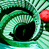
Find out how to make this icon
Comments will be most greatly appreciated and welcomed.
Icon originally from this post.
I start off using this picture and we crop, resize, and sharpen it once. And we get our base.

to
Now that we have our base, we add a New Raster Layer and fill it with color #C1FBFF which is a nice blueish color and set it to Burn Opactity %100.

to
Still on the bluiesh layer I deleted the girl and the umbrella because I wanted to contrast the umbrella color with the building behind.

to
Then I add a peachy/beige gradient and set it to Burn Opacity %100.

to
Duplicate your base and bring it to the top of all your layers and set it to Soft Light %100, but erase the woman's face because it looks too dark.

to
Create a New Raster Layer, fill with color #FFC0C0, and set it to Burn Opacity %46, and erase the woman's face again.

to
Again make another New Raster Layer and fill with color #F6B3F7 and set to Burn Opacity %20.

to
Since the building still doesn't stand out so much, we go back to the blue layer and duplicate it twice.

to
Now go back to your peachy/beige layer and duplicate once.

to
Now your icon is too dark so go back to your base and duplicate it and set it to Screen Opacity %78.

to
and Voìla your icon is done.
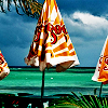
Icons using the same/similar technique


Extra Notes:
-I used PSP 8 to make this icon.
-Comments are appreciated.
-Love to see what you come up with. =D
-For more of my icons see cristal_graphix

to this

Find out how to make this icon
Comments will be most greatly appreciated and welcomed.
Icon originally from this post.
I start off using this picture and we crop, resize, and sharpen it once. And we get our base.

to

Now that we have our base, we add a New Raster Layer and fill it with color #C1FBFF which is a nice blueish color and set it to Burn Opactity %100.

to

Still on the bluiesh layer I deleted the girl and the umbrella because I wanted to contrast the umbrella color with the building behind.

to

Then I add a peachy/beige gradient and set it to Burn Opacity %100.

to

Duplicate your base and bring it to the top of all your layers and set it to Soft Light %100, but erase the woman's face because it looks too dark.

to

Create a New Raster Layer, fill with color #FFC0C0, and set it to Burn Opacity %46, and erase the woman's face again.

to

Again make another New Raster Layer and fill with color #F6B3F7 and set to Burn Opacity %20.

to

Since the building still doesn't stand out so much, we go back to the blue layer and duplicate it twice.

to

Now go back to your peachy/beige layer and duplicate once.

to

Now your icon is too dark so go back to your base and duplicate it and set it to Screen Opacity %78.

to

and Voìla your icon is done.
Icons using the same/similar technique
Extra Notes:
-I used PSP 8 to make this icon.
-Comments are appreciated.
-Love to see what you come up with. =D
-For more of my icons see cristal_graphix