Tutorial #1
This is my first tutorial, which requires Photoshop CS2 (other versions are probably fine) and Selective Coloring (sorry!).

to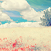
The results aren't exact since I'm trying to recreate this icon (originally from this post), but they are pretty close.
1. Prepare your base (crop, fix lighting, etc.)

2. Make a fill layer with the color #FBF37e and set it to soft light at 100%. You can use a darker yellow if you want the final image to be bluer, or a brighter yellow if you want your final image to be greener.


3. Make a selective color layer with these settings:
Reds: -100, +15, -15, +10
Yellows: -100, -100, -100, -100
Neutrals: +25, 0, +15, -25

4. Make a new selective color layer with these settings:
Reds: 0, +75, +15, +30
Yellows: -100, +30, 0, +30
Neutrals: +35, +25, 0, +15

5. Make a fill layer with the color #04092a and set it to exclusion at 100%.

6. Make another selective color layer with these settings:
Reds: -100, +10, +5, 0
Yellows: -100, 0, +5, +25
Neutrals: +30, 0, -40, 0

7. Make a Hue/Saturation layer with these settings:
Cyans: 0, +30, 0
Blues, 0, +20, 0

8. Make one last selective color layer with these settings:
Reds: -100, 0, +30, 0
Yellows; 0, -45, -100, 0
Cyans: +40, 0, 0, 0

And you're done! I merged all my layers and sharpened it once (Filter--Sharpen--Sharpen). You made need to go to Fade Sharpen depending on your image.
Every image is different, so you will need to tweak the settings to whatever makes your image look the best! Our result is slightly bluer than the original icon I made, which you can change by altering the selective coloring settings.
I hope was helpful :)
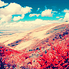
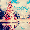
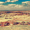
Other Icons made with similar techniques:
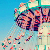
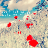
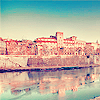

to
The results aren't exact since I'm trying to recreate this icon (originally from this post), but they are pretty close.
1. Prepare your base (crop, fix lighting, etc.)

2. Make a fill layer with the color #FBF37e and set it to soft light at 100%. You can use a darker yellow if you want the final image to be bluer, or a brighter yellow if you want your final image to be greener.


3. Make a selective color layer with these settings:
Reds: -100, +15, -15, +10
Yellows: -100, -100, -100, -100
Neutrals: +25, 0, +15, -25

4. Make a new selective color layer with these settings:
Reds: 0, +75, +15, +30
Yellows: -100, +30, 0, +30
Neutrals: +35, +25, 0, +15

5. Make a fill layer with the color #04092a and set it to exclusion at 100%.

6. Make another selective color layer with these settings:
Reds: -100, +10, +5, 0
Yellows: -100, 0, +5, +25
Neutrals: +30, 0, -40, 0

7. Make a Hue/Saturation layer with these settings:
Cyans: 0, +30, 0
Blues, 0, +20, 0

8. Make one last selective color layer with these settings:
Reds: -100, 0, +30, 0
Yellows; 0, -45, -100, 0
Cyans: +40, 0, 0, 0

And you're done! I merged all my layers and sharpened it once (Filter--Sharpen--Sharpen). You made need to go to Fade Sharpen depending on your image.
Every image is different, so you will need to tweak the settings to whatever makes your image look the best! Our result is slightly bluer than the original icon I made, which you can change by altering the selective coloring settings.
I hope was helpful :)
Other Icons made with similar techniques: