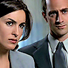
Too much ice cream is bad for the tummieee.
I know a lot of icon-makers already are well aware of how to improve an image/cap, but for those who don't, I'd like to share a few of my personal steps. These are the steps that I ALWAYS apply on each and every one of my icons even before I add textures/brushes/gradients/etc. Here you will learn how to take a really bad cap and turn it into something [I think] probably ten times better.
This tutorial is for Photoshop 8. There are a few things on here I'm not sure will translate to other programs, as PS is the only program I've ever had. [ edit ] Thanks to julia_thorne13 for informing me that it can be translated to PSP, thanks![ //end edit ]
Take this cap. It has only been cropped -->
And we'll learn how to make it into this -->
As you can see, the first image is really ugly. It's not sharp, and dark, among other things.
01 Start with this.

______________________________________
02 Sharpen it by going to Image > Sharpen > Sharpen.

-->
______________________________________
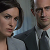
03 Take the smudge tool (under the eraser tool indicated by a hand with a pointing index finger) mode: normal, strength: 10%. Zoom in to about 500%, using a round, soft edged brush about 4-9 px in diameter, smudge the cheeks, foreheads, necks, noses, clothes, etc, of Olivia & Elliot. Only avoid the eyes and lips. Try to smudge the background more than the people. That will make the background more blurred, which makes the people stand out.

-->
______________________________________
04 Then sharpen the image again. Sometimes sharpening it again is too much. If that is the case, go to Edit > Fade Sharpen and adjust the percentage to your liking. If you are using a program that does not have a fade sharpen, then you can duplicate the layer and then sharpen the duplicated layer. Afterwards, you can adjust the opacity of your sharpened layer (duplicated layer) to your liking.

-->
______________________________________
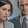
05 Now here is the part where I'm not sure if other programs will have it or not. I learned this nifty nifty trick in my advanced Photoshop class. Go to Image > Adjustments > Shadow/Highlight. The default setting should be shadow: 50%, highlight: 0%. I left it at the default setting and clicked OK. You can adjust the shadow* to your liking, but I wouldn't mess with the highlight.
*This tool removes the shadows in a picture. It's really useful for taking away the shadow on a person's face, as well as brightening the picture.

-->
Note: This only works for PS CS. For lower PS, go to Image > Adjustments > Variations and choose lighter once or twice, or thrice. That will brighten the image. The colors will be flatter than if you use shadow/highlight. But don't worry, cause you can crank up the contrast in step 6 to give it more color.
Here is the result if you use shadow/highlight.
Here is the result if you use variations.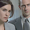
______________________________________
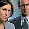
06 Nifty eh?? But *yawns* the colors are dull, boring, flat, bleh. Hmph. We'll fix that. Now, add a new adjustment layer by going to Layer > New Adjustment Layer > Brightness/Contrast . . . Crank up the contrast to about 30, or whatever suits your icon.

-->
______________________________________
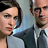
07 I thought the faces were too yellowish (because of the high contrast). So add another adjustment layer Layer > New Adjustment Layer > Hue/Saturation. First, in the edit box, choose reds and decrease the saturation to -10. Second, choose yellows in the edit box, saturation: -10. And lastly, choose magentas in the edit box and also decrease the saturation to -10.

-->
______________________________________
08 Now for the last step. Add another adjustment layer Layer > New Adjustments Layer > Selective Color. In the colors box, choose blacks, then go down to the slider for black and increase that to 10%.
*This darkens only the blacks in an image. It's great for darkening hair and eyebrows to make them stand out more. It's like applying make up, only not really. ^__________^

-->
And you're done! Now you have a really nice base for you icons. Add gradients, brushes, creativity, and you've got yourself an awesome icon! <3
Before:
After:
This tutorial is for Photoshop 8. There are a few things on here I'm not sure will translate to other programs, as PS is the only program I've ever had. [ edit ] Thanks to julia_thorne13 for informing me that it can be translated to PSP, thanks![ //end edit ]
Take this cap. It has only been cropped -->

And we'll learn how to make it into this -->

As you can see, the first image is really ugly. It's not sharp, and dark, among other things.
01 Start with this.

______________________________________
02 Sharpen it by going to Image > Sharpen > Sharpen.

-->

______________________________________
03 Take the smudge tool (under the eraser tool indicated by a hand with a pointing index finger) mode: normal, strength: 10%. Zoom in to about 500%, using a round, soft edged brush about 4-9 px in diameter, smudge the cheeks, foreheads, necks, noses, clothes, etc, of Olivia & Elliot. Only avoid the eyes and lips. Try to smudge the background more than the people. That will make the background more blurred, which makes the people stand out.

-->

______________________________________
04 Then sharpen the image again. Sometimes sharpening it again is too much. If that is the case, go to Edit > Fade Sharpen and adjust the percentage to your liking. If you are using a program that does not have a fade sharpen, then you can duplicate the layer and then sharpen the duplicated layer. Afterwards, you can adjust the opacity of your sharpened layer (duplicated layer) to your liking.

-->

______________________________________
05 Now here is the part where I'm not sure if other programs will have it or not. I learned this nifty nifty trick in my advanced Photoshop class. Go to Image > Adjustments > Shadow/Highlight. The default setting should be shadow: 50%, highlight: 0%. I left it at the default setting and clicked OK. You can adjust the shadow* to your liking, but I wouldn't mess with the highlight.
*This tool removes the shadows in a picture. It's really useful for taking away the shadow on a person's face, as well as brightening the picture.

-->

Note: This only works for PS CS. For lower PS, go to Image > Adjustments > Variations and choose lighter once or twice, or thrice. That will brighten the image. The colors will be flatter than if you use shadow/highlight. But don't worry, cause you can crank up the contrast in step 6 to give it more color.
Here is the result if you use shadow/highlight.

Here is the result if you use variations.

______________________________________
06 Nifty eh?? But *yawns* the colors are dull, boring, flat, bleh. Hmph. We'll fix that. Now, add a new adjustment layer by going to Layer > New Adjustment Layer > Brightness/Contrast . . . Crank up the contrast to about 30, or whatever suits your icon.

-->

______________________________________
07 I thought the faces were too yellowish (because of the high contrast). So add another adjustment layer Layer > New Adjustment Layer > Hue/Saturation. First, in the edit box, choose reds and decrease the saturation to -10. Second, choose yellows in the edit box, saturation: -10. And lastly, choose magentas in the edit box and also decrease the saturation to -10.

-->

______________________________________
08 Now for the last step. Add another adjustment layer Layer > New Adjustments Layer > Selective Color. In the colors box, choose blacks, then go down to the slider for black and increase that to 10%.
*This darkens only the blacks in an image. It's great for darkening hair and eyebrows to make them stand out more. It's like applying make up, only not really. ^__________^

-->

And you're done! Now you have a really nice base for you icons. Add gradients, brushes, creativity, and you've got yourself an awesome icon! <3
Before:

After:
