I was trying to daydream, but my mind kept wandering.
A requested tutorial. (Hah, I've always wanted to say that! Requested. Not, I am a loser with no social life so I decided to create a tutorial, but a real, honest-to-god, request, as in, I desire to know how you made that wonderful icon, you sexy beast!)
Going from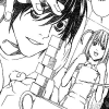
to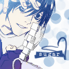
01. All right. First, choose your image. Crop, resize, do whatever you need to do to make a nice little base, but don't worry about anything in the background -- just make sure the main focus of your icon looks all right, which is, in this case, the ever-sexy L and his tower of sugar cubes.

02. Create a new layer, then use your paintbrush tool in white to cover up everything you don't want. (I had a lot of fun erasing Misa. GOODBYE, BITCH.)
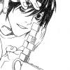
03. Time for the COLORING. This is, once again, on a new layer (named "skin" for easy reference), set to multiply around 50%. The opacity is just so you can see what the hell you're doing as you fill in with the colors of your choice, because you'll be adjusting it later. I used #EECFA2, a nice neutral tone, to fill in every bit of where L's skin is. It doesn't matter if you go out of the lines, because you can just erase the stray bits.
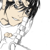
04. Fiddle around with the opacity until you like what you see. I wanted L to look nice and pale, so I chose 33%.
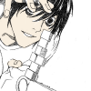
05. New layer, new color. I did L's shirt next (layer name, "shirt" -- I bet you never would've guessed), following steps three and four.
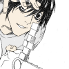
06. Continue on. Color until you you're satisfied. Copy merged -- copy, NOT FLATTEN, in case you ever want to go back and change something on a previous layer.
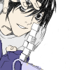
07. Now that we've got a normal picture, we need to jazz it up, find a common color to base the brushes on. I chose a blue/red gradient from crumblingwalls, set to lighten at 100%.

>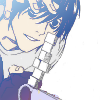
08. A little too washed out for my tastes, I think. I used that merged copy on top, set to soft light at 100%.
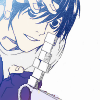
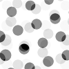
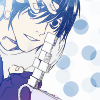
09. It's workable, don't you think? Time to tackle all that white space. I used a dotty brush from orchidicons (here) in #6B9BCA, from the top of L's hair, erasing everything that overlapped. I even duplicated, mirrored and flipped it, as to add more dots, but that's purely a matter of personal choice.
>
>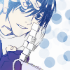
10. Time for text! I have a very love/hate relationship with it, seeing as how I prefer my icons with some type of it but I can hardly ever think of funny/poignant phrases. In this case, I'd recently heard a commercial with that song sugar (bum bum bum bum bum bum) oooh honey honey in it, and who I am to deny repetitive lyrics stuck in my head? I ran with it, size... four or five, no-caps in Another Typewriter, white.

11. Except, uh, you can't see it. I created a new layer below the text one, and added a couple of criss-crossed lines with another blue from L's hair.
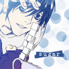
12. A heart brush, on a whim.

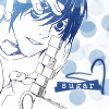
And you're done! Let me know if this was helpful to you, and feel free to share any icons you've made using this technique. Just for fun, let's compare the base, an icon where L wasn't colored in, and our final product --

>
>
...
I much prefer the last. :))
Going from

to

01. All right. First, choose your image. Crop, resize, do whatever you need to do to make a nice little base, but don't worry about anything in the background -- just make sure the main focus of your icon looks all right, which is, in this case, the ever-sexy L and his tower of sugar cubes.

02. Create a new layer, then use your paintbrush tool in white to cover up everything you don't want. (I had a lot of fun erasing Misa. GOODBYE, BITCH.)

03. Time for the COLORING. This is, once again, on a new layer (named "skin" for easy reference), set to multiply around 50%. The opacity is just so you can see what the hell you're doing as you fill in with the colors of your choice, because you'll be adjusting it later. I used #EECFA2, a nice neutral tone, to fill in every bit of where L's skin is. It doesn't matter if you go out of the lines, because you can just erase the stray bits.

04. Fiddle around with the opacity until you like what you see. I wanted L to look nice and pale, so I chose 33%.

05. New layer, new color. I did L's shirt next (layer name, "shirt" -- I bet you never would've guessed), following steps three and four.

06. Continue on. Color until you you're satisfied. Copy merged -- copy, NOT FLATTEN, in case you ever want to go back and change something on a previous layer.

07. Now that we've got a normal picture, we need to jazz it up, find a common color to base the brushes on. I chose a blue/red gradient from crumblingwalls, set to lighten at 100%.

>

08. A little too washed out for my tastes, I think. I used that merged copy on top, set to soft light at 100%.

09. It's workable, don't you think? Time to tackle all that white space. I used a dotty brush from orchidicons (here) in #6B9BCA, from the top of L's hair, erasing everything that overlapped. I even duplicated, mirrored and flipped it, as to add more dots, but that's purely a matter of personal choice.

>

>

10. Time for text! I have a very love/hate relationship with it, seeing as how I prefer my icons with some type of it but I can hardly ever think of funny/poignant phrases. In this case, I'd recently heard a commercial with that song sugar (bum bum bum bum bum bum) oooh honey honey in it, and who I am to deny repetitive lyrics stuck in my head? I ran with it, size... four or five, no-caps in Another Typewriter, white.

11. Except, uh, you can't see it. I created a new layer below the text one, and added a couple of criss-crossed lines with another blue from L's hair.

12. A heart brush, on a whim.

And you're done! Let me know if this was helpful to you, and feel free to share any icons you've made using this technique. Just for fun, let's compare the base, an icon where L wasn't colored in, and our final product --

>

>

...
I much prefer the last. :))