Icons
It's really quite amazing how using different gradients and blending options can change an icon. I often make multiple versions of the one icon, and then cull them down until I'm left with just one or two.
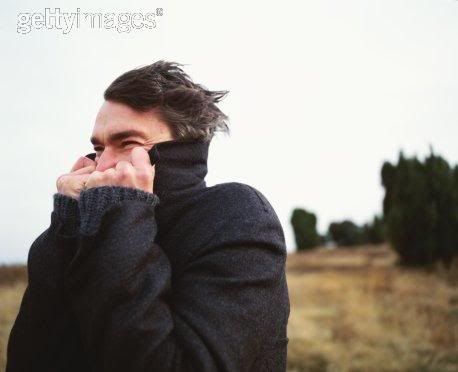
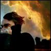
I started out with this image from Getty Images:
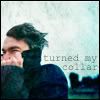
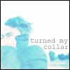
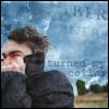
And then I played with it until I wound up with a number of different icons:

::
::
::
::
::
::
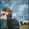
I quite like how these turned out. Quote is from Simon and Garfunkel's Sound of Silence, image is from Getty Images, gradient credits can be found here. Please credit me if you use, please don't alter them, and I always love getting comments. :)
I started out with this image from Getty Images:
And then I played with it until I wound up with a number of different icons:
::
::
::
::
::
::
I quite like how these turned out. Quote is from Simon and Garfunkel's Sound of Silence, image is from Getty Images, gradient credits can be found here. Please credit me if you use, please don't alter them, and I always love getting comments. :)