Text Guide
Text-Icon Guide
Ok. I'm in no way calling myself an expert. There are far better makers out there than me and I bloody well know it. I'm just offering what I think works and what doesn't. I'm going from observation and from past failures in my own text icon making. I use Photoshop terms, but I'm sure most are the same program-wide.
MAKE SURE YOUR RESOLUTION IS SET TO 72 PIXELS/INCH. Otherwise the sizing will be messed up.
Part I: Make It Readable!
(For the sake of making it simple, I'll use a plain background.)
USE LEGIBLE TEXT! This is key to making a good text icon. Everyone uses Arial Black & Cooper, but that's because they're simple, readable fonts.

(I used Arial Black. "THIS IS is size 14 & "LEGIBLE" is size 18)
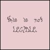
Can you tell me that that says? If you squint, you may be able to make it out, but you don't want to have to squint! (I used Bellyfish at size 18 for this example.)
MAKE SURE YOUR TEXT IS READABLE AGAINST YOUR BACKGROUND.

High contrast between your background & text is good!
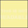
Can you read this? Nope! This is an extreme case, but you get the point.
Don't blind people!
Often times, people will use colours that clash with each other.
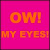
Do your eyes burn yet?

The text is bright, but the pale background balances it out.

Using the same range of colours is the way to go.
Part II: Background
Your background can be the difference between a great text-based icon and a horrible one. Don't use a busy background! Try using muted colours and simple textures. (All textures used in this tutorial are 100% mine. I'm working on putting together a downloadable set.)
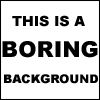
The text is readable, but the background is too damn dull!

The text is easily readable and the background is simple but interesting.

You can see more of the background, but it doesn't overpower the text.
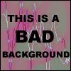
This is bad. While the text is readable, there's waaaaay too much going on in the background.
Part III: Using Pixel Fonts
Pixel fonts are good if you need to write small. Pixel fonts can be found at dafont.com under the Pixel section. The pixel font I'm using in this section is called 04b_03.
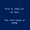
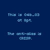
Always know what size to use. Typically, you want to use point 6 or point 8, depending on the pixel font. 04b_03 looks best at point 8. Always use Anti Alias: NONE.
vs.
vs.
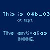
See the difference?
Part IV: Keep it Short!
That one SNL quote may be really funny, but keep it short and sweet. This is also the shortest section, ironically!
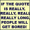
If you're like me, reading a lot of text at once in a small space makes your attention span snap.

Part V: Emphasis
As you can already tell, I used larger sized font to make certain words stand out.

vs.

vs.

Which looks best?
Using CAPS can also put the emphasis on certain words.

vs.

Using bold and italics can make text pop.
Using bold:

vs using italics:

Changing the font is another way to emphasize words:

So this is an example of using almost every technique I outlined:
Move on to the second part, animation.
As always, give me feedback! Need something clarified? Leave a comment!