more quick tips for Photoshop
#1: ctrl-Q sends you into quick mask mode-- with your brush tool, paint over the area you want selected, then hit ctrl-Q a second time. The area you painted will now be selected and ready for you to flood-fill, mask, etc.
#2: creating a black and white gradient map layer over an image and setting it to various modes is a quick way of enhancing contrast without having to resort to fiddling with curves or a brightness/contrast adjustment layer.
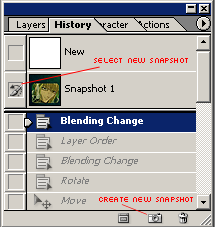
#3: Sharpening is necessary a lot of the time, but often it will bring imperfections into focus. But using the blur tool to get rid of those imperfections can result in a smudgy look that you don't like. The history-brush tool

is a good way to eliminate pixelization and compression marks without that smudgy look or the risk over over-blurring.

Just before you sharpen your image, go to your History palette and click the "create new snapshot" button (it looks like a tiny camera) on the bottom. Then click the box next to the snapshot that appears up top. Return to your image, select the history-brush tool and whichever brush you want to use (I use a small, hard, round brush) and go over the areas you want smoothed. They will return to their former, unsharpened state. You might need to use the blur tool after all, but this is a good step to take before that, in case blurring isn't really needed.
#4: use a combination of the stamp tool

and healing brush tool

to remove watermarks, TV station call letters, manga speech bubbles, etc.
#5: always Auto Level (Image > Adjustments > Auto Levels) anything you do to bring the contrast and brightness to proper levels. Even do this on texture layers, gradients, light layers, etc. that you'll be using, to see if they improve. If not, just go back a step in your history layer.
#6: unless you're creating an animated graphic, always save your work first as a .psd (so you can go back and edit it, see the individual layers, etc) and then as a .png.
Pros of using .png format:
+ .png files don't reduce the number of colours like .gifs do (.gifs max out at only 256 colours)
+ .png files don't compress large areas of colour for size like .jpgs (compression marks give the work an overly-sharpened, pixelated appearance)
+ .pngs support transparency
Cons of using .png format:
- .png files are larger, as a general rule, than .gifs or .jpgs but I have yet to make an icon in .png format that is larger than 40k, the maximum LJ permits
- .pngs cannot be used to animate a graphic