.tutorial 3 - brushes and collage
It's procrastination time, which means... time for another tutorial!
Designed for: PS7. Translatable? Not sure :/
This tutorial is really for a collage-type icon, but the cool thing is using brushes made from odd stock/texture images and using them to show off the subject. Lots of steps, but most are pretty straightforward.
Go from this to
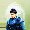
credit:oxoniensis owns this tutorial, as both background textures are by her. (Seriously, her stuff is awesome. Go checkitout.)
A. Base
1. Take this texture, duplicate once, set to soft light.
2. Flatten and set aside.
B. Texture
1. Take this texture, duplicate twice.
2. Set the middle layer (the first copy) to screen at 75% opacity.
3. Set the top layer (the second copy) to soft light.
4. Flatten and set aside.
C. Brush
1. Open up this large texture by myrasis.
2. Using the elliptical marquee tool set to Normal, select the centermost of of the concentric circles (the darker section). Cut and paste into a new document.
3. Resize to c. 80px in height.
4. Duplicate > soft light > sharpen.
5. Flatten and set aside.
[You'll end up with something like this. You can desaturate it if you want, but the color's not important -- it's the contrast.]
D. Scratch texture
1. Open this scratch texture by sanami276.
2. Duplicate, set the copy to soft light.
3. Flatten and set aside.
E. Sheppard
1. Crop out the relevant Sheppard parts from the stock photo and paste into a new document. Don't resize!
Prepping this image is fairly easy because the quality's so good, so there's just a few simple steps:
2. Duplicate > screen.
3. In the screen layer, go to Image > Adjustments > Hue/Saturation > Saturation +40.
4. New fill layer > E6EFFF (light blue) > color burn.
5. New fill layer > EBEBEB (light grey) > color burn.
6. Flatten and paste into a new document.
7. Now for cropping out the background. Check out my two other tutorials that discuss cropping here and here.
Yay! Hard, annoying part done. Now for touch-up.
8. Resize to approx. 70=75px in height (mine is 73).
9. Duplicate > soft light > sharpen.
10. For extra clarity, I went to sharpen > unsharp mask [amount 13% radius .6 threshold 0] x2.
11. Merge visible.
F. Assembly
For the background:
1. Open a new document and paste in green texture.
2. Paste in pale texture > multiply.
For the brushes:
3. Go into the image you made from myrasis's stock. Making sure the brush icon is selected in your palette, go to edit > define brush. Click OK when the dialog box comes up.
4. Back to your icon: New layer > brush in white (FFFFFF) 2x. Sharpen. [Note: don't move your mouse around; keep it stationary]
5. New layer > resize brush to c. 60px, apply in pale blue (e.g. DFF6FF). Set to lighten.
[If your brush layers are off center, Ctrl-A > nudge > click on align horizontal centers.]
For the subject:
6. Paste in Sheppard, set to overlay.
7. Duplicate, set to multiply.
Final touch:
8. Paste in scratch texture, set to screen.
9. Edit > transform > flip horizontal.
10. Flatten.
Yay! Done!
The final layer order looks like this:
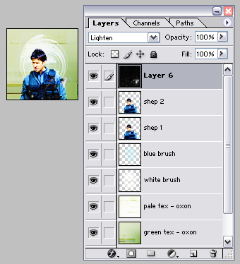
And the icon looks like this:

Notes: A lot of my icons tend to follow the same general technique. I love simple background textures because I can add cool stuff to them, like brushes and scratches, and they show off the subject well. In this case, Sheppard and his very serious expression :)
Some of the ones I've been mucking about with using this style are:

*

*brand new! Made with a brush very heavily modified from one of design bum's vector studies. The second two were done using brushes made from circles I ran through a few of PS7's filter > distort function (mostly Zig-Zag and Twirl).
Designed for: PS7. Translatable? Not sure :/
This tutorial is really for a collage-type icon, but the cool thing is using brushes made from odd stock/texture images and using them to show off the subject. Lots of steps, but most are pretty straightforward.
Go from this to

credit:oxoniensis owns this tutorial, as both background textures are by her. (Seriously, her stuff is awesome. Go checkitout.)
A. Base
1. Take this texture, duplicate once, set to soft light.
2. Flatten and set aside.
B. Texture
1. Take this texture, duplicate twice.
2. Set the middle layer (the first copy) to screen at 75% opacity.
3. Set the top layer (the second copy) to soft light.
4. Flatten and set aside.
C. Brush
1. Open up this large texture by myrasis.
2. Using the elliptical marquee tool set to Normal, select the centermost of of the concentric circles (the darker section). Cut and paste into a new document.
3. Resize to c. 80px in height.
4. Duplicate > soft light > sharpen.
5. Flatten and set aside.
[You'll end up with something like this. You can desaturate it if you want, but the color's not important -- it's the contrast.]
D. Scratch texture
1. Open this scratch texture by sanami276.
2. Duplicate, set the copy to soft light.
3. Flatten and set aside.
E. Sheppard
1. Crop out the relevant Sheppard parts from the stock photo and paste into a new document. Don't resize!
Prepping this image is fairly easy because the quality's so good, so there's just a few simple steps:
2. Duplicate > screen.
3. In the screen layer, go to Image > Adjustments > Hue/Saturation > Saturation +40.
4. New fill layer > E6EFFF (light blue) > color burn.
5. New fill layer > EBEBEB (light grey) > color burn.
6. Flatten and paste into a new document.
7. Now for cropping out the background. Check out my two other tutorials that discuss cropping here and here.
Yay! Hard, annoying part done. Now for touch-up.
8. Resize to approx. 70=75px in height (mine is 73).
9. Duplicate > soft light > sharpen.
10. For extra clarity, I went to sharpen > unsharp mask [amount 13% radius .6 threshold 0] x2.
11. Merge visible.
F. Assembly
For the background:
1. Open a new document and paste in green texture.
2. Paste in pale texture > multiply.
For the brushes:
3. Go into the image you made from myrasis's stock. Making sure the brush icon is selected in your palette, go to edit > define brush. Click OK when the dialog box comes up.
4. Back to your icon: New layer > brush in white (FFFFFF) 2x. Sharpen. [Note: don't move your mouse around; keep it stationary]
5. New layer > resize brush to c. 60px, apply in pale blue (e.g. DFF6FF). Set to lighten.
[If your brush layers are off center, Ctrl-A > nudge > click on align horizontal centers.]
For the subject:
6. Paste in Sheppard, set to overlay.
7. Duplicate, set to multiply.
Final touch:
8. Paste in scratch texture, set to screen.
9. Edit > transform > flip horizontal.
10. Flatten.
Yay! Done!
The final layer order looks like this:

And the icon looks like this:

Notes: A lot of my icons tend to follow the same general technique. I love simple background textures because I can add cool stuff to them, like brushes and scratches, and they show off the subject well. In this case, Sheppard and his very serious expression :)
Some of the ones I've been mucking about with using this style are:

*


*brand new! Made with a brush very heavily modified from one of design bum's vector studies. The second two were done using brushes made from circles I ran through a few of PS7's filter > distort function (mostly Zig-Zag and Twirl).