Tutorial #1
Going from 
to
First of all, most of this tutorial is inspired by one that _chokeanddie made. But since chosenxone requested a tutorial on this icon, I decided to create this tutorial for her.
First step for all my icons are screen layers. For this specific icon I screened it 6 times and on the 6th screen layer I added a new adjustment layer for hue/saturation/lightness and did -20 on saturation:

Next step is Layer->New Adjustment Layer->Selective Color:
Reds:
Cyan: -100
Yellow: +100
Yellows:
Cyan: -100
Yellow: +100
Greens:
Magenta: +100
Yellow: +100
Black: +100

Now make another Layer->New Adjustment Layer->Selective Color Layer:
Yellows:
Cyan: +40
Majenta: -40
Yellow: -100
Black: +30
Neutrals:
Cyan: +18
Yellow: -11
Black: -8

Then merge all layers. Then duplicate the current layer and set the layer to multiply, opacity of 18:

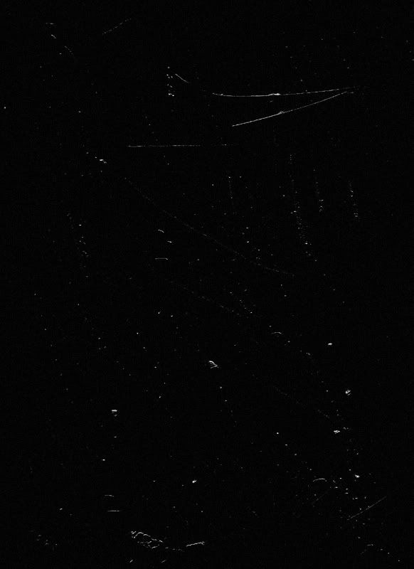
Then I add this texture, set to screen:

Then I added this texture (from _excentric_) at the top of the icon:

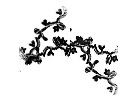
And finally I added this floral brush (from inxsomniax) around Buffy:

And tada!:

If you have any questions, I'll try my best to answer them. And feel free to comment with your results :)

to

First of all, most of this tutorial is inspired by one that _chokeanddie made. But since chosenxone requested a tutorial on this icon, I decided to create this tutorial for her.
First step for all my icons are screen layers. For this specific icon I screened it 6 times and on the 6th screen layer I added a new adjustment layer for hue/saturation/lightness and did -20 on saturation:

Next step is Layer->New Adjustment Layer->Selective Color:
Reds:
Cyan: -100
Yellow: +100
Yellows:
Cyan: -100
Yellow: +100
Greens:
Magenta: +100
Yellow: +100
Black: +100

Now make another Layer->New Adjustment Layer->Selective Color Layer:
Yellows:
Cyan: +40
Majenta: -40
Yellow: -100
Black: +30
Neutrals:
Cyan: +18
Yellow: -11
Black: -8

Then merge all layers. Then duplicate the current layer and set the layer to multiply, opacity of 18:

Then I add this texture, set to screen:

Then I added this texture (from _excentric_) at the top of the icon:

And finally I added this floral brush (from inxsomniax) around Buffy:

And tada!:

If you have any questions, I'll try my best to answer them. And feel free to comment with your results :)