And the fourth tut is here
Have you guys seen last night's episode??? It was AMAZING. I loved everything, I can't wait to start iconizing it!
Okay, the purpose of this entry wasn't that...
As requested by kisuncha and yohopiratesyoho, here is a tutorial explaining how I do my icons with Veronica Mars caps.
The icon we are going to make today is this one:
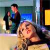
01. Crop your base. I got this one from VM-caps.
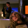
02. A bit dark, huh? To fix it we're going to duplicate the base twice and set both of them to Screen 100%.
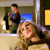
03. Now it looks too bright and too yellow for me, and to contrast more the pic and make it bluer (can i say that?) we are going to add a new layer and fill it with #e2e9ff. Set it to Color Burn.

>>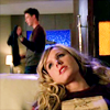
04. Now we're going to use Color Balance (Image>>Adjustments>>Color Balance), a very helpful friend. Adjust the setting like this:
Midtones
Shadows
Highlights
05. Now go to Image>>Adjustments>>Hue/Saturation and up the saturation to +11.
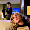
06. And now the Selective Color! You guys know how it works. Image>>Adjustments>>Selective Color and adjust the settings:
Reds
Cyan: -60
Magenta: -11
Yellow: -12
Yellows
Cyan: +22
Yellow: -31
Magentas
Cyan: -82
Magenta: +74
Yellow: +53
Neutrals
Cyan: +19
Magenta: -8
Yellow: -19
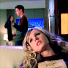
07. Another Selective Color layer:
Reds
Cyan: -100
Magenta: +14
Yellow: +24
Yellows
Cyan: -100
Yellow: +86
Cyans
Cyan: +81
Magenta: -32
Yellow: -54
Magentas
Magenta: +100
Yellow: +58
Neutrals
Cyan: +9
Magenta: -9
Yellow: -14
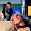
08. And the last selective color layer:
Reds
Cyan: -36
Yellow: +15
Yellows
Cyan: -11
Yellow: +100
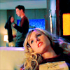
09. And you are done! I usually sharpen the pic once. Filter>>Sharpen>>Unsharp Mask.
Amount: 20%
Radius: 1,0
Threshold: 0

>>
It doesn't make a big difference but I prefer the second one.
-----
And that's it! You guys can try this tutorial whenever you want, but try to change a bit the steps, add more/less screen layers, change the selective coloring settings... just be original!
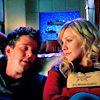
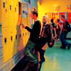
Other icons using the same coloring:

Feel free to friend this comunity if you like what you've seen ;)
Okay, the purpose of this entry wasn't that...
As requested by kisuncha and yohopiratesyoho, here is a tutorial explaining how I do my icons with Veronica Mars caps.
The icon we are going to make today is this one:
01. Crop your base. I got this one from VM-caps.
02. A bit dark, huh? To fix it we're going to duplicate the base twice and set both of them to Screen 100%.
03. Now it looks too bright and too yellow for me, and to contrast more the pic and make it bluer (can i say that?) we are going to add a new layer and fill it with #e2e9ff. Set it to Color Burn.
>>
04. Now we're going to use Color Balance (Image>>Adjustments>>Color Balance), a very helpful friend. Adjust the setting like this:
Midtones
Shadows
Highlights
05. Now go to Image>>Adjustments>>Hue/Saturation and up the saturation to +11.
06. And now the Selective Color! You guys know how it works. Image>>Adjustments>>Selective Color and adjust the settings:
Reds
Cyan: -60
Magenta: -11
Yellow: -12
Yellows
Cyan: +22
Yellow: -31
Magentas
Cyan: -82
Magenta: +74
Yellow: +53
Neutrals
Cyan: +19
Magenta: -8
Yellow: -19
07. Another Selective Color layer:
Reds
Cyan: -100
Magenta: +14
Yellow: +24
Yellows
Cyan: -100
Yellow: +86
Cyans
Cyan: +81
Magenta: -32
Yellow: -54
Magentas
Magenta: +100
Yellow: +58
Neutrals
Cyan: +9
Magenta: -9
Yellow: -14
08. And the last selective color layer:
Reds
Cyan: -36
Yellow: +15
Yellows
Cyan: -11
Yellow: +100
09. And you are done! I usually sharpen the pic once. Filter>>Sharpen>>Unsharp Mask.
Amount: 20%
Radius: 1,0
Threshold: 0
>>
It doesn't make a big difference but I prefer the second one.
-----
And that's it! You guys can try this tutorial whenever you want, but try to change a bit the steps, add more/less screen layers, change the selective coloring settings... just be original!
Other icons using the same coloring:
Feel free to friend this comunity if you like what you've seen ;)