Aspect Ratio for dummies
So. This is not a tutorial exactly. It is a plea. Please please please stop screwing with the aspect ratio of your icons/wallpaper/digital art.
[warning: lots and lots of images inside the cut-tags]
Aspect Ratio for dummies
Aspect ratio. noun.
Fortunately for us, most movies and TV shows have either of two aspect ratios: 4:3 or 16:9.
This means that the images width and height sizes have to be PROPORTIONAL to those numbers. For example:


4:3 is the regular TV ratio, 16:9 is the widescreen ratio [that most movies -- and some TV shows, like Alias and Angel -- have].
These are fixed, which means you're not supposed to change these proportions. No matter what actual values you have, it's important that they keep these proportions. So, for the TV ratio, you can have a 400x300 image, or a 1600x1200 image, or a 640x480 image, or any other numbers that keep the 4:3 ratio. It's when the proportion is changed that you screw up the aspect ratio
Now comes the fun part.
How do you know if a cap has the right ratio?
Seriously. All you gotta do is LOOK AT IT.
I mean:
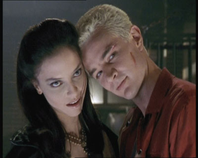

[400x320 - WRONG]
[400x300 = 4:3 ratio - RIGHT]
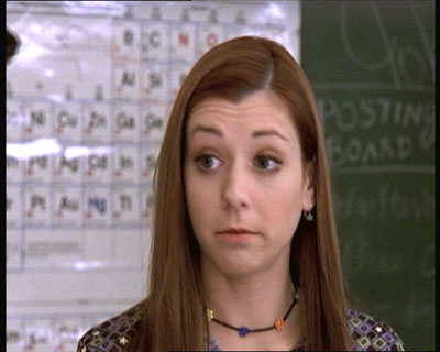

[400x320 - WRONG]
[400x300 = 4:3 ratio - RIGHT]
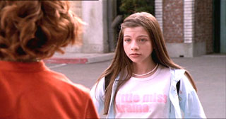

[320x168 - WRONG]
[320x180 = 16:9 ratio - RIGHT]
IMPORTANT: Season 1 and Season 2 caps at buffyscreenshots.com have the WRONG aspect ratio! You have to fix them before using them! All other seasons have the correct aspect ratio. How to fix them? Resize them to 400x300.
Sometimes, a screencap will seem to have the right values (as in the number of pixels), but the ratio is wrong. This happens a lot when a 16:9 movie is capped with a 4:3 ratio [I've hardly seen the opposite happen, but it can happen, so be careful there]:

It's a 300x255 image, which are values proportional to the 4:3 ratio, but you can see Buffy is all smushed.
To fix this, you need math.
x / y = 16 / 9
x is your width, y is your height. Pick one from the image. Use the equation to figure out the other. I picked the width, so x = 300. Now I need to figure out the y.
300 / y = 16 / 9
16y = 300 * 9
y = 168.75
I used 169 because 0.75 of a pixel doesn't really exist on most softwares. And the 0.25 extra won't make a difference:
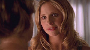
And now Buffy looks human.
Some other times, a screencap will just plain have a weird size, for whatever reason:

What do you do when that happens? Unless you feel like wasting a looong time trying to figure out the math to fix the ratio, YOU DON'T USE THAT SCREENCAP.
And the part everyone is waiting for:
How to crop icons and maintain the right aspect ratio
There are several ways to do this. I'm gonna go through 2 different processes here, both for Photoshop 7. Hopefully they're translatable to PSP and GIMP and such.
1. Using the marquee tool:
This is the marquee tool:

Use the Fixed Aspect Ratio option and you can't screw up with it.
Select the part of the image you want to use. Then go IMAGE >> CROP, like this:
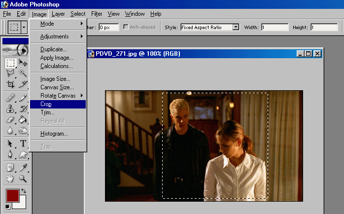
Then all you gotta do is resize [Image >> Image Size...]. REMEMBER TO CHECK THE "Constrain Proportions" BOX:
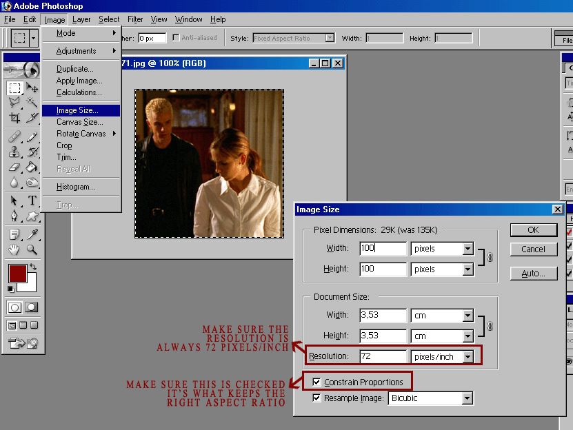
The result:

2. Using the crop tool:
I always use this method. I find it easier, because it crops and resizes at the same time, maintaining the right aspect ratio.
This is the crop tool:

Add whatever values you want to the width and the height of the crop tool. You can make them 100x85 or 90x70 or any other size you want. Then select the area you want to use and double click inside the selection to crop it:
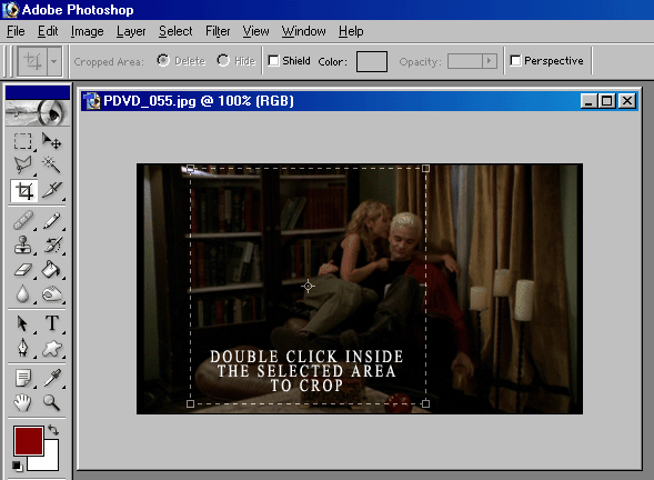
And the result:
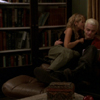
I guess that's it. Did I miss anything?
And feel free to pimp this post. Hopefully, it'll help the smushed icons disappear from the face of LJ. :)
[warning: lots and lots of images inside the cut-tags]
Aspect Ratio for dummies
Aspect ratio. noun.
- The width-to-height ratio of a film or television image.
- The span-to-mean-chord ratio of an airfoil.
- [graphics] The ratio of width to height of a pixel, image, or display screen.
Fortunately for us, most movies and TV shows have either of two aspect ratios: 4:3 or 16:9.
This means that the images width and height sizes have to be PROPORTIONAL to those numbers. For example:


4:3 is the regular TV ratio, 16:9 is the widescreen ratio [that most movies -- and some TV shows, like Alias and Angel -- have].
These are fixed, which means you're not supposed to change these proportions. No matter what actual values you have, it's important that they keep these proportions. So, for the TV ratio, you can have a 400x300 image, or a 1600x1200 image, or a 640x480 image, or any other numbers that keep the 4:3 ratio. It's when the proportion is changed that you screw up the aspect ratio
Now comes the fun part.
How do you know if a cap has the right ratio?
Seriously. All you gotta do is LOOK AT IT.
I mean:


[400x320 - WRONG]
[400x300 = 4:3 ratio - RIGHT]


[400x320 - WRONG]
[400x300 = 4:3 ratio - RIGHT]


[320x168 - WRONG]
[320x180 = 16:9 ratio - RIGHT]
IMPORTANT: Season 1 and Season 2 caps at buffyscreenshots.com have the WRONG aspect ratio! You have to fix them before using them! All other seasons have the correct aspect ratio. How to fix them? Resize them to 400x300.
Sometimes, a screencap will seem to have the right values (as in the number of pixels), but the ratio is wrong. This happens a lot when a 16:9 movie is capped with a 4:3 ratio [I've hardly seen the opposite happen, but it can happen, so be careful there]:

It's a 300x255 image, which are values proportional to the 4:3 ratio, but you can see Buffy is all smushed.
To fix this, you need math.
x / y = 16 / 9
x is your width, y is your height. Pick one from the image. Use the equation to figure out the other. I picked the width, so x = 300. Now I need to figure out the y.
300 / y = 16 / 9
16y = 300 * 9
y = 168.75
I used 169 because 0.75 of a pixel doesn't really exist on most softwares. And the 0.25 extra won't make a difference:

And now Buffy looks human.
Some other times, a screencap will just plain have a weird size, for whatever reason:

What do you do when that happens? Unless you feel like wasting a looong time trying to figure out the math to fix the ratio, YOU DON'T USE THAT SCREENCAP.
And the part everyone is waiting for:
How to crop icons and maintain the right aspect ratio
There are several ways to do this. I'm gonna go through 2 different processes here, both for Photoshop 7. Hopefully they're translatable to PSP and GIMP and such.
1. Using the marquee tool:
This is the marquee tool:

Use the Fixed Aspect Ratio option and you can't screw up with it.
Select the part of the image you want to use. Then go IMAGE >> CROP, like this:

Then all you gotta do is resize [Image >> Image Size...]. REMEMBER TO CHECK THE "Constrain Proportions" BOX:

The result:

2. Using the crop tool:
I always use this method. I find it easier, because it crops and resizes at the same time, maintaining the right aspect ratio.
This is the crop tool:

Add whatever values you want to the width and the height of the crop tool. You can make them 100x85 or 90x70 or any other size you want. Then select the area you want to use and double click inside the selection to crop it:

And the result:

I guess that's it. Did I miss anything?
And feel free to pimp this post. Hopefully, it'll help the smushed icons disappear from the face of LJ. :)