Challenge 03 Round 01 Results
Here are our results. I'm so sorry, but we have to say "goodbye" to some participants.
Eliminated:
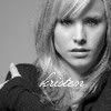
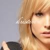
cooper_666 with 8 votes


rosebranch with 6 votes
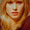
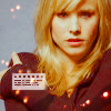
night_sunshine with 6 votes
People's Choice:

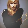
loving_w with 6 votes
Mod's Choice:


kisuncha
Beautiful cropping and colourings on both icons. Especially violet skies on the second one!
Did you forget your set number? You can find it HERE
Voting Tally:
01| -6
02| -1+3= +2
03| +1
04| -5
05| +2
06| -2+1= -1
07| 0
08| -2+1= -1
09| -6
10| +6
11| +1
12| -3
13| +2
14| -8
15| +1
16| 0
17| -1+3= +2
18| +2
19| 0
20| 0
21| +2
22| -2
23| 0
24| -3+1= -2
Favourite sets
set #2 - interesting use of texures, and amazing cropping on the second icon
set 02 - lovely coloring and composition of the second icon, the first icon maybe could have background lighter than black, but it's still pretty and quite original
set #2 - very original icons, love the text and texture use on the second icon
set #03 - I like the texture in the background that looks like stars in the first one, it compliments the icon. The second black and white one is really pretty as well and the tiny text fits perfectly.
set #05 - Lovely coloring and use of text. Great composition on both icons. It is a great set.
set 05 - Great use of colouring and contrast.
set 6 - Good use of the texture,good cropping
set #8 - strong use of color and text
set #10 - interesting way of evoking drama
set #10 - Awesome textures. They fit very well with the image. Both icons have a very simple but gorgeous coloring.
set #10 - nice coloring and cropping on both
set #10 - it's simple, but the coloring is nice and soft, the cropping is great
set #10 - great colouring, good use of textures, icons look nice together.
set #10 - great textures use on both icons
set #11 - colouring is beautiful
set #13 - colouring is very crispy and fresh, both icons look very nice, thouch maybe in the firs one... one eye is more blue than the other? weird!
#13 - great croppings and colors are nice
#15 - nice croppings and use of color
set #17 - cropping on the second is amazing, and so is the brush/texture+text, first icon is simple yet very elegant & intersting, not boring
set 17 - very original second icon, and the first icon doesn't look that simple either, thanks to the light texture and not centered crop
set #17 - Beautiful coloring in the first one and I think the texture works wonderfully. The second one is the one that really caught my eye for some reason though, love how it's not too bright but not too dark either. And I adore the text, it works perfectly.
set 18 - Good colouring and cropping
set 18 - Great colouring and the second icon has an original crop.
set #21 - amazing colkours, good crops, love text use.
set #21 - Love the corpping and the coloring
set #24 - nice coloring and I love the text effects on the second one
Lesser quality sets
set #01 - Both icons look too busy. There are too much texures and/or brushes, so the icons are overwhelmed.
#1 - both icons are too overcrowed with texture
set #1 - the colorings are too dark and the textures are badly placed.
set #1 - to muddy colours a=on both of icons, textures don't fit the, they don't look like set.
set #01 - Both icons are very dark. The first has textures galore but the way the texture goes over her face kind of blurs her face out which isn't complimentary to the icon.
set #01 - the textures are misplaced and the coloring don´t pop
set #2 - icons do not feel cohesive as a set
set #4 - the first icon is over sharpened, but the second one is very intersting with the rotating, although i don't believe the font fits
set 04 - the second icon is not bad, but first icon is very grainy/pixelated
set #4 - both of the icons are oversharpened
set #4 - both icons are too oversjarpen, first one is too blue.
set #04 - Over-sharpened; it's much more noticeable in the first icon but I think it's in the second as well. Though I do like the coloring in the second one better (the first one makes her look a little washed out) I think the text placement doesn't work that well.
#6 - first icon is too oversharped and brish on to doesn't match..
set 06 - The first icon has some purple highlights in it and on the second one the right Kristen is a bit too red/grey.
set #8 - the icons are both too busy with the tight crop and many effects
set #08 - The Tiny text is misplaced.
set #9 - the icons are both very blurry and grainy... colouring is too yellowinsh
set #9 - very dark, and the coloring does not seem to fit with the picture on both icons
set #09 - The coloring on both icons is extremely orange/red. And also, the images are pixelated.
set #9 - yellowish coloring doesn't look to good on icons, also texture use in second icon doesn't fit.
set 09 - The first icon could use some more contrast and is also a bit too dark.
set #9 - too yellow colouring on both of icons, they look dirty and muddy.
set #12 - color is very light and the icons don't have good focal points
#12 - borh icons are too bright and texture on the second icon doesn't match
set 12 - Oversharpened and bad use of the texture,too much pink
set #14 - icons seem of poor quality, as much a font style
set 14 - The first icon looks a bit oversharpened and the second could use some more contrast.
set #14 - the icon quality is grainy, and the text seems out of place on the first icon; the second icon is very nicely cropped & the text seems to be in a perfect position, but is a bit un-readable
set #14 - Everything looks really oversharpened.
set 14 - both have low image quality (try saving as png instead of jpg :)), also text on the first icon isn't well readable
set 14 - overharpened icons and the text don't fit the icon
set #14 - both icons are too simple, colouring is boring and does not seem to compliment the image, also bad text use
set #14 - I think the problem on both the icons is that the maker over-sharpened the image. Most of the problem is with her hair but on the black & white one even a little bit of the background is really grainy. Then there's the issue of the font which isn't at all bold enough to make out.
set #17 - images are blurry and a bit dull
set #22 - the first is not aesthetically pleasing, with the many colors & the second's light texture does not go with the image
set 22 - The texture don't fit the two icons,
set #24 - the icons look like they haven't been worked on that much and those numbers on the second one just don't make much sense to me
set 24 - kinda dull coloring and low contrast on both
set #24 - The images does not have much contrast and the colors don't pop
Eliminated:
cooper_666 with 8 votes


rosebranch with 6 votes


night_sunshine with 6 votes
People's Choice:


loving_w with 6 votes
Mod's Choice:


kisuncha
Beautiful cropping and colourings on both icons. Especially violet skies on the second one!
Did you forget your set number? You can find it HERE
Voting Tally:
01| -6
02| -1+3= +2
03| +1
04| -5
05| +2
06| -2+1= -1
07| 0
08| -2+1= -1
09| -6
10| +6
11| +1
12| -3
13| +2
14| -8
15| +1
16| 0
17| -1+3= +2
18| +2
19| 0
20| 0
21| +2
22| -2
23| 0
24| -3+1= -2
Favourite sets
set #2 - interesting use of texures, and amazing cropping on the second icon
set 02 - lovely coloring and composition of the second icon, the first icon maybe could have background lighter than black, but it's still pretty and quite original
set #2 - very original icons, love the text and texture use on the second icon
set #03 - I like the texture in the background that looks like stars in the first one, it compliments the icon. The second black and white one is really pretty as well and the tiny text fits perfectly.
set #05 - Lovely coloring and use of text. Great composition on both icons. It is a great set.
set 05 - Great use of colouring and contrast.
set 6 - Good use of the texture,good cropping
set #8 - strong use of color and text
set #10 - interesting way of evoking drama
set #10 - Awesome textures. They fit very well with the image. Both icons have a very simple but gorgeous coloring.
set #10 - nice coloring and cropping on both
set #10 - it's simple, but the coloring is nice and soft, the cropping is great
set #10 - great colouring, good use of textures, icons look nice together.
set #10 - great textures use on both icons
set #11 - colouring is beautiful
set #13 - colouring is very crispy and fresh, both icons look very nice, thouch maybe in the firs one... one eye is more blue than the other? weird!
#13 - great croppings and colors are nice
#15 - nice croppings and use of color
set #17 - cropping on the second is amazing, and so is the brush/texture+text, first icon is simple yet very elegant & intersting, not boring
set 17 - very original second icon, and the first icon doesn't look that simple either, thanks to the light texture and not centered crop
set #17 - Beautiful coloring in the first one and I think the texture works wonderfully. The second one is the one that really caught my eye for some reason though, love how it's not too bright but not too dark either. And I adore the text, it works perfectly.
set 18 - Good colouring and cropping
set 18 - Great colouring and the second icon has an original crop.
set #21 - amazing colkours, good crops, love text use.
set #21 - Love the corpping and the coloring
set #24 - nice coloring and I love the text effects on the second one
Lesser quality sets
set #01 - Both icons look too busy. There are too much texures and/or brushes, so the icons are overwhelmed.
#1 - both icons are too overcrowed with texture
set #1 - the colorings are too dark and the textures are badly placed.
set #1 - to muddy colours a=on both of icons, textures don't fit the, they don't look like set.
set #01 - Both icons are very dark. The first has textures galore but the way the texture goes over her face kind of blurs her face out which isn't complimentary to the icon.
set #01 - the textures are misplaced and the coloring don´t pop
set #2 - icons do not feel cohesive as a set
set #4 - the first icon is over sharpened, but the second one is very intersting with the rotating, although i don't believe the font fits
set 04 - the second icon is not bad, but first icon is very grainy/pixelated
set #4 - both of the icons are oversharpened
set #4 - both icons are too oversjarpen, first one is too blue.
set #04 - Over-sharpened; it's much more noticeable in the first icon but I think it's in the second as well. Though I do like the coloring in the second one better (the first one makes her look a little washed out) I think the text placement doesn't work that well.
#6 - first icon is too oversharped and brish on to doesn't match..
set 06 - The first icon has some purple highlights in it and on the second one the right Kristen is a bit too red/grey.
set #8 - the icons are both too busy with the tight crop and many effects
set #08 - The Tiny text is misplaced.
set #9 - the icons are both very blurry and grainy... colouring is too yellowinsh
set #9 - very dark, and the coloring does not seem to fit with the picture on both icons
set #09 - The coloring on both icons is extremely orange/red. And also, the images are pixelated.
set #9 - yellowish coloring doesn't look to good on icons, also texture use in second icon doesn't fit.
set 09 - The first icon could use some more contrast and is also a bit too dark.
set #9 - too yellow colouring on both of icons, they look dirty and muddy.
set #12 - color is very light and the icons don't have good focal points
#12 - borh icons are too bright and texture on the second icon doesn't match
set 12 - Oversharpened and bad use of the texture,too much pink
set #14 - icons seem of poor quality, as much a font style
set 14 - The first icon looks a bit oversharpened and the second could use some more contrast.
set #14 - the icon quality is grainy, and the text seems out of place on the first icon; the second icon is very nicely cropped & the text seems to be in a perfect position, but is a bit un-readable
set #14 - Everything looks really oversharpened.
set 14 - both have low image quality (try saving as png instead of jpg :)), also text on the first icon isn't well readable
set 14 - overharpened icons and the text don't fit the icon
set #14 - both icons are too simple, colouring is boring and does not seem to compliment the image, also bad text use
set #14 - I think the problem on both the icons is that the maker over-sharpened the image. Most of the problem is with her hair but on the black & white one even a little bit of the background is really grainy. Then there's the issue of the font which isn't at all bold enough to make out.
set #17 - images are blurry and a bit dull
set #22 - the first is not aesthetically pleasing, with the many colors & the second's light texture does not go with the image
set 22 - The texture don't fit the two icons,
set #24 - the icons look like they haven't been worked on that much and those numbers on the second one just don't make much sense to me
set 24 - kinda dull coloring and low contrast on both
set #24 - The images does not have much contrast and the colors don't pop