Challenge 03 Round 05 Results
I'm so sorry, but we have to say "goodbye" to some participants.
Eliminated:
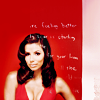
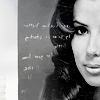
russian_hotness with 6 votes
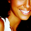
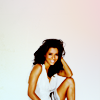
good_memories with 3 votes
People's Choice:


dance_the_dance with 4 votes
Mod's Choice:


xtine005
Beautiful colors on both icons
Did you forget your set number? You can find it HERE
Voting Tally:
01| -2+1= -1
02| +2
03| -6
04| +4
05| +2
06| -2
07| -2+1= -1
08| -2+1= -1
09| +1
10| 0
11| -1+1= 0
12| -3
13| -2
14| -1+1= 0
15| 0
Favourite sets
set #1 - nice cropping and colouring.
set #02 - Great texture and coloring
set #2 - great coloring and texture use
set #4 - very lovely coloring on both icons, & pretty texture on 2nd icon <3
set 4 - love the crop in the first, and texture usage in the second one
set #04 - Love the coloring an the golden frame by icon 2
set #4 - nice cropping and colouring.
set 5 - great crop on both icons
set #05 - Great colouring, and the colouring on the second one is great.
set #7 - great cropping & coloring
set #8 - the crooping in the second one is amazing & the layout/creativity in the first is *thumbs up*
set 09 - cropping of the first icon is just gorgeous, and both have great contrast
set #11 - Great use of text placement.
set 14 - both look fresh and good quality, first icon has lovely composition too
Lesser quality sets
set #01 - The colouring is a bit too dark.
set 01 - it's about the simplest set here, a little too dark too
set 03 - both icons (especially second) look oversharpened and overcontrasted
set #03 - The text is going through Eva's face, and the second one looks oversharpened.
set #3 - it looks oversharpened & the text brush is oddly placed, makes the icon look unclean
set 3 - both icons are oversharpened and the white texture/brush used isn't flattering at all
set #03 - The Tiny Brushes are misplaced
set #3 - too sharp, cropping doesn't suit the image, tiny text doesn't fit.
set 6 - the coloring is too unnatural and the composition of the first icon seems too cluttered
set #6 - the coloring does not compliment the icon
set 07 - first icon is a bit undercontrasted and second one is too yellow
set #7 - the coloring of the second icon does not compliment the image
set 8 - The first icon was a good idea that was not executed well. The second icon is over sharpened and the white texture over it seems out of place.
set #8 - first is way too crowded and the second, the white takes over the image.
set #11 - the text in the second icon seems out of place
set #12 - too much saturation, & the cropping on 1st icon is odd
set #12 - The coloring is too yellow/brown
set #12 - Skin is definitely way too dark.
set #13 - too much contrast especially on the 2nd icon
set #13 - The second one is oversharpened, and a bit a too yellow colouring.
set #14 - The image does not have much contrast
Eliminated:
russian_hotness with 6 votes


good_memories with 3 votes
People's Choice:


dance_the_dance with 4 votes
Mod's Choice:


xtine005
Beautiful colors on both icons
Did you forget your set number? You can find it HERE
Voting Tally:
01| -2+1= -1
02| +2
03| -6
04| +4
05| +2
06| -2
07| -2+1= -1
08| -2+1= -1
09| +1
10| 0
11| -1+1= 0
12| -3
13| -2
14| -1+1= 0
15| 0
Favourite sets
set #1 - nice cropping and colouring.
set #02 - Great texture and coloring
set #2 - great coloring and texture use
set #4 - very lovely coloring on both icons, & pretty texture on 2nd icon <3
set 4 - love the crop in the first, and texture usage in the second one
set #04 - Love the coloring an the golden frame by icon 2
set #4 - nice cropping and colouring.
set 5 - great crop on both icons
set #05 - Great colouring, and the colouring on the second one is great.
set #7 - great cropping & coloring
set #8 - the crooping in the second one is amazing & the layout/creativity in the first is *thumbs up*
set 09 - cropping of the first icon is just gorgeous, and both have great contrast
set #11 - Great use of text placement.
set 14 - both look fresh and good quality, first icon has lovely composition too
Lesser quality sets
set #01 - The colouring is a bit too dark.
set 01 - it's about the simplest set here, a little too dark too
set 03 - both icons (especially second) look oversharpened and overcontrasted
set #03 - The text is going through Eva's face, and the second one looks oversharpened.
set #3 - it looks oversharpened & the text brush is oddly placed, makes the icon look unclean
set 3 - both icons are oversharpened and the white texture/brush used isn't flattering at all
set #03 - The Tiny Brushes are misplaced
set #3 - too sharp, cropping doesn't suit the image, tiny text doesn't fit.
set 6 - the coloring is too unnatural and the composition of the first icon seems too cluttered
set #6 - the coloring does not compliment the icon
set 07 - first icon is a bit undercontrasted and second one is too yellow
set #7 - the coloring of the second icon does not compliment the image
set 8 - The first icon was a good idea that was not executed well. The second icon is over sharpened and the white texture over it seems out of place.
set #8 - first is way too crowded and the second, the white takes over the image.
set #11 - the text in the second icon seems out of place
set #12 - too much saturation, & the cropping on 1st icon is odd
set #12 - The coloring is too yellow/brown
set #12 - Skin is definitely way too dark.
set #13 - too much contrast especially on the 2nd icon
set #13 - The second one is oversharpened, and a bit a too yellow colouring.
set #14 - The image does not have much contrast