Challenge 03 Round 07 Results
Sorry for waiting - I have some troubles with internet connection. Now results are ready. I'm so sorry, but we have to say "goodbye" to some participants.
Eliminated:

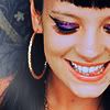
by michelle_sarah
(-5 votes)

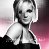
by para_giaulz
(-4 votes)
People's Choice:
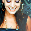

by dance_the_dance
(+3 votes)
Mod's Choice:


by loving_w
(I like the colors, they look really natural, and good use of texture on first icon - yellow and violet on her eyes seem to be very good combination)
Voting Tally (set number here):
01| -5
02| -1-1+1=-1
03| -1
04| -4
05| +1-1=0
06| +1-1=0
07| +3
08| +1
Lesser quality sets:
set #1 - The crops are alright, but the coloring is slightly too orange, as if she glows + her teeth are a bit blue
set 01 - for some reason they're low quality technically, not exactly oversharpened, but edges are too enhanced; also second crop showing that bit of her eye isn't the best
set #1 - both icons are oversharpened
set #1 - both icons are oversharpened
set #1 - too sharpen, dark, bad contrast
set 02 - they both have a bit washed-out look, and second icon looks overcontrasted
set #2 - the first icon looks too pale
set #3 - too simple, dull crop
set #4 - first icon looks quite blurry, and 2nd icon the border around Britney doesn't fit + the background and the tiny text don't blend in.
set #4 - the tiny text used on the 2nd icon is oddly placed
set #4 - bad texture and text use
set #4 - on the first icon text's style is bad, on the second - the whole composition
set #5 - The coloring is too brightly especially by icon one.
set #6 - The coloring is a little bit too dark.
Favourite sets:
set #2 - beautiful crop, great b-w interpretation
set 05 - both colorings are gorgeous, and so is the second cropping!
set #6 - Great use of textures/text and very pretty coloring.
set #7 - i love the coloring & texture used, really pretty <3
set #7 - nice coloring
set #7 - Oh i love this set, great coloring and the lighttexture by icon 8 is great.
set #8 - great colours and texture use on first icon
Eliminated:


by michelle_sarah
(-5 votes)


by para_giaulz
(-4 votes)
People's Choice:


by dance_the_dance
(+3 votes)
Mod's Choice:


by loving_w
(I like the colors, they look really natural, and good use of texture on first icon - yellow and violet on her eyes seem to be very good combination)
Voting Tally (set number here):
01| -5
02| -1-1+1=-1
03| -1
04| -4
05| +1-1=0
06| +1-1=0
07| +3
08| +1
Lesser quality sets:
set #1 - The crops are alright, but the coloring is slightly too orange, as if she glows + her teeth are a bit blue
set 01 - for some reason they're low quality technically, not exactly oversharpened, but edges are too enhanced; also second crop showing that bit of her eye isn't the best
set #1 - both icons are oversharpened
set #1 - both icons are oversharpened
set #1 - too sharpen, dark, bad contrast
set 02 - they both have a bit washed-out look, and second icon looks overcontrasted
set #2 - the first icon looks too pale
set #3 - too simple, dull crop
set #4 - first icon looks quite blurry, and 2nd icon the border around Britney doesn't fit + the background and the tiny text don't blend in.
set #4 - the tiny text used on the 2nd icon is oddly placed
set #4 - bad texture and text use
set #4 - on the first icon text's style is bad, on the second - the whole composition
set #5 - The coloring is too brightly especially by icon one.
set #6 - The coloring is a little bit too dark.
Favourite sets:
set #2 - beautiful crop, great b-w interpretation
set 05 - both colorings are gorgeous, and so is the second cropping!
set #6 - Great use of textures/text and very pretty coloring.
set #7 - i love the coloring & texture used, really pretty <3
set #7 - nice coloring
set #7 - Oh i love this set, great coloring and the lighttexture by icon 8 is great.
set #8 - great colours and texture use on first icon