Icon Tutorial 04
Going from 
to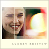
Also achieve color variations quickly.
Icon Tutorial 04 - Made by ealias of Bedazzling. Credit is appreciated :)
Going from
to
.
Step 1: Sharpen the image once. Duplicate it and set it on Screen, 100%. Duplicate the new layer, desaturate, and set it to Soft Light, 50%.

Step 2: Set this gradient on Color Burn, 100%.


Step 3: Set this texture by awmpdotnet on Hard Light, 100%. Mask out the areas that cover her face.


Step 4: Add a white border brush. Or, like I did, fill a new layer with white, and simply mask out different box areas with different opacities.

Step 5: Set this gradient on Color Burn, 100%.


Step 6: Use a soft round white brush on the top left color.

Step 7: Add a light gray border.

Step 8: Add tiny text. I used Times New Roman, 4 pt, 600 tracking, 40% black.

Done! Like the last tutorial, here are some quick variations. First, flatten the image.
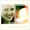
New Adjustment Layer > Hue/Saturation > > Soft Light > Colorize > 130, 40, +20
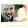
Color Balance: -60, 10, 20
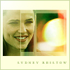
Variations: More Green, More Yellow
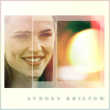
New Fill Layer > Gradient > Soft Light > Pastels
Let me know how it works out for you.
Original image from Sydney Bristow HDTV Capture. Texture by awmpdotnet. Gradients are my own.

to
Also achieve color variations quickly.
Icon Tutorial 04 - Made by ealias of Bedazzling. Credit is appreciated :)
Going from

to
.
Step 1: Sharpen the image once. Duplicate it and set it on Screen, 100%. Duplicate the new layer, desaturate, and set it to Soft Light, 50%.

Step 2: Set this gradient on Color Burn, 100%.


Step 3: Set this texture by awmpdotnet on Hard Light, 100%. Mask out the areas that cover her face.


Step 4: Add a white border brush. Or, like I did, fill a new layer with white, and simply mask out different box areas with different opacities.

Step 5: Set this gradient on Color Burn, 100%.


Step 6: Use a soft round white brush on the top left color.

Step 7: Add a light gray border.

Step 8: Add tiny text. I used Times New Roman, 4 pt, 600 tracking, 40% black.
Done! Like the last tutorial, here are some quick variations. First, flatten the image.
New Adjustment Layer > Hue/Saturation > > Soft Light > Colorize > 130, 40, +20
Color Balance: -60, 10, 20
Variations: More Green, More Yellow
New Fill Layer > Gradient > Soft Light > Pastels
Let me know how it works out for you.
Original image from Sydney Bristow HDTV Capture. Texture by awmpdotnet. Gradients are my own.