Tutorial #1
Fun with gradients! Or, how to make this icon...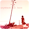
Hi y'all! This is my first tutorial, requested by brasaremean. And if anything is unclear, please let me know.
For Photoshop:
Start with this image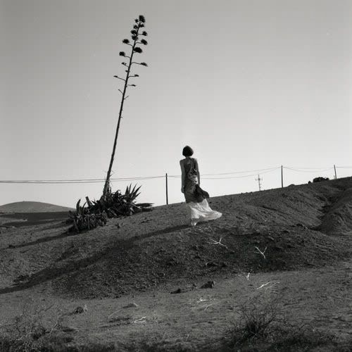
from here.
Then select a square portion of it and resize it to 100x100. (Image > Image Size)
Then sharpen the image (Filter > Sharpen > Sharpen)
Since you don't won't it too sharp, I usually reduce the sharpness depending on the icon. (Edit > Fade Sharpen > 70%)
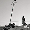
Now you're ready to add color and make it more interesting. When it comes to color and gradients, I always try to enhance the original image. And most of it is up to personal tastes.
Create a new layer and fill it with a dark blue color, (I used #0D294D) and set it to exclusion 100%.
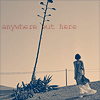
Now for gradients. I have no idea who made each individual gradient, but they are credited in my resources. I recommend crumblingwalls and oxoniensis.
On a new layer use
set on Soft Light at 100%.
Then this,
also set on Soft Light, 100%.
And this,
set on Multiply, 70%.
And,
at Lighten, 100%.
And finally,
at Soft Light, 100%.
Now, the icon looks a little funny and washed out.
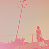
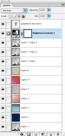
So, to fix this, we duplicate the base image image three times and set the layers at
-Soft Light 100%
-Soft Light 100%
-Soft Light 20% (This layer should be on top)
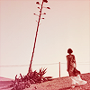
To add more contrast to the image, we have to add a new adjustment layer.
(Layer > New Adjustment Layer > Brightness/Contrast)
Slide the contrast bar to +30.
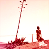
Only two more parts left!
I chose to add text to the image to add a little more interest. I happened to be listening to Better Than Ezra's "At the Stars," and chose the text 'anywhere but here.' But text is really up to the individual.
Font: Courier New
Size: 8 pt
Spacing: -50
Color: #A83337 I recommend choosing a color already present in the image.
Opacity: 90%
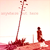
Here's what your layer palette should look like
And finally the last step is to add rounded edges, which is entirely optional. I just like the way it looks.
There are probably other ways of doing this, but I think this is easiest.
First you want to flatten the image. (Layer > Flatten Image) And copy it into a new document with a transparent background. Make sure it's transparent, as this is very important.
With the marquee tool, (the one with the dashed lines) select a square just inside of the icon. Make sure the whole icon isn't selected, or the next step won't work.
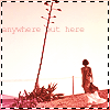
Go to Select > Modify > Smooth> Sample Radius: 5 pixels.
Then without removing the selection go to Select > Inverse, and then delete the selection.
This creates the rounded corners.

And you're finished!
Remember that these are just guidelines, and the fun really lies in experimentation!
Hi y'all! This is my first tutorial, requested by brasaremean. And if anything is unclear, please let me know.
For Photoshop:
Start with this image
from here.
Then select a square portion of it and resize it to 100x100. (Image > Image Size)
Then sharpen the image (Filter > Sharpen > Sharpen)
Since you don't won't it too sharp, I usually reduce the sharpness depending on the icon. (Edit > Fade Sharpen > 70%)
Now you're ready to add color and make it more interesting. When it comes to color and gradients, I always try to enhance the original image. And most of it is up to personal tastes.
Create a new layer and fill it with a dark blue color, (I used #0D294D) and set it to exclusion 100%.
Now for gradients. I have no idea who made each individual gradient, but they are credited in my resources. I recommend crumblingwalls and oxoniensis.
On a new layer use
set on Soft Light at 100%.
Then this,
also set on Soft Light, 100%.
And this,
set on Multiply, 70%.
And,
at Lighten, 100%.
And finally,
at Soft Light, 100%.
Now, the icon looks a little funny and washed out.
So, to fix this, we duplicate the base image image three times and set the layers at
-Soft Light 100%
-Soft Light 100%
-Soft Light 20% (This layer should be on top)
To add more contrast to the image, we have to add a new adjustment layer.
(Layer > New Adjustment Layer > Brightness/Contrast)
Slide the contrast bar to +30.
Only two more parts left!
I chose to add text to the image to add a little more interest. I happened to be listening to Better Than Ezra's "At the Stars," and chose the text 'anywhere but here.' But text is really up to the individual.
Font: Courier New
Size: 8 pt
Spacing: -50
Color: #A83337 I recommend choosing a color already present in the image.
Opacity: 90%
Here's what your layer palette should look like
And finally the last step is to add rounded edges, which is entirely optional. I just like the way it looks.
There are probably other ways of doing this, but I think this is easiest.
First you want to flatten the image. (Layer > Flatten Image) And copy it into a new document with a transparent background. Make sure it's transparent, as this is very important.
With the marquee tool, (the one with the dashed lines) select a square just inside of the icon. Make sure the whole icon isn't selected, or the next step won't work.
Go to Select > Modify > Smooth> Sample Radius: 5 pixels.
Then without removing the selection go to Select > Inverse, and then delete the selection.
This creates the rounded corners.
And you're finished!
Remember that these are just guidelines, and the fun really lies in experimentation!