Tutorial #5: Tear and the Tut!
Tutorial #5!
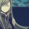
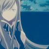
Going from this: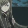
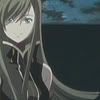
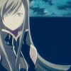
to this
Here's my fifth tutorial! Enjoy and comment! I'd love to see how yours all turned out! ^^ Like what you see here? Why not friend the community? I'll be posting a lot more of these! ^^
1.) First step, is of course to crop your base. Since we need to crop icons in LJ standards, they have to be 100 x 100. The icon I'm using right now is a cropped screencap from ryuudo featuring Tear Grants (Tales of the Abyss).
2.) Duplicate the base and sharpen once. (Some caps look worse when they're sharpened so it depends on you on how your picutre looks. In my case, the cap is blurry, so I sharpened. It's recommended though.)
3.) Duplicate the base again, drag this to the top and set it on Screen at 65%. This is to make our dark screencap nice and bright.
4.) Duplicate the base and drag this to the top, this time putting the setting on Soft Light at 80%. Mess with the opacities to suit the icon, alright? ^^
5.) Make a new layer and floodfill with #070440 (Which is basically a really dark navy blue.) setting this on Exclusion at 77%.
6.) Make a new layer and floodfill with #DFCD9D (Which is a beige-y brown.) setting this on Multiply at 44%. Dont worry, this is gonna get better soon!
7.) Make a new layer and floodfill with #9F9373 (Which is a darker version of the previous step, a little browner.) and set this at Darken at 35%. >.< Well, it's not looking so good now is it? Like I said, it's gonna get better. (Hopefully. Kidding. XD)
8.) New layer again and floodfill with #CFF8F8 (This is basically a really light blue.), setting this at Color Burn at full opacity. Still not looking good, huh? Relax. XD
9.) Make the last color layer, floodfilling this with #F5CFF8 (A really light pink.) and putting it on Soft Light at full opacitiy. Wow, it's coming together! At last! XD
10.) Still, it's not as good is it? Well, this step will settle things down a bit with those bright colors. Duplicate your base and drag it to the top, setting it on Soft Light at full opacity.
Better, yah? ^^;;
11.) Now the fun part begins! Go to Layer >> New Adjustment Layer (Or just click the yin yang symbol beside the new layer button below the Layers palette.) and select Color Balance. Set them on this:
MIDTONES: 58, -16, -21
SHADOWS: -36, -15, 15
HIGHLIGHTS: -12, -11, 0
12.) Go to Hue/Saturation back in the adjustment layers and put the MASTER Saturation at 30. Don't mess with anything else! ^^; (But of course, if your icon looks fugly with this step, you can skip it or mess around. XD)

13.) Duplicate the exclusion layer and drag it to the top, setting the opacity on 64%. Yey, it's turning out good! XD

14.) Paste this texture on top of everything (I made this.) and set it on Screen.

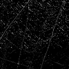
15.) Last step! Yey! XD Anyway, paste this texture (Made by xplastique) below the other Screen texture. I used a vector mask to erase portions of it that covered Tear's face completely.
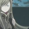
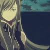
And your done! Finished! The final product is this:
Was it hard? Was it easy? Love it? Hate it? Comment and show me your result! I'd love to see your outcomes! :D Remember, not all icons agree with tuts like this, so mess around with opacities and stuff. ^^
Remember to friend the community if you wanna see more of this, and my icons! :D See you, enjoy! ^^V
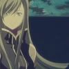
Going from this:
to this
Here's my fifth tutorial! Enjoy and comment! I'd love to see how yours all turned out! ^^ Like what you see here? Why not friend the community? I'll be posting a lot more of these! ^^
1.) First step, is of course to crop your base. Since we need to crop icons in LJ standards, they have to be 100 x 100. The icon I'm using right now is a cropped screencap from ryuudo featuring Tear Grants (Tales of the Abyss).
2.) Duplicate the base and sharpen once. (Some caps look worse when they're sharpened so it depends on you on how your picutre looks. In my case, the cap is blurry, so I sharpened. It's recommended though.)
3.) Duplicate the base again, drag this to the top and set it on Screen at 65%. This is to make our dark screencap nice and bright.
4.) Duplicate the base and drag this to the top, this time putting the setting on Soft Light at 80%. Mess with the opacities to suit the icon, alright? ^^
5.) Make a new layer and floodfill with #070440 (Which is basically a really dark navy blue.) setting this on Exclusion at 77%.
6.) Make a new layer and floodfill with #DFCD9D (Which is a beige-y brown.) setting this on Multiply at 44%. Dont worry, this is gonna get better soon!
7.) Make a new layer and floodfill with #9F9373 (Which is a darker version of the previous step, a little browner.) and set this at Darken at 35%. >.< Well, it's not looking so good now is it? Like I said, it's gonna get better. (Hopefully. Kidding. XD)
8.) New layer again and floodfill with #CFF8F8 (This is basically a really light blue.), setting this at Color Burn at full opacity. Still not looking good, huh? Relax. XD
9.) Make the last color layer, floodfilling this with #F5CFF8 (A really light pink.) and putting it on Soft Light at full opacitiy. Wow, it's coming together! At last! XD
10.) Still, it's not as good is it? Well, this step will settle things down a bit with those bright colors. Duplicate your base and drag it to the top, setting it on Soft Light at full opacity.
Better, yah? ^^;;
11.) Now the fun part begins! Go to Layer >> New Adjustment Layer (Or just click the yin yang symbol beside the new layer button below the Layers palette.) and select Color Balance. Set them on this:
MIDTONES: 58, -16, -21
SHADOWS: -36, -15, 15
HIGHLIGHTS: -12, -11, 0
12.) Go to Hue/Saturation back in the adjustment layers and put the MASTER Saturation at 30. Don't mess with anything else! ^^; (But of course, if your icon looks fugly with this step, you can skip it or mess around. XD)
13.) Duplicate the exclusion layer and drag it to the top, setting the opacity on 64%. Yey, it's turning out good! XD
14.) Paste this texture on top of everything (I made this.) and set it on Screen.
15.) Last step! Yey! XD Anyway, paste this texture (Made by xplastique) below the other Screen texture. I used a vector mask to erase portions of it that covered Tear's face completely.
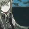
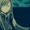
And your done! Finished! The final product is this:
Was it hard? Was it easy? Love it? Hate it? Comment and show me your result! I'd love to see your outcomes! :D Remember, not all icons agree with tuts like this, so mess around with opacities and stuff. ^^
Remember to friend the community if you wanna see more of this, and my icons! :D See you, enjoy! ^^V