Icon Tutorial#8: Sakura in Style!
(Running out of obvious pun/title names for these XD)
As requested by dragonsquee!
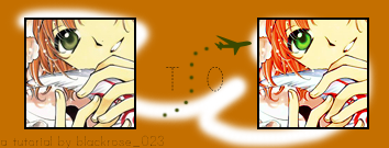
** done using Adobe Photoshop CS2
** involves Selective Coloring, Channel Mixer (not translatable)
** comment? ^^;;
Hello once again everyone to one of tutorials! :D This particular one was requested by the oh so talented dragonsquee from this icon batch! (Number 4 from Tsubasa Chronicles) Although I just remembered I erased the PSD. file for all these icons (to save some space), I managed to remember how I did it and also, even though the cropping isn't the same as the one in number four, it's close, yah? ^^;; XD Yes, I'm a moron aren't I? XD
Anyway, a few reminders before we begin! :D Please do not copy this tutorial step by step! It's meant to inspire and help you, but experimentation is greatly expected! ^^V Show me your outcomes as well! :D (And I don't have images for this one, sadly. XD This is because I'm a bum) XD Let's start! :D
-------------------------------------
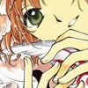
1.) I'm going to skip the cropping part of the icon and get right down and dirty to business. ^^;; Grab your base and prep it up with some Auto Levels/Auto Contrast.
This is the base I'm using, the beautiful Sakura from Cardcaptor Sakura/Tsubasa Reservoir Chronicles fame! :D Also remember, not all icons agree with this tutorial, so keep in mind to play with settings to suit your picture! ;3
2.) Next, duplicate the base, desaturate it and apply a small amount of vanishing cream Gaussian Blur at 6.0 radius. Then I set the layer on Soft Light.
3.) Duplicate the base again and drag it to the top, setting it on Hard Light at 50% opacity.
4.) Make a new layer and fill it with a brownish/beige color (I used #E0C899). I set this layer on Multiply at a low opacity, below fifty perhaps. (I set it on 44%)
5.) Make a new layer and fill it with a nice, light blue color (I used #92E1D7). I et this layer to Soft Light it's the most abused blending option, I heard in one forum XD at a relatively high opacity, mostly below 90 depending on the icon you're using. (I used 82%.)
6.) Make a new layer and fill it with a nice light pink color (I used #EBBAEE) don't fear the pink!. I set this layer on Overlay at a really low opacity, depending on the picture once again. (Mine was set to 44%)
7.) I duplicated my base, dragged it to the top and had it set on Color at full strength.
8.) I opened the Adjustment Layers it's like the Pandora's Box of photoshop sometimes XD and chose the Brightness/Contrast selection. If you're going to use this as well, it's best to keept the brightness lower than the contrast :3 (Mine was -15, +12)
9.) Another Adjustment Layer baby option, this time, Hue/Saturation. Pump up the MASTER saturation on the levels of +20-55. :D
10.) Okay, now we move on to Selective Coloring , the destroyer of evil and ruler of worlds which is basically yours to play with. :D Of course, depending on the hues of the picture, it's best to play with RED, YELLOW and NEUTRAL settings. Because my icon has a green hue to it (aka her eyes), I also played with the GREEN setting.
If anyone is interested, my settings were:
REDS: -100, 0, 100, 0
YELLOWS: 42, 18, -33, 0
GREENS: 100, -100, 100, -100 (This just enhances the green of Sakura's eyes, but if your icon has no greens to it, its best to just skip this one.)
NEUTRALS: 30, 21, -17, 0
11.) Last Adjustment Layer their daddy's getting worried.XD, the Channel Mixer! I just realized that the icon lacks a certain color so I experimented and used this RED setting to pump up the volume the reddish hues in it. Play with it as you please, of course and this step is also optional. ;3
My settings were:
RED: 121, -34, -28, CONSTANT: 32
12.) Now it's not very...good right now is it? ^^;; That's the key to it XD Now I duplicated my base, dragged it to the top and set it on Soft Light..Oh no? Not yet? Sorry, force of habit XD Luminosity at full strength. There, much better right? ;3
OPTIONAL: Now, if you have an icon with dull eyes because of the process it went through, you can make a new layer above the Luminosity one and use the eye dropper tool on the color of the character's eyes. (I did this with my icon) Then use a soft brush and dab that color on the eyes and set the layer on Overlay. :3
13.) Duplicate the base again and drag it to the top, this time though, I finally set it to Soft Light at a medium high level of opacity, about 50+70. (Mine was at 65%)
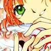
Add brushes, texts, borders, textures and you're done! This is my final product:
Sakura : Wings of Words
So how was it? Good? Bad? Like it? Hate it? Drop a comment and tell me what you think! :D Hope this helps, and enjoy! ^^ Remember to play with your settings as well. ;3 ^__^V Till next time. :D
As requested by dragonsquee!

** done using Adobe Photoshop CS2
** involves Selective Coloring, Channel Mixer (not translatable)
** comment? ^^;;
Hello once again everyone to one of tutorials! :D This particular one was requested by the oh so talented dragonsquee from this icon batch! (Number 4 from Tsubasa Chronicles) Although I just remembered I erased the PSD. file for all these icons (to save some space), I managed to remember how I did it and also, even though the cropping isn't the same as the one in number four, it's close, yah? ^^;; XD Yes, I'm a moron aren't I? XD
Anyway, a few reminders before we begin! :D Please do not copy this tutorial step by step! It's meant to inspire and help you, but experimentation is greatly expected! ^^V Show me your outcomes as well! :D (And I don't have images for this one, sadly. XD This is because I'm a bum) XD Let's start! :D
-------------------------------------
1.) I'm going to skip the cropping part of the icon and get right down and dirty to business. ^^;; Grab your base and prep it up with some Auto Levels/Auto Contrast.
This is the base I'm using, the beautiful Sakura from Cardcaptor Sakura/Tsubasa Reservoir Chronicles fame! :D Also remember, not all icons agree with this tutorial, so keep in mind to play with settings to suit your picture! ;3

2.) Next, duplicate the base, desaturate it and apply a small amount of vanishing cream Gaussian Blur at 6.0 radius. Then I set the layer on Soft Light.
3.) Duplicate the base again and drag it to the top, setting it on Hard Light at 50% opacity.
4.) Make a new layer and fill it with a brownish/beige color (I used #E0C899). I set this layer on Multiply at a low opacity, below fifty perhaps. (I set it on 44%)
5.) Make a new layer and fill it with a nice, light blue color (I used #92E1D7). I et this layer to Soft Light it's the most abused blending option, I heard in one forum XD at a relatively high opacity, mostly below 90 depending on the icon you're using. (I used 82%.)
6.) Make a new layer and fill it with a nice light pink color (I used #EBBAEE) don't fear the pink!. I set this layer on Overlay at a really low opacity, depending on the picture once again. (Mine was set to 44%)
7.) I duplicated my base, dragged it to the top and had it set on Color at full strength.
8.) I opened the Adjustment Layers it's like the Pandora's Box of photoshop sometimes XD and chose the Brightness/Contrast selection. If you're going to use this as well, it's best to keept the brightness lower than the contrast :3 (Mine was -15, +12)
9.) Another Adjustment Layer baby option, this time, Hue/Saturation. Pump up the MASTER saturation on the levels of +20-55. :D
10.) Okay, now we move on to Selective Coloring , the destroyer of evil and ruler of worlds which is basically yours to play with. :D Of course, depending on the hues of the picture, it's best to play with RED, YELLOW and NEUTRAL settings. Because my icon has a green hue to it (aka her eyes), I also played with the GREEN setting.
If anyone is interested, my settings were:
REDS: -100, 0, 100, 0
YELLOWS: 42, 18, -33, 0
GREENS: 100, -100, 100, -100 (This just enhances the green of Sakura's eyes, but if your icon has no greens to it, its best to just skip this one.)
NEUTRALS: 30, 21, -17, 0
11.) Last Adjustment Layer their daddy's getting worried.XD, the Channel Mixer! I just realized that the icon lacks a certain color so I experimented and used this RED setting to pump up the volume the reddish hues in it. Play with it as you please, of course and this step is also optional. ;3
My settings were:
RED: 121, -34, -28, CONSTANT: 32
12.) Now it's not very...good right now is it? ^^;; That's the key to it XD Now I duplicated my base, dragged it to the top and set it on Soft Light..Oh no? Not yet? Sorry, force of habit XD Luminosity at full strength. There, much better right? ;3
OPTIONAL: Now, if you have an icon with dull eyes because of the process it went through, you can make a new layer above the Luminosity one and use the eye dropper tool on the color of the character's eyes. (I did this with my icon) Then use a soft brush and dab that color on the eyes and set the layer on Overlay. :3
13.) Duplicate the base again and drag it to the top, this time though, I finally set it to Soft Light at a medium high level of opacity, about 50+70. (Mine was at 65%)
Add brushes, texts, borders, textures and you're done! This is my final product:
Sakura : Wings of Words

So how was it? Good? Bad? Like it? Hate it? Drop a comment and tell me what you think! :D Hope this helps, and enjoy! ^^ Remember to play with your settings as well. ;3 ^__^V Till next time. :D