【TUTORIAL】 Colouring in Photoshop
This is um, going to be um, a very different sort of tutorial. Because over the period I've been working on the tutorial, I've scrapped all the sample images I tried colouring (Mostly, I'd finish the skin and go aoidhglaksdhf fuck you at them). Then um, recently I started colouring in openCanvas rather than Photoshop, which is problematic because the techniques and tools employed are going to be different.
Because of that, I'll be doing two manga colouring tutorials - here, have the Photoshop one first, considering Photoshop's a more commonly employed program over openCanvas, and OC is impossible to explain steps for.
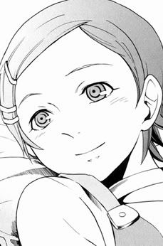
Anyway, here's how to go from:
to
Program: Adobe Photoshop CS3 (Translateable, but Photoshoppers have it easiest)
Level: Medium/Hard - Requires knowledge on how to create solid colour adjustment layers and/or apply layer masks to layers, as well as knowledge of clipping masks.
WARNING: This tutorial is image heavy, and extremely tl;dr aka long.
This tutorial will not cover base preperation, because I'm lazy, and because the lovely ladies at robotsex have done tutorials on them that will probably be better with anything I'll ever come up with. This is mostly a pure colouring tutorial - the few things I do as touchups hardly qualify as tutorial material. I just tell you to add them, but not what to change 8D;;.
QUICKJUMP/INDEX OF TOPICS
For your convenience, in case a particular section sounds more interesting :D.
➝ the basics
➝ colouring skin
➝ colouring eyes
➝ colouring hair
➝ colouring clothing
➝ colouring shiny things
➝ backgrounds
➝ final touchups
THE BASICS
~ Find yourself an image. For the sake of laziness, I'll be using this really minimalistic scan of Eureka from Eureka SeveN.

If you need to fix your scan, do so. I don't need to - I'm lazy, remember? Also, just a note. I don't recommend to people who have poor light sourcing abilities to erase screentones until AFTER they finish colouring. Screentones can be helpful...though, sometimes, they're completely useless (note: the tones on her shirt). Use your best judgement, which is, well, I can't teach you judgement, that's asking for the impossible :(.
~ I don't have a fixed pattern as to how I block in colours. Most of the time, I colour by section, in the order of skin, eyes, hair, clothes, background details. Sometimes, when things get fiddly, or the shadows are interchangeable (Like say, if clothing is two-toned, like Eureka's, which is cyan and white), I colour the base colours of the clothing, before shading over them.
~ Firstly, add a white layer underneath your lineart/manga scan. Then set your lineart to either multiply/linear burn (depends on the intensity you want). There are alternative techniques to how to deal with lineart, one using colour burn, and another, probably more common, using quickmask. fiendie has already written about using that technique on her tutorial for prepping lineart here, so go check that out if you're interested. But multiply/linear burn is just my way of doing it.
~ Next, create a layer filled with some sort of ridiculous colour. Anything will do, as long as it'll help you erase stuff later. I like to use either plums, magentas, greens or blues, usually of a medium shade of darkness, and quite dull. I also prefer creating them a solid colour layer, so that I can easily change the colours in the event of clashes (There are times when you, say, pick plum, but the character has pink hair, so it's a bit hard to see where you coloured out of the lineart). Hide it after you create it - you don't really need it unless cleaning up things.
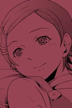
I used #984554 for this particular colouring, because Eureka's mostly blue and cyan, so it'll effectively contrast with those colours.
COLOURING SKIN
~ IT'S SKINTIEMS. Create a solid colour layer and pick a very light shade of peach/pink (I used #fbe7d8), and then fill the layer mask with black, so you can't see the colour anymore. Then just use a hard brush tool to colour in her skin. It's not really important to colour within the lines of hair and clothing, seeing as those layers will just overlap and cover up, so for the mean time, just make sure the colour doesn't overlap the background - unhide the "eraser colour" as I like to call it, if you need to.
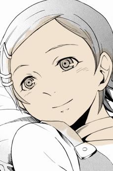
I'm aware I'm defying canon colours by giving her normal skin, but bear with me - colouring her with pale whiteish skin isn't going to teach you how to colour nice skin damnit. Besides I like colouring Eureka with normal colours |D. ANYWAY. Your skin colour choice should really depend on what you're colouring. Manly men tend to have more yellowish, skin, and girls by default always seem to be pinker. Why? I don't know, mangaka and anime producers are silly :D.
~ First thing to shading is deciding on a light source. No light source, no nice shady-wady. That's just the way things roll. So what I did was blob in a light and draw arrows where the light should fall. Light shines 360 degrees, and anything that's in the way of light will cast shadows - the bigger the obstacle, the larger the shadow. Isn't my lightsource adorable 8D? *is shot*
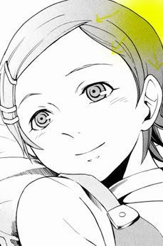
~ Pick a slightly darker shade to start shading with. I like to use multiply on Photoshop. Why? I've yet to figure out, actually. Reflex, I guess. I create a new layer and set it on multiply, and start brushing on it with the colour #f1dcc1. Use the smudge tool at 30~40% opacity, and using a soft brush, just smudge the edges slightly so it's softer. This step's optional. If you don't smudge, you end up with an effect seen on most of my icons here - something that's a little posterised looking, with very defined shades. I personally like smudging bigger scans mostly because I use a mouse, and my lines get shaky at times, so it's a fantastic cover up 8D. Lower the opacity to something like 30% - this is the first layer of shadow, it shouldn't be too dark.
~ I'm really too lazy to explain the rest of my shading of the skin, this uh "slideshow" of shading It's basically a rinse & repeat technique. For lazy people, continue to use the same shade to shade. For not-so-lazy people, use different shades, pinker, browner, darker, not darker, whatever. Remember what I said about not-beginner-friendly 8D? But, for the very last bit of shadows, what I did was add a bit of purple on very low opacity set to multiply. It kind of enhances the shadows (and looks cool). The shading for this scan is mostly halfassed btw.
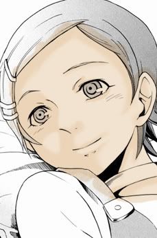
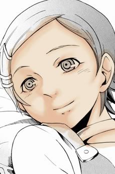
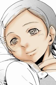

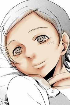
~ And then the highlights! Remember your light source, and just follow accordingly. I like to either do huge chunks of white at light opacity and layer highlighs (in my icons), or just small bits of highlights, which I've shown here. I just smudge them so they're not so harsh, and yeap. I also added a pink blush (pink set to multiply, ultra gaussian blurred XD) to Eureka were there are blushmarks, so hay. Most people would do lipstick, but GOD AM I BAD AT LIPSTICK, so I'mma skip it. Feel free to add lipstick/makeup if you want to though.
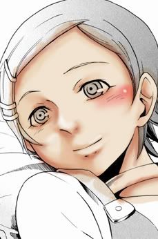
~ So, you're done with colouring. But ohshit everything leaks out of the lineart, what to do!?!? Never fear! Just select all of the skin layers above the base, and clip them to the base layer using clipping masks (ctrl+alt+g for PSCS3, ctrl+g for PSCS, or just layer --> create clipping mask). VOILA, MAGIC!

COLOURING EYES
~ People often tell me I do nice eyes. I think they're lying. Anyway, I actually HATE eye linearts by default, so I always erase them from my lineart. You can do this using a layermask, or using just a white brush brushing on the lineart layer. Or you can leave it there, really. Then create a white colour layer and fill in the eye whites :D. It looks really creepy at this stage, rofl.
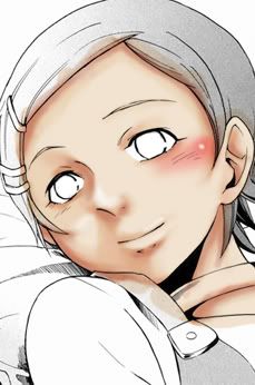
~ Create a layer and fill it with a light shade of your character's eye colour. I mean it when I said light shade. My eye colouring method involves a lot of layering to get depth, so the lighter, the better, because it comes out looking more stunning :D.
~ I really don't know how to explain my methods for colouring eyes. I've always done it instinctively from looking at so many manga linearts and such. What I do know is I like to have solid irises in the centre so it looks like they actually have real eyes rather than creepy sparklesparkle anime ones. What I basically did was just continuously pick darker shades of the colour and set it on multiply at varying opacities. Then, I use a light shade set on screen to add some highlights. Lastly, I have a layer of white, but in small quantities :O. Explaining eyes is a pain in the butt damnit.
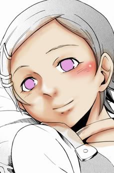


~ Oh yes, don't forget to clip all the bits of colouring the eye (not the eye whites) to the base layer, so they don't leak out :D. I was clipping mine the whole way, so yeap.
COLOURING HAIR
~ People often tell me my hair's nice one too many times as well. I disagree, but that's not the point of the tutorial. Anyway, create a colour layer again, and choose your hair's base colour. Make it lightish, as usual! Then just colour the hair in. It's pretty important not to leak out your hair, since, well, hair goes over the face.
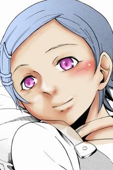
~ Shading hair is always fun, I think. Mostly because colour variations are very important. Eureka's hair is cyan/blue (I chose to go with using manga artwork as her hair colour source, rather than the anime, where her hair is more green), so I add a lot of either blue, cyan and green colours to it. It's best to first blend in the colours before thinking about actual shading :D. I prefer to NOT add highlight strands to hair, and just darken parts that should be darker. That's probably hard to understand, but maybe the slideshow gives a better example. Note: I was too lazy to clip them until I was done 8D.
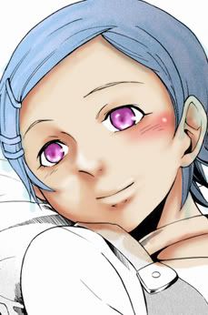
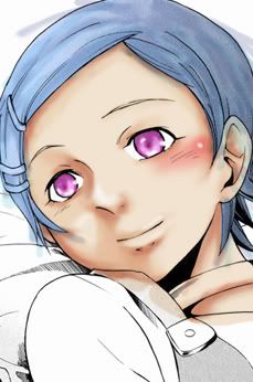

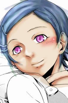
~ Next, circular lighting that falls on hair, aka the "halo". Probably the most defining part about my hair, apart from ugly strands that everyone seems to like, which I've taken to not doing anymore on anything larger than icons because it's hideous with a mouse. Add a new layer above all your hair, and clip it to the base hair layer, and set it to screen. Pick a medium but bright shade of your hair's colour. Using a largeish soft brush (I used 35px, but this really depends on the size of your scan and how much hair there is), follow your light source and draw a circle around the top part of the hair. A lot of times, manga scan drawings DEFY how the light should fall (like my scan), but screw it, just draw the circle/halo. The closer the lightsource is to you, the smaller the circle should be. If you feel the lighting isn't strong enough, create another layer with the same settings, and use a slightly smaller brush and repeat.
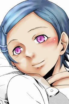

If your hair has a lot of screentones, the effect won't be that fantastic. This is evident in the difference of brightness between the left side and the right side of Eureka's hair here, since the right side is more heavily screentoned. You could always add the screen layer OVER the lineart in this case - but be sure to erase around bits you don't want it to highlight (like the face and the background).
COLOURING CLOTHING
Colouring clothing is always a major problem for, uhm, everyone. I'm actually not the best person to ask for help when it comes to clothing, because 90% of the time I just add whatever folds and hope it looks decent :D;;. The only reason I'm really actually doing this section (you can seriously just use similar shading approaches to the skin and hair), is because a lot of people have no idea how to shade white, so I figured that's not a bad thing to talk about in a tutorial. If you have no idea about how to colour clothes, I suggest looking at photographs, really. They're the best way to identify how creases and folds deflect light, and also the general flow of clothing, really.
~ Colour in the base colours of the clothing using the same method as all the base colours. Can you tell I'm getting lazy? XDDD. In Eureka's case, since her dress is technically a single piece, I coloured the white parts, and the cyan on top, but clipped to the white part. I'm going to shade over it as a single unit. Also, the plum background is unhidden because, well, white cannot be differentiated above white, DUH.
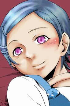
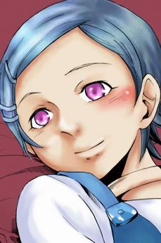
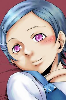
~ To determine the sort of colours you should pick to shade white, it's important to figure out what sort of lighting you might have. Blueish? Orangey? Bright white? Actually, lighting is important for all shadings, really, but especially so when colouring white things, since it's harder to adjust. I went with a blueish lighting, to fit the whole blue colour scheme. For shading, I mostly did multitudes of blue, greenish-blue and blueish-purple on very low opacity set to multiply. It doesn't HAVE to be multiply, but in my case, since I was shading over the blue bits of her dress too, multiply was required XD.


COLOURING SHINY THINGS
...Also known as accessories. But accessories/other miscellaneous items aren't always shiny. In Eureka's case? Yeah, they're all shiny. With shiny things, it's important to remember that shadows are very dark, highlights are ridiculously bright. Doing that will allow you to achieve a very shiny effect. And I'm kind of an expert at shiny, for some peculiar reason.
For this part of the tutorial, I'm only going to colour the metal bangle-like-choker on her neck and her hair pins, which are both gold. The same can be applied to the metal button on her dress, just using greys and blues (I don't like to shade with grey, because it looks flat somehow, so I always add blues and purples to silver metal items).
~ Just...do the base colours. Pick a light shade of yellow, but make sure it's bright, and more towards the orange spectrum rather than the green spectrum.

~ Next, pick some sort of orange, and set it on multiply, and add the shadows. Remember that the choker is a rounded item, so shade thinking of how light falls on rounded things. Continue to darken the shadows, really. The darker the better~! Add lights in a similar way to the face, with little flecks of white where there should be lights.



BACKGROUNDS
A hardworking person would colour the background, since she's lying on sheets. I'm not a hardworking person, and I just wasted about 5 hours of my life on this tutorial, so there. Or I guess I could colour it in. No explanations gaiz, it's basically exactly the same approach to colouring clothing, since it's cloth material. The background goes under ALL other colour layers for...obvious reasons. Also, the technically correct way should be to colour from bottom to top, that is, background first. But...how many people actually DO that? I only do it for icons if I'm sure of a colour scheme, otherwise, I wing it, and do the background last, or halfway through colouring.





And we're done with the colouring, yay~! Now's a great time to go back and fix imperfections. In my case, I realise I completely forgot about her button (lol smart), so I coloured that in. Also, notice how I didn't mention merging things? I'm kind of a perfectionist by nature, so merging layers is...well, a massive no-no for me, really. Feel free to merge though, if you're confident of your stuff :D.

FINAL TOUCHUPS
So, technically we're done, but godddd that looks bland. And not everything seems to follow a unified colour scheme anyway.
~ Add a curves adjustment layer OVER your lineart. We're going to fix up the contrast and colour scheme a little :D. Doing it over your lineart means it affects the entire image, not just the colourings, and not just a single section. Think of it as doing graphics over a regular scan! Anyway, I fiddled with the curves to fix up the brightness and contrast, and certain aspects of colouring. This is something I really can't give you numbers for, since it varies from scan to scan.

~ The colour scheme is a bit ehhh for me, so I added a colour balance layer, and adjusted it so it was more blueish.

This time, we're really done, because I can't be bothered to do texturing or whatever :D. Sorry that this tutorial was mostly not very helpful, and pretty useless. Or maybe it was of some use. *cough*.
Oh right, before I forget. I didn't continuously mention this while I was doing the tutorial even though I was doing it, but do smudge all your shading layers slightly, especially with cloth materials, so that things look a little softer!
For anyone who got lost on the way, or for people who're just curious, here is my PSD file (2.09 MB). Note that um, I doubt just looking at the PSD is going to help you magically be great at colouring (I lol at people who ask for PSDs at icon tutorials), but it might help explain my haphazardous technique better than my tl;dr would. Maybe. I don't know. It's also a good idea to look at it to see what order I put the layers, things like that :D.
And so ends the longest, most boring, most confusing manga colouring tutorial you've ever laid your eyes on - I mean, it even has a quickjump index thing wtf. I'd love to see what anyone who tries my technique comes up with ♥!
Because of that, I'll be doing two manga colouring tutorials - here, have the Photoshop one first, considering Photoshop's a more commonly employed program over openCanvas, and OC is impossible to explain steps for.
Anyway, here's how to go from:

to

Program: Adobe Photoshop CS3 (Translateable, but Photoshoppers have it easiest)
Level: Medium/Hard - Requires knowledge on how to create solid colour adjustment layers and/or apply layer masks to layers, as well as knowledge of clipping masks.
WARNING: This tutorial is image heavy, and extremely tl;dr aka long.
This tutorial will not cover base preperation, because I'm lazy, and because the lovely ladies at robotsex have done tutorials on them that will probably be better with anything I'll ever come up with. This is mostly a pure colouring tutorial - the few things I do as touchups hardly qualify as tutorial material. I just tell you to add them, but not what to change 8D;;.
QUICKJUMP/INDEX OF TOPICS
For your convenience, in case a particular section sounds more interesting :D.
➝ the basics
➝ colouring skin
➝ colouring eyes
➝ colouring hair
➝ colouring clothing
➝ colouring shiny things
➝ backgrounds
➝ final touchups
THE BASICS
~ Find yourself an image. For the sake of laziness, I'll be using this really minimalistic scan of Eureka from Eureka SeveN.

If you need to fix your scan, do so. I don't need to - I'm lazy, remember? Also, just a note. I don't recommend to people who have poor light sourcing abilities to erase screentones until AFTER they finish colouring. Screentones can be helpful...though, sometimes, they're completely useless (note: the tones on her shirt). Use your best judgement, which is, well, I can't teach you judgement, that's asking for the impossible :(.
~ I don't have a fixed pattern as to how I block in colours. Most of the time, I colour by section, in the order of skin, eyes, hair, clothes, background details. Sometimes, when things get fiddly, or the shadows are interchangeable (Like say, if clothing is two-toned, like Eureka's, which is cyan and white), I colour the base colours of the clothing, before shading over them.
~ Firstly, add a white layer underneath your lineart/manga scan. Then set your lineart to either multiply/linear burn (depends on the intensity you want). There are alternative techniques to how to deal with lineart, one using colour burn, and another, probably more common, using quickmask. fiendie has already written about using that technique on her tutorial for prepping lineart here, so go check that out if you're interested. But multiply/linear burn is just my way of doing it.
~ Next, create a layer filled with some sort of ridiculous colour. Anything will do, as long as it'll help you erase stuff later. I like to use either plums, magentas, greens or blues, usually of a medium shade of darkness, and quite dull. I also prefer creating them a solid colour layer, so that I can easily change the colours in the event of clashes (There are times when you, say, pick plum, but the character has pink hair, so it's a bit hard to see where you coloured out of the lineart). Hide it after you create it - you don't really need it unless cleaning up things.

I used #984554 for this particular colouring, because Eureka's mostly blue and cyan, so it'll effectively contrast with those colours.
COLOURING SKIN
~ IT'S SKINTIEMS. Create a solid colour layer and pick a very light shade of peach/pink (I used #fbe7d8), and then fill the layer mask with black, so you can't see the colour anymore. Then just use a hard brush tool to colour in her skin. It's not really important to colour within the lines of hair and clothing, seeing as those layers will just overlap and cover up, so for the mean time, just make sure the colour doesn't overlap the background - unhide the "eraser colour" as I like to call it, if you need to.

I'm aware I'm defying canon colours by giving her normal skin, but bear with me - colouring her with pale whiteish skin isn't going to teach you how to colour nice skin damnit. Besides I like colouring Eureka with normal colours |D. ANYWAY. Your skin colour choice should really depend on what you're colouring. Manly men tend to have more yellowish, skin, and girls by default always seem to be pinker. Why? I don't know, mangaka and anime producers are silly :D.
~ First thing to shading is deciding on a light source. No light source, no nice shady-wady. That's just the way things roll. So what I did was blob in a light and draw arrows where the light should fall. Light shines 360 degrees, and anything that's in the way of light will cast shadows - the bigger the obstacle, the larger the shadow. Isn't my lightsource adorable 8D? *is shot*

~ Pick a slightly darker shade to start shading with. I like to use multiply on Photoshop. Why? I've yet to figure out, actually. Reflex, I guess. I create a new layer and set it on multiply, and start brushing on it with the colour #f1dcc1. Use the smudge tool at 30~40% opacity, and using a soft brush, just smudge the edges slightly so it's softer. This step's optional. If you don't smudge, you end up with an effect seen on most of my icons here - something that's a little posterised looking, with very defined shades. I personally like smudging bigger scans mostly because I use a mouse, and my lines get shaky at times, so it's a fantastic cover up 8D. Lower the opacity to something like 30% - this is the first layer of shadow, it shouldn't be too dark.
~ I'm really too lazy to explain the rest of my shading of the skin, this uh "slideshow" of shading It's basically a rinse & repeat technique. For lazy people, continue to use the same shade to shade. For not-so-lazy people, use different shades, pinker, browner, darker, not darker, whatever. Remember what I said about not-beginner-friendly 8D? But, for the very last bit of shadows, what I did was add a bit of purple on very low opacity set to multiply. It kind of enhances the shadows (and looks cool). The shading for this scan is mostly halfassed btw.


~ And then the highlights! Remember your light source, and just follow accordingly. I like to either do huge chunks of white at light opacity and layer highlighs (in my icons), or just small bits of highlights, which I've shown here. I just smudge them so they're not so harsh, and yeap. I also added a pink blush (pink set to multiply, ultra gaussian blurred XD) to Eureka were there are blushmarks, so hay. Most people would do lipstick, but GOD AM I BAD AT LIPSTICK, so I'mma skip it. Feel free to add lipstick/makeup if you want to though.

~ So, you're done with colouring. But ohshit everything leaks out of the lineart, what to do!?!? Never fear! Just select all of the skin layers above the base, and clip them to the base layer using clipping masks (ctrl+alt+g for PSCS3, ctrl+g for PSCS, or just layer --> create clipping mask). VOILA, MAGIC!

COLOURING EYES
~ People often tell me I do nice eyes. I think they're lying. Anyway, I actually HATE eye linearts by default, so I always erase them from my lineart. You can do this using a layermask, or using just a white brush brushing on the lineart layer. Or you can leave it there, really. Then create a white colour layer and fill in the eye whites :D. It looks really creepy at this stage, rofl.

~ Create a layer and fill it with a light shade of your character's eye colour. I mean it when I said light shade. My eye colouring method involves a lot of layering to get depth, so the lighter, the better, because it comes out looking more stunning :D.
~ I really don't know how to explain my methods for colouring eyes. I've always done it instinctively from looking at so many manga linearts and such. What I do know is I like to have solid irises in the centre so it looks like they actually have real eyes rather than creepy sparklesparkle anime ones. What I basically did was just continuously pick darker shades of the colour and set it on multiply at varying opacities. Then, I use a light shade set on screen to add some highlights. Lastly, I have a layer of white, but in small quantities :O. Explaining eyes is a pain in the butt damnit.


~ Oh yes, don't forget to clip all the bits of colouring the eye (not the eye whites) to the base layer, so they don't leak out :D. I was clipping mine the whole way, so yeap.
COLOURING HAIR
~ People often tell me my hair's nice one too many times as well. I disagree, but that's not the point of the tutorial. Anyway, create a colour layer again, and choose your hair's base colour. Make it lightish, as usual! Then just colour the hair in. It's pretty important not to leak out your hair, since, well, hair goes over the face.

~ Shading hair is always fun, I think. Mostly because colour variations are very important. Eureka's hair is cyan/blue (I chose to go with using manga artwork as her hair colour source, rather than the anime, where her hair is more green), so I add a lot of either blue, cyan and green colours to it. It's best to first blend in the colours before thinking about actual shading :D. I prefer to NOT add highlight strands to hair, and just darken parts that should be darker. That's probably hard to understand, but maybe the slideshow gives a better example. Note: I was too lazy to clip them until I was done 8D.


~ Next, circular lighting that falls on hair, aka the "halo". Probably the most defining part about my hair, apart from ugly strands that everyone seems to like, which I've taken to not doing anymore on anything larger than icons because it's hideous with a mouse. Add a new layer above all your hair, and clip it to the base hair layer, and set it to screen. Pick a medium but bright shade of your hair's colour. Using a largeish soft brush (I used 35px, but this really depends on the size of your scan and how much hair there is), follow your light source and draw a circle around the top part of the hair. A lot of times, manga scan drawings DEFY how the light should fall (like my scan), but screw it, just draw the circle/halo. The closer the lightsource is to you, the smaller the circle should be. If you feel the lighting isn't strong enough, create another layer with the same settings, and use a slightly smaller brush and repeat.


If your hair has a lot of screentones, the effect won't be that fantastic. This is evident in the difference of brightness between the left side and the right side of Eureka's hair here, since the right side is more heavily screentoned. You could always add the screen layer OVER the lineart in this case - but be sure to erase around bits you don't want it to highlight (like the face and the background).
COLOURING CLOTHING
Colouring clothing is always a major problem for, uhm, everyone. I'm actually not the best person to ask for help when it comes to clothing, because 90% of the time I just add whatever folds and hope it looks decent :D;;. The only reason I'm really actually doing this section (you can seriously just use similar shading approaches to the skin and hair), is because a lot of people have no idea how to shade white, so I figured that's not a bad thing to talk about in a tutorial. If you have no idea about how to colour clothes, I suggest looking at photographs, really. They're the best way to identify how creases and folds deflect light, and also the general flow of clothing, really.
~ Colour in the base colours of the clothing using the same method as all the base colours. Can you tell I'm getting lazy? XDDD. In Eureka's case, since her dress is technically a single piece, I coloured the white parts, and the cyan on top, but clipped to the white part. I'm going to shade over it as a single unit. Also, the plum background is unhidden because, well, white cannot be differentiated above white, DUH.

~ To determine the sort of colours you should pick to shade white, it's important to figure out what sort of lighting you might have. Blueish? Orangey? Bright white? Actually, lighting is important for all shadings, really, but especially so when colouring white things, since it's harder to adjust. I went with a blueish lighting, to fit the whole blue colour scheme. For shading, I mostly did multitudes of blue, greenish-blue and blueish-purple on very low opacity set to multiply. It doesn't HAVE to be multiply, but in my case, since I was shading over the blue bits of her dress too, multiply was required XD.


COLOURING SHINY THINGS
...Also known as accessories. But accessories/other miscellaneous items aren't always shiny. In Eureka's case? Yeah, they're all shiny. With shiny things, it's important to remember that shadows are very dark, highlights are ridiculously bright. Doing that will allow you to achieve a very shiny effect. And I'm kind of an expert at shiny, for some peculiar reason.
For this part of the tutorial, I'm only going to colour the metal bangle-like-choker on her neck and her hair pins, which are both gold. The same can be applied to the metal button on her dress, just using greys and blues (I don't like to shade with grey, because it looks flat somehow, so I always add blues and purples to silver metal items).
~ Just...do the base colours. Pick a light shade of yellow, but make sure it's bright, and more towards the orange spectrum rather than the green spectrum.

~ Next, pick some sort of orange, and set it on multiply, and add the shadows. Remember that the choker is a rounded item, so shade thinking of how light falls on rounded things. Continue to darken the shadows, really. The darker the better~! Add lights in a similar way to the face, with little flecks of white where there should be lights.


BACKGROUNDS
A hardworking person would colour the background, since she's lying on sheets. I'm not a hardworking person, and I just wasted about 5 hours of my life on this tutorial, so there. Or I guess I could colour it in. No explanations gaiz, it's basically exactly the same approach to colouring clothing, since it's cloth material. The background goes under ALL other colour layers for...obvious reasons. Also, the technically correct way should be to colour from bottom to top, that is, background first. But...how many people actually DO that? I only do it for icons if I'm sure of a colour scheme, otherwise, I wing it, and do the background last, or halfway through colouring.


And we're done with the colouring, yay~! Now's a great time to go back and fix imperfections. In my case, I realise I completely forgot about her button (lol smart), so I coloured that in. Also, notice how I didn't mention merging things? I'm kind of a perfectionist by nature, so merging layers is...well, a massive no-no for me, really. Feel free to merge though, if you're confident of your stuff :D.

FINAL TOUCHUPS
So, technically we're done, but godddd that looks bland. And not everything seems to follow a unified colour scheme anyway.
~ Add a curves adjustment layer OVER your lineart. We're going to fix up the contrast and colour scheme a little :D. Doing it over your lineart means it affects the entire image, not just the colourings, and not just a single section. Think of it as doing graphics over a regular scan! Anyway, I fiddled with the curves to fix up the brightness and contrast, and certain aspects of colouring. This is something I really can't give you numbers for, since it varies from scan to scan.

~ The colour scheme is a bit ehhh for me, so I added a colour balance layer, and adjusted it so it was more blueish.

This time, we're really done, because I can't be bothered to do texturing or whatever :D. Sorry that this tutorial was mostly not very helpful, and pretty useless. Or maybe it was of some use. *cough*.
Oh right, before I forget. I didn't continuously mention this while I was doing the tutorial even though I was doing it, but do smudge all your shading layers slightly, especially with cloth materials, so that things look a little softer!
For anyone who got lost on the way, or for people who're just curious, here is my PSD file (2.09 MB). Note that um, I doubt just looking at the PSD is going to help you magically be great at colouring (I lol at people who ask for PSDs at icon tutorials), but it might help explain my haphazardous technique better than my tl;dr would. Maybe. I don't know. It's also a good idea to look at it to see what order I put the layers, things like that :D.
And so ends the longest, most boring, most confusing manga colouring tutorial you've ever laid your eyes on - I mean, it even has a quickjump index thing wtf. I'd love to see what anyone who tries my technique comes up with ♥!