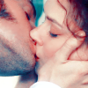
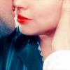
Colouring Tutorial
Requested by goutte_de_rosee.

This was as close as I could get to the original colouring. Enjoy! :)
STEP 1
* Crop your image and resize it. (Screencap courtesy of lauralorien)

STEP 2
* Duplicate your base twice.
* Set both duplicates to Screen.

STEP 3
* Go to: Layer >> New Adjustment Layer >> Selective Colour >> OK
* Input these settings:
Reds
-55
+100
+100
+100
Yellows
-100
0
+100
+10
Neutrals:
+60
0
-55
+5

STEP 4
*New Selective Colour Layer
*Settings:
Reds
-62
0
0
0

STEP 5
*New Selective Colour Layer
*Settings:
Reds
+30
0
-30
+10
Yellows
+100
0
-100
+20
Neutrals:
-10
0
-5
+5

STEP 6
*New Selective Colour Layer
*Settings:
Reds
+50
0
+10
+5
Yellows
+100
0
-100
+5
Neutrals
+10
0
+5
-10

STEP 7
*New Selective Colour Layer (Last one!)
*Settings:
Reds
0
+5
+5
+5
Yellows
+100
0
-100
-100
Neutrals:
+5
0
-5
0

STEP 8
* Go to: Layer >> New Adjustment Layer >> Curves >> OK
* Input these settings:
RGB
Make a single point.
Input: 120
Output: 135
* Set this layer to Soft Light.

STEP 9
* Duplicate your base and drag it to the top.
* Set it to Screen with an opacity of 50%.

STEP 10
* Duplicate your base and drag it to the top again.
* Set it to Soft Light at 50%.

STEP 11
* Once more, duplicate your base and drag it to the top.
* Set it to Color Burn at 3%.

STEP 12
* Duplicate your base (last time!) and drag it to the top.
*Set it to Luminosity at 5%.
* Zoom in and use the Blur tool to soften the more pixelated areas.

And you're done! Now you can add text, brushes, textures, etc. or leave it as it is.
Don't forget to experiment! I'd love to see what you come up with. :)
Icons made with a similar colouring technique:


