(no subject)
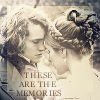
This time I'm not going to do the icon as I made it; rather, I'm going to work from the bottom layer to the top and tell you what went into each layer. I can't actually remember what order I did it in, sorry. Lol.
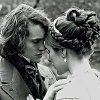
Layer 1: Is our image. It's Hugh Dancy with his costar from David Copperfield, I believe. It's greyscale, and I've done some sharpening filters on it. There are 48547620945 tutorials on preparing a base around, so I won't go into great detail. This method works better with a greyscale image, though, so if you have a colour one, desaturate it.br>
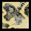
Layer 2: Take your marquee tool and set it to Square. Make a square selection. Then invert the selection (in PSP7: Selections > Invert) and flood fill the new selection with black. Invert the selection again, take a brush of about 10px, colour #EAD796, and create a few squiggles. Try to avoid Hugh's and his Lady-friend's faces. Then, increase the brush size to over 100px, and drop the density to 20 or less. Click once on the image to create the little dots. Don't overdo them. Make sure you've still got your square selection on, as we don't want the yellow overlapping the black.
Layer 2 contd.: Use a motion blur (In PSP7: Effects > Blur > Motion Blur) with angle of 329 or thereabouts, and strength of 24. Make sure your selection is still selected. You don't want the black border to blur! Set this mofo to Soft Light, opacity 100%.

Layer 3: Flood fill this layer with #D1CFBB. Set blending to Difference. It'll look pretty insane for a while, but bear with me.

Layer 4: Flood fill this layer with #EAD796 (the same colour you used earlier for the squiggles). Set it to Exclusion.

Layer 5: Duplicate your image layer and drag it up to this slot. Set it to Soft Light.
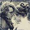
Layer 6: Create a saturation adjustment layer (in PSP7: Layers > New Adjustment Layer > Hue/Saturation/Lightness). Drag the Saturation slider down to -100, and leave the other two alone. Set the layer blending to Color, 45% opacity.

Layer 7: Grab this gradient by yours truly, whack it on a layer, and set it to Overlay, opacity 100%.

Layer 8: Then stick this gradient on another new layer, and set it to Hard Light, opacity 100%.
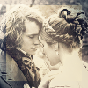
Now you have a beautifully prepared icon with the romantic feel of a vintage photo.

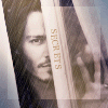
I did add some text as you see, which, sure, involved some tricks of its own. But permit a girl to keep some of her secrets. :>
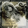
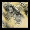
Just thought I'd show this to you, it's layers one, two, and five, plus some text. It has a pretty damn cool feel itself, no?
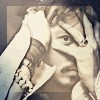
Other icons I made using the same or a similar layer set:
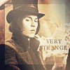
Icon post coming soon; am just getting them all organised and making a few more. :>