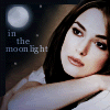
Tutorial, or, How I Prepare My Bases.

Well, this isn't so much a tutorial, as just my personal slant on base preparation. I hopped on my high horse a few weeks ago and said it was a good base that made an icon, not fancy effects. So, here's my take on a 'good' base. This tutorial is for PSP7 (all the stuff in brackets is the PSP7 technical direction), but it's all baby techniques, and I'm pretty sure there's a PSP8+ & Photoshop5+ equivalent for everything. If you know your program, it'll translate.

^Our beginning picture. The beauteous Keira Knightley, looking even more beauteous than usual. Oh, and excuse my typos. My fingers are cold, and I'm not an Olympic Gold typist at the best of times.

So, to get to this point, I've rotated my picture to the right by 20 degrees (Image > Rotate) and Unsharped Mask (Effects > Sharpen > Radius: 4.00, Strength: 37, Clipping: 0). I rotated the picture because blank space for text was going to be a problem otherwise. Often I don't bother oif the image is okay as it is, but rotating can give an interesting new slant to an image, especially if it's one that 7496254056 people have used already (GoF promo pics, anyone?). It's better to sharpen your pic before you resize it, because then the resize smooths out any over-sharp edges. If it's an especially weak base image, then I'll Unsharp Mask before resizing and Sharpen after resizing to get a nice crispness.

Now I've resized the image to 100x100. I've also duplicated the layer twice (On layer palette, right-click over the layer > Duplicate) and set the lower one to Screen and the upper to Soft Light (On the layer palette, click where it says 'Normal' and a menu will pop up). Unless the image is too dark already, I'll just about always have a Screen & a Soft Light layer.

Okay, now we're going to prep the Screen layer. Make sure it's selected (In the Layer Palette, just click on the layer--it'll probably be called Copy of Background), then adjust the Brightness/Contrast so it's dark and contrasty (Colors > Adjust > Brightness/Contrast. Brightness: -40, Contrast: 40). After that, desaturate it so it's not quite greyscale (Colors > Adjust > Hue/Saturation/Lightness. Hue: 0, Saturation: -30, Lightness: 0). As in the image to the right, it'll look pretty funny on Normal mode.

Now, to prep the Soft Light layer. Make sure it's selected, then colorize it to a nice blue (Colors > Colorize. Hue: 130, Saturation: 40).

Create a new layer Between your Screen layer and your Soft Light layer. There's a few things you can do with this layer. I often use some sort of dark blue (#141542, or #102942) on Exclusion, or a middling brown (like #645030) on Screen, or a light, medium-saturation colour (#EAD796, #CCC881, or #E9C3CD, for example) on Multiply. It depends on the image and the mood. This time I'm going for a kinda moonlit night feel, so I'm using the gradient to the right, set on Multiply. For the curious, the gradient is blue (#8E90BA) to light gray (#E1DEDB), using a foreground-background gradient set on circle (click on the arrow beside your foreground colour--which should be the blue--and select the second option. Then click on your foreground colour box, which should not be a gradient of some sort. Click on the downwards-arrow beside the big square box to the left, and select "#1 Foreground-Background". THen go to the Style settings at the side of the pop-up box and select the third one down. Finally, there should be a cursor-type thing in the box that shows your gradient. Drag it to the right edge.)

Phew. That's the base done, with a nice moonlighty glow. Then, of course, I had a festival with other effects & gradients and made that icon you saw at the beginning of the tutorial. Oh, and I never merge the base layers, because a lot of the patterny, gradienty action happens under the Soft Light layer.