(no subject)
As requested, a tutorial for this effect:
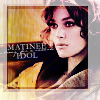
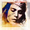
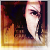

Today I have decided to work with this image to my left. It's Keira Knightley, as are a disproportionate number of my tutorials. She just does such lovely photoshoots.
This tutorial is for:
♥ PSP9 (but very translateable if you know your program).
♥ Moderate ability (nothing particularly complex, so if you don't know how to do something I describe, go back to icon_tutorial and raid the memories).
♥ Black and white images. Colour images won't work properly, so if you have a colour image, hit it with Adjust > Hue and Saturation > Colorize (my preference) > Hue: Whatever you like, Saturation: 0. You may also want to hit it with a Brightness/Contrast at about 30/30.
If the images aren't showing up, you can view the tutorial HERE. It ain't pretty, but it works. I think.

Duplicate that honey pie and set the upper one to Soft Light (100%).

Whack this gradient (by yours truly) between the two image layers set on Overlay (100%). You may also want to hit it with a Gaussian Blur (radius: 4) to smooth out any compression issues.

Merge the three layers (merge visible, preferably). I know this may go against the grain, but you're going to need to duplicate them en masse later, so they need to be merged and you may as well get it over with.
Create a new raster layer above your newly merged image and whack this texture (yes, by yours truly) onto it. Set it to Screen (100%--heck, unless I say so, all them layers are at 100%, y'hear?).
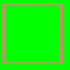
New raster layer, whack this border on and for the love of God delete the green bit. Set it to 50%.
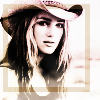
Now, duplicate your merged layer and drag it above the previous two layers. Set it to Soft Light. This is what your icon should thus far be looking like.
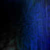
Another rater layer, another texture (mine!). Set this little beauty to Difference.
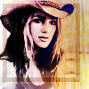
Now, on the original Matinee Idol icon, I had a blue layer on OVerlay here. As you can see, it looks a bit whack on Cowgirl!Keira. However, if your icon can handle it, anything from #141542 (dark) to #3e3f72 (lighter) would have a neat effect on the background colouring.
Second border layer. Delete the green bit (oh please, delete the green bit *tear*), set it to 60%.
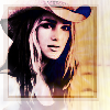
And there you have it! Do your crazy text thing, and you'll have an orfully cool icon.
Oh, and you should all check out the layouts at ellipsisicons (oh wait you're viewing it right now) and ellipsisblack, because they're pretty.


Today I have decided to work with this image to my left. It's Keira Knightley, as are a disproportionate number of my tutorials. She just does such lovely photoshoots.
This tutorial is for:
♥ PSP9 (but very translateable if you know your program).
♥ Moderate ability (nothing particularly complex, so if you don't know how to do something I describe, go back to icon_tutorial and raid the memories).
♥ Black and white images. Colour images won't work properly, so if you have a colour image, hit it with Adjust > Hue and Saturation > Colorize (my preference) > Hue: Whatever you like, Saturation: 0. You may also want to hit it with a Brightness/Contrast at about 30/30.
If the images aren't showing up, you can view the tutorial HERE. It ain't pretty, but it works. I think.

Duplicate that honey pie and set the upper one to Soft Light (100%).

Whack this gradient (by yours truly) between the two image layers set on Overlay (100%). You may also want to hit it with a Gaussian Blur (radius: 4) to smooth out any compression issues.

Merge the three layers (merge visible, preferably). I know this may go against the grain, but you're going to need to duplicate them en masse later, so they need to be merged and you may as well get it over with.

Create a new raster layer above your newly merged image and whack this texture (yes, by yours truly) onto it. Set it to Screen (100%--heck, unless I say so, all them layers are at 100%, y'hear?).

New raster layer, whack this border on and for the love of God delete the green bit. Set it to 50%.

Now, duplicate your merged layer and drag it above the previous two layers. Set it to Soft Light. This is what your icon should thus far be looking like.

Another rater layer, another texture (mine!). Set this little beauty to Difference.

Now, on the original Matinee Idol icon, I had a blue layer on OVerlay here. As you can see, it looks a bit whack on Cowgirl!Keira. However, if your icon can handle it, anything from #141542 (dark) to #3e3f72 (lighter) would have a neat effect on the background colouring.

Second border layer. Delete the green bit (oh please, delete the green bit *tear*), set it to 60%.

And there you have it! Do your crazy text thing, and you'll have an orfully cool icon.
Oh, and you should all check out the layouts at ellipsisicons (oh wait you're viewing it right now) and ellipsisblack, because they're pretty.