Tutorial #3
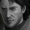
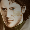
A simple way to "realistically" colorize black and white images.
From this:
To one of the following:


[+] Made in PSPXI, but easily translatable.
[+] Intermediate difficulty.
01. Start with your base. I've chosen an image of Otacon from the upcoming Metal Gear Solid 4 video game.

02. Duplicate your base and set it to Screen 100%.
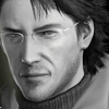
03. Depending on how dark your image is, you may want to repeat Step 02. I decided mine was still too dark, so I duplicated the current layer and kept it at Screen 100%.
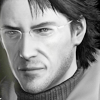
04. Duplicate your base layer and bring it to the top. Set it at Soft Light 100%. These steps help create some nice contrast.
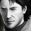
(Note: I will not be writing any instructions to sharpen the icon in this tutorial, as the image I am using is crisp enough not to require sharpening. However, if you do need to sharpen your image, generally, it's best to sharpen the more prominent features of the face - eyes, nose, mouth, edges - and soften everything else).
05. Now on to the colorization: we'll start with the skin. First, create a new layer. Take a soft round brush and paint over the face and other areas showing skin with a peach or other skintone color (I used #f3bea9 for a pale skintone, but it depends entirely on what you want the outcome to be).
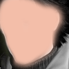
06. Set the layer at Overlay and adjust the opacity to your liking (I lowered mine to 66%). Erase any coloring that may have gone outside the lines.

07. I wanted the lips to slightly stand out from the rest of the skin coloring, so once again, I created a new layer and used a soft round brush to paint over the lips (I used the color #e6693e).
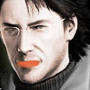
08. Again, set the layer to Overlay and adjust the opacity, erasing if needed. I lowered mine all the way to 20% for a more natural look.
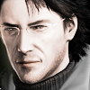
09. To color the eyes, paint a dot over each of the irises in the color of your choice (I used #067ca0). Set to Overlay and adjust the opacity if needed (I kept mine at 100%). Optional: adjusting the contrast of the eyes can help create a more dramatic effect.

Hopefully, you've noticed a pattern by now. To colorize an area, all you need to do is create a new layer, paint over the area with the color of your choice, and set the layer to Overlay. Simple enough concept, though it may take some tweaking of the hue and opacity (and possibly the contrast) to generate your desired outcome.
10. Finish colorizing any other parts you wish (makeup, clothes, etc.), using the same technique. I decided to give Otacon's turtleneck a nice hunter green color.
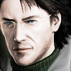
11. If you like, you may stop here and proceed to paste on textures and text. However, I wanted the icon to have a warmer tint, so I created a new layer, filled it with #f8b762 and set it to Hard Light 25%.
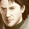
12. To add more contrast, Copy Merge all layers and paste as a new layer, setting at Soft Light 52%.
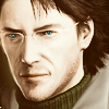
13. To create the text, I simply created a new layer and typed some small text in black, setting the layer to Overlay 100% and duplicating it.

14. Again, you can stop here if you wish, but I took it one step further and pasted a black/gray gradient (like this one) onto a new layer and set it at Hard Light 60% for a darker contrast.

And that's it! Like most other tutorials, this is not meant to be followed exactly as the coloring depends entirely on the image you're working with, but hopefully, it succeeded in giving you some direction. Feel free to post your own results!
Another example:

to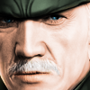
(Achieving white/gray hair is a bit difficult against skin, but so far, I've found that a light gray brush like #c7c7c7 works best. Then use the eraser with an extremely low opacity - we're talking 5% - on the skintone layer where the hair is.)
From this:
To one of the following:
[+] Made in PSPXI, but easily translatable.
[+] Intermediate difficulty.
01. Start with your base. I've chosen an image of Otacon from the upcoming Metal Gear Solid 4 video game.
02. Duplicate your base and set it to Screen 100%.
03. Depending on how dark your image is, you may want to repeat Step 02. I decided mine was still too dark, so I duplicated the current layer and kept it at Screen 100%.
04. Duplicate your base layer and bring it to the top. Set it at Soft Light 100%. These steps help create some nice contrast.
(Note: I will not be writing any instructions to sharpen the icon in this tutorial, as the image I am using is crisp enough not to require sharpening. However, if you do need to sharpen your image, generally, it's best to sharpen the more prominent features of the face - eyes, nose, mouth, edges - and soften everything else).
05. Now on to the colorization: we'll start with the skin. First, create a new layer. Take a soft round brush and paint over the face and other areas showing skin with a peach or other skintone color (I used #f3bea9 for a pale skintone, but it depends entirely on what you want the outcome to be).
06. Set the layer at Overlay and adjust the opacity to your liking (I lowered mine to 66%). Erase any coloring that may have gone outside the lines.
07. I wanted the lips to slightly stand out from the rest of the skin coloring, so once again, I created a new layer and used a soft round brush to paint over the lips (I used the color #e6693e).
08. Again, set the layer to Overlay and adjust the opacity, erasing if needed. I lowered mine all the way to 20% for a more natural look.
09. To color the eyes, paint a dot over each of the irises in the color of your choice (I used #067ca0). Set to Overlay and adjust the opacity if needed (I kept mine at 100%). Optional: adjusting the contrast of the eyes can help create a more dramatic effect.
Hopefully, you've noticed a pattern by now. To colorize an area, all you need to do is create a new layer, paint over the area with the color of your choice, and set the layer to Overlay. Simple enough concept, though it may take some tweaking of the hue and opacity (and possibly the contrast) to generate your desired outcome.
10. Finish colorizing any other parts you wish (makeup, clothes, etc.), using the same technique. I decided to give Otacon's turtleneck a nice hunter green color.
11. If you like, you may stop here and proceed to paste on textures and text. However, I wanted the icon to have a warmer tint, so I created a new layer, filled it with #f8b762 and set it to Hard Light 25%.
12. To add more contrast, Copy Merge all layers and paste as a new layer, setting at Soft Light 52%.
13. To create the text, I simply created a new layer and typed some small text in black, setting the layer to Overlay 100% and duplicating it.
14. Again, you can stop here if you wish, but I took it one step further and pasted a black/gray gradient (like this one) onto a new layer and set it at Hard Light 60% for a darker contrast.
And that's it! Like most other tutorials, this is not meant to be followed exactly as the coloring depends entirely on the image you're working with, but hopefully, it succeeded in giving you some direction. Feel free to post your own results!
Another example:
to
(Achieving white/gray hair is a bit difficult against skin, but so far, I've found that a light gray brush like #c7c7c7 works best. Then use the eraser with an extremely low opacity - we're talking 5% - on the skintone layer where the hair is.)