TUTORIAL: manga colouring: the "don't"s (part 1) »

WARNING: Disgusting result and large images.
Don't you have requests to finish?
Next question ...
What the hell is this?
This is a learning experience!! Hello, friend, welcome to epicfail. This is the first part of my series on Manga Colouring: The "Don't"s, wherein I demonstrate shit you should never think about doing.
Oh god.
That's right!!!! Now, let's begin.
Step 1.
Getcher base. Anything you think can be feasibly turned into something hideous will do. I'm going to use this picture of Estelle from the Tales of Vesperia manga. She has no idea what she's in for!
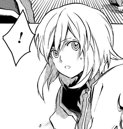
Step 2.
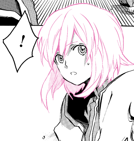
So, now you make a Multiply layer above the lineart. Pick a nice colour, like pink, and start colouring all over her hair. Make sure you get all the lines and all the inbetween bits. Like in this image. Then set this layer to Screen at 100% opacity. Just for the record, everything in this tutorial will be at 100% opacity. :)
Your result should look something like the following!! We're off to a great start.
Step 3.
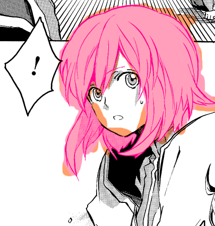
Now pick a colour similar to the one you used in the last step. Preferably a little lighter. Make a Multiply later above the lineart and below the Screen layer. Start colouring in the hair.
Yeah, yeah that looks pretty cool. But I wanted to add a little PIZAZZZZZ to it, so I modified the colours slightly, as you can see now.
Step 4.
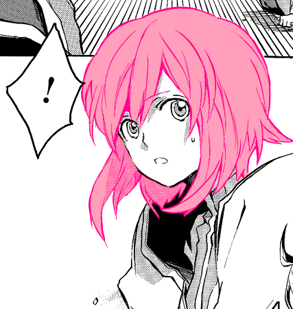
As awesome as the orange bits look, you are not 3 year olds. Erase (using the eraser tool!!) all that isn't supposed to be there. That means the stuff outside the lines.
Step 5.
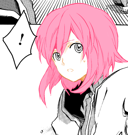
With that done, we can move onto the skin. Create a new Screen layer (100% opacity remember!!!), and use a deep orange colour. Colour in the face, including the lines, like we did before! And then, clean it up.
Step 6.
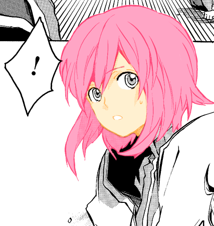
Now create a Multiply layer (100% opacity!) below that Screen layer, and using a pink-ish colour, start colouring. This is the point where you notice if you've screwed up. It's okay, go back to the other layers and fix it until it looks ... uh ... I'm not going to say good. Until it looks like the following! Now we're almost there.
Step 7.
We make a new layer and we start colouring in the eyes, following the exact same principle, okay?
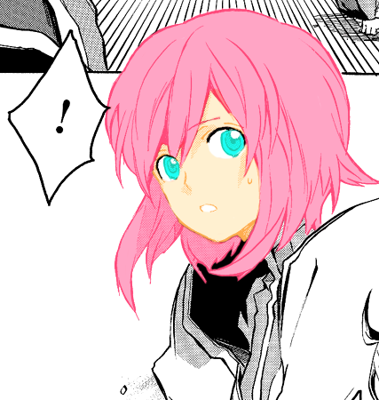
That's hot.
Step 8.
Okay so now we resize and crop it to icon-size. I'm not fucking explaining how to do that. Now you notice since we haven't done the clothes it might look a little shoddy!! Not to worry, you can crop it creatively.
Like so:

Step 9.
Now all that's left is some cool effects. Make a Selective Colouring layer and play around with the Reds and Yellows. To make the colours pop. And if that's not enough, you can also create a Hue/Saturation layer! Set the Saturation to +15 and you're all set. Or are you!?!?!? (No.)
There's only one more thing that this icon needs. And that is a gray texture set to Multiply at whatever opacity you like. I am going to use this lovely texture by palebird.
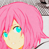
And there you have it, folks. An absolutely disgusting icon. ALL RIGHT HIGH FIVE!!