inquisitory ✭ 17; i loved you first
First real tutorial here and I'm v. excited to be on the team! \o/
Request by aurturius ♥
Go from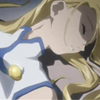
to
in Photoshop. Uses Color Balance, so it should be translatable.
Like most of my Tales icons these days, this one was a reject for talesof_battle :') But hey, it turned out pretty OK anyway and is very simple to make (unlike most of my icons these days, lawl)! I can't seem to find the full image atm, but here's the base:

Quite plain and kind of dark, right? I felt spicing up the contrast before messing with fill layers would be best in this case~ First, a duplicate on Screen, 80%, erasing parts with a soft brush that became too light from the change. If you want, you can split this up into two 40% layers and erase different parts on each; see what works best for your image.
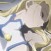
Add two more duplicates, both on Soft Light, 100%, again paying attention to the values in the icon. If it looks funky, don't be afraid to erase/blur parts; remember that guys, it's my #1 iconing rule besides abusing Exclusion~
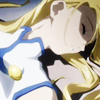
Speaking of abusing Exclusion, that's the next step %D Great timing on my part *shot* Errrrr add #000A54 on Exclusion, 100% TWICE for this:
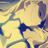
The aim was to make the colouring bluish on this image; blue tends to work on most Legendia images and that makes me happy ♥ To balance out how obviously washed out it is, try an Overlay, 100% duplicate that's desaturated.
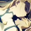
This provides a good opportunity to make a point about desaturated duplicates. What desaturating tends to do is bring out more details in the shading and such that you might want to take advantage of, as I did here, but it really depends on your image - some icons will benefit more from keeping the colours intact. Heck, you could always just boost the brightness/contrast on the duplicate instead :x But enough with the nuances of desaturating, I'm sure you all want to move on. A Hue/Saturation... adjustment layer with saturation boosted to 39 should be enough to counteract the desaturated-ness while still keeping the shading.
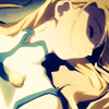
Preeeeetty~ You could stop here, but I feel more could be done to the image, don't you? Color Balance... adjustment layers are ftw and should be used more often, srsly.
Midtones: -37, 0, +30
Highlights: +17
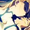
One final adjustment layer and we're finished! Brightness/Contrast... should be adjusted as follows:
Brightness: -18
Contrast: 10

That was so refreshing to write, I haven't written a tutorial using less than 10 steps for a while %D And since it is short, you should be even more motivated to try it and show me, yes? *subliminal messaging GO*
Other examples:
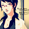
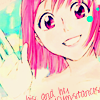

I encourage you to go play around and show me your finished icons! DOOO IIIIIIT, I wanna see what you guys come up with~
If you like what you see, why not friend ewidentnie for future updates?
Request by aurturius ♥
Go from

to

in Photoshop. Uses Color Balance, so it should be translatable.
Like most of my Tales icons these days, this one was a reject for talesof_battle :') But hey, it turned out pretty OK anyway and is very simple to make (unlike most of my icons these days, lawl)! I can't seem to find the full image atm, but here's the base:

Quite plain and kind of dark, right? I felt spicing up the contrast before messing with fill layers would be best in this case~ First, a duplicate on Screen, 80%, erasing parts with a soft brush that became too light from the change. If you want, you can split this up into two 40% layers and erase different parts on each; see what works best for your image.

Add two more duplicates, both on Soft Light, 100%, again paying attention to the values in the icon. If it looks funky, don't be afraid to erase/blur parts; remember that guys, it's my #1 iconing rule besides abusing Exclusion~

Speaking of abusing Exclusion, that's the next step %D Great timing on my part *shot* Errrrr add #000A54 on Exclusion, 100% TWICE for this:

The aim was to make the colouring bluish on this image; blue tends to work on most Legendia images and that makes me happy ♥ To balance out how obviously washed out it is, try an Overlay, 100% duplicate that's desaturated.

This provides a good opportunity to make a point about desaturated duplicates. What desaturating tends to do is bring out more details in the shading and such that you might want to take advantage of, as I did here, but it really depends on your image - some icons will benefit more from keeping the colours intact. Heck, you could always just boost the brightness/contrast on the duplicate instead :x But enough with the nuances of desaturating, I'm sure you all want to move on. A Hue/Saturation... adjustment layer with saturation boosted to 39 should be enough to counteract the desaturated-ness while still keeping the shading.

Preeeeetty~ You could stop here, but I feel more could be done to the image, don't you? Color Balance... adjustment layers are ftw and should be used more often, srsly.
Midtones: -37, 0, +30
Highlights: +17

One final adjustment layer and we're finished! Brightness/Contrast... should be adjusted as follows:
Brightness: -18
Contrast: 10

That was so refreshing to write, I haven't written a tutorial using less than 10 steps for a while %D And since it is short, you should be even more motivated to try it and show me, yes? *subliminal messaging GO*
Other examples:


I encourage you to go play around and show me your finished icons! DOOO IIIIIIT, I wanna see what you guys come up with~
If you like what you see, why not friend ewidentnie for future updates?