inquisitory ✭ 48; too much sugar for my sweet tooth.
It seems like I'm doing one tutorial a month asdflkajs. This will not do :'D I would try to speed up but school is getting crazier and crazier orz. Um, have this to tide you over until whenever I can next get a moment to write a tutorial;;;;
Request by almateria~ ♥
start
to finish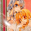
program Photoshop. Uses Channel Mixer and Color Balance, so it should be translatable.
✎ abbreviations/terms
AL ➝ adjustment layer
CM ➝ channel mixer
BC ➝ brightness/contrast
CB ➝ color balance
HS ➝ hue/saturation
for example, SC/AL will mean Selective Color Adjustment Layer.
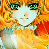
It was from this piece of Arina Tanemura art that I chose to make my base~

Cropped out Maora because it just looked better that way :') Okay, let's start with a Soft Light, 100% duplicate.
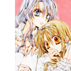
Yeahhh contrast! 8D The dull colours are kinda pretty, but if we boost 'em up, it follows that it will be even prettier! Do just that with a HS/AL and Saturation up to 30.
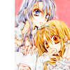
Their skin is getting kind of crazy white now, so we should try using #f3e6da to get it back on track. Multiply, 100% will do it, along with adding a nice sidebar!
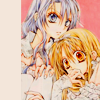
Next, it's time for a couple CM/ALs! \o/ First, with settings by whiz, that go like this:
Red: 96, 10, -10, 0
Green: 28, 71, -1, 0
Blue: -1, 8, 85, 0
Set these to 50% and you're good to go... on to the next step, that is! >:D
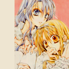
Let's bring out the reds and pinks some more with the next CM/AL, settings by xxsecretive and opacity to 80%:
Reds: 110, 32, -46, 0
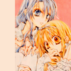
Awwright, now I think it's time to add something to the side! After fishing around a bit in my ever-so-large texture folders, I came across this ribbon-like thing by eveningwalk. Rotate it to fit your sidebar and cut off the excess with the Rectangular Marquee tool. Then you'll want to use an HS/AL with a clipping mask on it (to attach it to the bar only and not the whole picture; right-click the layer to do this) to move Saturation to -11 and avoid further eye-burning when this icon is finished xD
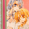
As long as my instructions back there didn't confuse you to death, we can move on xD Let's add some shinies with this texture by hellodarliing on Lighten, 100%. Rotate to your liking and take a soft brush to erase the bits you don't like, so you end up with something like this:
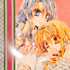
Not to pimp out myself or anything too much, but uh, I happened to use my own scribbles (full set here orz) in the corner. idk, it just breaks up the monotony of the ribbon texture?? You may have to adjust the Levels on the texture to make it show up more (drag the white slider to the left).
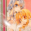
This was another icon for manga_battle that required a red colour scheme, so following are the last adjustments to accomplish that. First, #e0e0e0 on Color Burn, 100%~
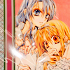
and for some doofy reason I put the next settings all in one image alfdjhsal. but ANYWAY
Take a BC/AL with Brightness to -14 and Contrast to 26, and the next two CB/AL, each on its own AL, and you're finito! \o/
Midtones: 16, 0, -8
Shadows: -13, 0, -9
Midtones: -100, 0, 16
Highlights: 4, 0, -5

✖ other examples
try it out! then friend us?
Request by almateria~ ♥
start

to finish

program Photoshop. Uses Channel Mixer and Color Balance, so it should be translatable.
✎ abbreviations/terms
AL ➝ adjustment layer
CM ➝ channel mixer
BC ➝ brightness/contrast
CB ➝ color balance
HS ➝ hue/saturation
for example, SC/AL will mean Selective Color Adjustment Layer.
It was from this piece of Arina Tanemura art that I chose to make my base~

Cropped out Maora because it just looked better that way :') Okay, let's start with a Soft Light, 100% duplicate.

Yeahhh contrast! 8D The dull colours are kinda pretty, but if we boost 'em up, it follows that it will be even prettier! Do just that with a HS/AL and Saturation up to 30.

Their skin is getting kind of crazy white now, so we should try using #f3e6da to get it back on track. Multiply, 100% will do it, along with adding a nice sidebar!

Next, it's time for a couple CM/ALs! \o/ First, with settings by whiz, that go like this:
Red: 96, 10, -10, 0
Green: 28, 71, -1, 0
Blue: -1, 8, 85, 0
Set these to 50% and you're good to go... on to the next step, that is! >:D

Let's bring out the reds and pinks some more with the next CM/AL, settings by xxsecretive and opacity to 80%:
Reds: 110, 32, -46, 0

Awwright, now I think it's time to add something to the side! After fishing around a bit in my ever-so-large texture folders, I came across this ribbon-like thing by eveningwalk. Rotate it to fit your sidebar and cut off the excess with the Rectangular Marquee tool. Then you'll want to use an HS/AL with a clipping mask on it (to attach it to the bar only and not the whole picture; right-click the layer to do this) to move Saturation to -11 and avoid further eye-burning when this icon is finished xD

As long as my instructions back there didn't confuse you to death, we can move on xD Let's add some shinies with this texture by hellodarliing on Lighten, 100%. Rotate to your liking and take a soft brush to erase the bits you don't like, so you end up with something like this:

Not to pimp out myself or anything too much, but uh, I happened to use my own scribbles (full set here orz) in the corner. idk, it just breaks up the monotony of the ribbon texture?? You may have to adjust the Levels on the texture to make it show up more (drag the white slider to the left).

This was another icon for manga_battle that required a red colour scheme, so following are the last adjustments to accomplish that. First, #e0e0e0 on Color Burn, 100%~

and for some doofy reason I put the next settings all in one image alfdjhsal. but ANYWAY
Take a BC/AL with Brightness to -14 and Contrast to 26, and the next two CB/AL, each on its own AL, and you're finito! \o/
Midtones: 16, 0, -8
Shadows: -13, 0, -9
Midtones: -100, 0, 16
Highlights: 4, 0, -5

✖ other examples


try it out! then friend us?