Tutorial
PS CS2

->
SIMILAR COLORING
With some layers deleted and modified
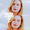
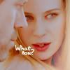

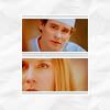

I admire all who has the patience to read through it =P
BASE
I got a very " washed out / flat " base. To make it better I duplicated it several times and played with blend modes. I usually use screen to make it lighter, multiply to make it darker and soft light / overlay to get some more contrast.
- First copy: screen, 100%
- Second copy: multiply: 40%
- Third copy: soft light 80%


COLORING
*Take a deep breath*
CURVES
rgb= input: 108 output: 134
red= input: 41 output: 53 & input: 191 output: 191
green= input: 135 output: 132
blue= input: 159 output: 150
CURVES
rgb= input: 11 output: 2 & input: 143 output: 165
SELECTIVE COLOR (blue shine)
Reds: -20 0 50 0
Yellows: -30 15 -20 20
Whites: 100 -50 -100 0
Neutrals: 0 0 0 -10
------------------------------> 50% opacity!
COLOR BALANCE (blue shine)
Shadows: 0 0 10
Midtones: 0 0 -20
Highlights: 0 0 10
HUE SATURATION
Master saturation: 10
CURVES
rgb= input: 21 output: 0 & input: 255 output: 243
red= input: 141 output: 131
green= input: 132 output: 140
blue= input: 65 output: 62 & input: 194 output: 191
------------------------------> 50% opacity!
LEVELS
rgb input levels: 0 0.82 243
red input levels: 6 0.93 255
blue input levels: 0 0.76 227
------------------------------> Set on pin light
------------------------------> Duplicate the levels layer and set on normal, 25% opacity
COLOR FILL LAYER
#f0f0f0 on color burn 100% opacity
COLOR FILL LAYER
#ffbbbb on soft light 50% opacity
PHOTO FILTER
Cooling filter (82), density 10%
HUE SATURATION
Master saturation: 10
CURVES
rgb= input: 255 output: 231
red= input: 105 output: 102
blue= input: 64 output: 71 & input: 214 output: 216
BRIGHTNESS/CONTRAST
Brightness: 0
Contrast: +10
COLOR BALANCE
Midtones: 0 0 -10
Highlights: 0 -20 -20
COLOR FILL LAYER
#e0b69d on multiply 50% opacity
CURVES
rgb= input: 71 output: 90
COLOR FILL LAYER
#dec5aa on multiply 30% opacity
CURVES
rgb= input: 85 output: 124
red= input: 114 output: 140
green= input: 131 output: 126
blue= input: 134 output: 114
------------------------------> 50% opacity!
CURVES
blue= input: 108 output: 143
------------------------------> 10% opacity!
PHOTO FILTER
Cooling filter (82), density 8%
BRIGHTNESS/CONTRAST
Brightness: 3
Contrast: 5
BLUR & SHARPEN
Add a new layer. Copy merge everything in that layer (press crtl+alt+shift+E). Blur and sharpen where needed! I've blurred the left part because I'm going to put a texture on there and didn't want House to shine through it.

TEXTURE
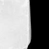
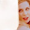
The easiest step =P Just set this texture (I made it...) on screen:
TEXT
Take your eyedropper tool and pick 2 colors from your icon. Use those 2 colors for the text. I used the font BadaBoom in 2 different sizes. Then rotate the text by going to 'edit' - 'free transform'. That made the text slightly blurry so I sharpened it a litle bit.


->

SIMILAR COLORING
With some layers deleted and modified


I admire all who has the patience to read through it =P
BASE
I got a very " washed out / flat " base. To make it better I duplicated it several times and played with blend modes. I usually use screen to make it lighter, multiply to make it darker and soft light / overlay to get some more contrast.
- First copy: screen, 100%
- Second copy: multiply: 40%
- Third copy: soft light 80%


COLORING
*Take a deep breath*
CURVES
rgb= input: 108 output: 134
red= input: 41 output: 53 & input: 191 output: 191
green= input: 135 output: 132
blue= input: 159 output: 150
CURVES
rgb= input: 11 output: 2 & input: 143 output: 165
- YAY brighter and softer colors!

SELECTIVE COLOR (blue shine)
Reds: -20 0 50 0
Yellows: -30 15 -20 20
Whites: 100 -50 -100 0
Neutrals: 0 0 0 -10
------------------------------> 50% opacity!
COLOR BALANCE (blue shine)
Shadows: 0 0 10
Midtones: 0 0 -20
Highlights: 0 0 10
HUE SATURATION
Master saturation: 10
CURVES
rgb= input: 21 output: 0 & input: 255 output: 243
red= input: 141 output: 131
green= input: 132 output: 140
blue= input: 65 output: 62 & input: 194 output: 191
------------------------------> 50% opacity!
- So far!

LEVELS
rgb input levels: 0 0.82 243
red input levels: 6 0.93 255
blue input levels: 0 0.76 227
------------------------------> Set on pin light
------------------------------> Duplicate the levels layer and set on normal, 25% opacity
COLOR FILL LAYER
#f0f0f0 on color burn 100% opacity
COLOR FILL LAYER
#ffbbbb on soft light 50% opacity
PHOTO FILTER
Cooling filter (82), density 10%
HUE SATURATION
Master saturation: 10
- So far!

CURVES
rgb= input: 255 output: 231
red= input: 105 output: 102
blue= input: 64 output: 71 & input: 214 output: 216
BRIGHTNESS/CONTRAST
Brightness: 0
Contrast: +10
COLOR BALANCE
Midtones: 0 0 -10
Highlights: 0 -20 -20
- So far!

COLOR FILL LAYER
#e0b69d on multiply 50% opacity
CURVES
rgb= input: 71 output: 90
COLOR FILL LAYER
#dec5aa on multiply 30% opacity
- So far!

CURVES
rgb= input: 85 output: 124
red= input: 114 output: 140
green= input: 131 output: 126
blue= input: 134 output: 114
------------------------------> 50% opacity!
CURVES
blue= input: 108 output: 143
------------------------------> 10% opacity!
PHOTO FILTER
Cooling filter (82), density 8%
BRIGHTNESS/CONTRAST
Brightness: 3
Contrast: 5
- You made it!

BLUR & SHARPEN
Add a new layer. Copy merge everything in that layer (press crtl+alt+shift+E). Blur and sharpen where needed! I've blurred the left part because I'm going to put a texture on there and didn't want House to shine through it.

TEXTURE
The easiest step =P Just set this texture (I made it...) on screen:


TEXT
Take your eyedropper tool and pick 2 colors from your icon. Use those 2 colors for the text. I used the font BadaBoom in 2 different sizes. Then rotate the text by going to 'edit' - 'free transform'. That made the text slightly blurry so I sharpened it a litle bit.
