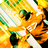
tutorial; bright coloring (NYPD Blue)
Going from this to 
Using PSP 8. Slightly image heavy. NO CURVES!
MADE EASY AND DESCRIBED IN FULL!
01: Choose your pic/cap. Mine's a pic someone (going by the name of NYPDWife) took on set of NYPD Blue which I got from nypdblue[dot]org.
Now rather than cropping it like a boring person, I rotated it 40% left (done by going to 'image>rotate>free rotate' and clicking 'left' and typing in 40%). This is to make the icon more interesting (and take my attention away from the fact that the perp's arm is in Charlotte Ross's face!). Then you just need to crop it and resize to 100x100 pixels:
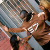
02: Let's jump straight into the coloring, as I think it's what makes an icon. I tend to go for really bright colors, so this tutorial should be no surprise! First layer is a pinkish red:

Set it to overlay, 100%
What's that? Yours looks totally awful and you want to close my tutorial and try another one? IT'S SUPPOSED TO LOOK AWFUL! I will fix it laters, at the moment it looks like this:
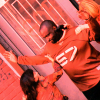
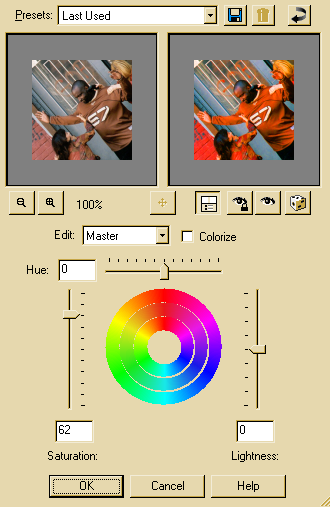
03: I told you I'd fix it, and here we are. Select the base (in my case, the cropped image of Rita, Connie and the perp, but yours should be A DIFFERENT PICTURE because otherwise, it's copying me isn't it? :P) and duplicate it (right click on the base in the layers toolbar and select duplicate). Drag this to the top of the layers toolbar. Set it to screen. You should see an improvement straight away. Then, making sure you're still on the screened layer, increase the saturation. Press ctrl+h at the same time to get the tool open (I dunno where it is in PS) and select 60% saturation.
This is what the tool should look like:
Duplicate this layer.
You will now have something like this:
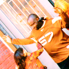
04: Now for the rest of the coloring, as it looks a bit bland at the moment.
These colors on seperate layers:

AND
Both set to burn, 100%
This is what you'll have:
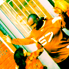
MERGE LAYERS!
05: I want to add a little something to the icon, but I really hate it when a whole icon is taken over by texture. Then, everyone knows which texture you used, and it makes a whole bunch of icons look exactly the same. Which is why I love ianthinae's light textures!
I used this one:
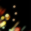
(I think I rotated it... I'm not actually sure).
And set it to screen 100%. Then duplicate the base (if you merged layers, this should be the full icon! Not the original pic, or you lose some of the coloring!) and drag it so it's top layer. Set it to soft light 100%.
You can add text if you like, but I decided not to. Here's my end result:

NOT DESCRIBED IN FULL
01: Choose your pic/cap. Rotated by 40% left. Crop & Resize to 100x100 pixels.

02: First layer pinkish red (#F87070):

Set to overlay, 100%

03: Base duplicated. Increase saturation to 60%. Drag layer to top and set to screen, 100%. Duplicate again.
This is what it should look like:

04: Mint green layer (#58FAA4) set to burn, 100%

Tan layer (#F4E19E) set to burn, 100%

MERGE LAYERS!
05: Light texture by ianthinae set to screen, 100%

(I think I rotated it... I'm not actually sure).
Duplicate merged base and drag onto the top. Set to softlight, 100%
Here's my end result:


Using PSP 8. Slightly image heavy. NO CURVES!
MADE EASY AND DESCRIBED IN FULL!
01: Choose your pic/cap. Mine's a pic someone (going by the name of NYPDWife) took on set of NYPD Blue which I got from nypdblue[dot]org.
Now rather than cropping it like a boring person, I rotated it 40% left (done by going to 'image>rotate>free rotate' and clicking 'left' and typing in 40%). This is to make the icon more interesting (and take my attention away from the fact that the perp's arm is in Charlotte Ross's face!). Then you just need to crop it and resize to 100x100 pixels:

02: Let's jump straight into the coloring, as I think it's what makes an icon. I tend to go for really bright colors, so this tutorial should be no surprise! First layer is a pinkish red:

Set it to overlay, 100%
What's that? Yours looks totally awful and you want to close my tutorial and try another one? IT'S SUPPOSED TO LOOK AWFUL! I will fix it laters, at the moment it looks like this:

03: I told you I'd fix it, and here we are. Select the base (in my case, the cropped image of Rita, Connie and the perp, but yours should be A DIFFERENT PICTURE because otherwise, it's copying me isn't it? :P) and duplicate it (right click on the base in the layers toolbar and select duplicate). Drag this to the top of the layers toolbar. Set it to screen. You should see an improvement straight away. Then, making sure you're still on the screened layer, increase the saturation. Press ctrl+h at the same time to get the tool open (I dunno where it is in PS) and select 60% saturation.
This is what the tool should look like:

Duplicate this layer.
You will now have something like this:

04: Now for the rest of the coloring, as it looks a bit bland at the moment.
These colors on seperate layers:

AND

Both set to burn, 100%
This is what you'll have:

MERGE LAYERS!
05: I want to add a little something to the icon, but I really hate it when a whole icon is taken over by texture. Then, everyone knows which texture you used, and it makes a whole bunch of icons look exactly the same. Which is why I love ianthinae's light textures!
I used this one:

(I think I rotated it... I'm not actually sure).
And set it to screen 100%. Then duplicate the base (if you merged layers, this should be the full icon! Not the original pic, or you lose some of the coloring!) and drag it so it's top layer. Set it to soft light 100%.
You can add text if you like, but I decided not to. Here's my end result:

NOT DESCRIBED IN FULL
01: Choose your pic/cap. Rotated by 40% left. Crop & Resize to 100x100 pixels.

02: First layer pinkish red (#F87070):

Set to overlay, 100%

03: Base duplicated. Increase saturation to 60%. Drag layer to top and set to screen, 100%. Duplicate again.
This is what it should look like:

04: Mint green layer (#58FAA4) set to burn, 100%

Tan layer (#F4E19E) set to burn, 100%

MERGE LAYERS!
05: Light texture by ianthinae set to screen, 100%

(I think I rotated it... I'm not actually sure).
Duplicate merged base and drag onto the top. Set to softlight, 100%
Here's my end result:
