Challenge #7: Round #6 Results
The votes are in and here are the results. Also thank you to all those who voted :)
Eliminated:
tvnet222 : -5

People's choice:
looni_ma : +3

Mod's choice:
None.
1.-5
2.-2+2=0
3.-1+4=+3
4.-2+1=-1
5.-2+1=-1
6.-4
If your icon number is not listed, you received no votes. Congratulations :)
Comments:
Eliminate:
1 - icon is boring and colors are dull
6 - too much light and bad cropping
#4 - beautiful use of textures, but the colors too dark and because of them icon looks dirty and untidy
#5 - the scratch texture doesn't fit the icon and and the girl's face either, too dark colors and the icon looks a bit empty
3 - the texture over her face doesn't fit
6 - her face looks very washed out and also a bad crop
#1, the colouring of the icon does not make the model stand out. She blends in with the background too much and the reddish hue of the icon is not vibrant enough.
#6, the colouring of the icon looks too washed out. Cropping is not as interesting.
#1 - too red coloring, the crop isn't good
#2 - oversharpened, too pale
#1 - uninspired cropping and the coloring is too saturated and bright.
#6 - akward cropping and too brightly colored. She seems like a ghost.
01 -- dull crop and color is too red
02 -- too much contrast and poor textures
4: the texture is a little heavy
5: her face could use a little more contrast
To keep:
3: the cropping and soft coloring is beautiful
03 -- i love the crop and coloring, and the little bit of textures is a nice accent
#5 - The contrast is amazing and I also like the cloudy texture a lot
#4 - awesome texture usage
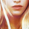
#3, cropping is unique and interesting. Colouring is nice and pretty. It brings out the colour of her lips and makes her look delicate. Texture use is simple and minimal, thus keeping to the ethereal feel of the icon.
2 - creative use of texture and good use of black and white
#3 - good crop, nice use of textures and lovely colors
2 - very interedting idea.
Good luck to everyone next round :)
Eliminated:
tvnet222 : -5

People's choice:
looni_ma : +3

Mod's choice:
None.
1.-5
2.-2+2=0
3.-1+4=+3
4.-2+1=-1
5.-2+1=-1
6.-4
If your icon number is not listed, you received no votes. Congratulations :)
Comments:
Eliminate:
1 - icon is boring and colors are dull
6 - too much light and bad cropping
#4 - beautiful use of textures, but the colors too dark and because of them icon looks dirty and untidy
#5 - the scratch texture doesn't fit the icon and and the girl's face either, too dark colors and the icon looks a bit empty
3 - the texture over her face doesn't fit
6 - her face looks very washed out and also a bad crop
#1, the colouring of the icon does not make the model stand out. She blends in with the background too much and the reddish hue of the icon is not vibrant enough.
#6, the colouring of the icon looks too washed out. Cropping is not as interesting.
#1 - too red coloring, the crop isn't good
#2 - oversharpened, too pale
#1 - uninspired cropping and the coloring is too saturated and bright.
#6 - akward cropping and too brightly colored. She seems like a ghost.
01 -- dull crop and color is too red
02 -- too much contrast and poor textures
4: the texture is a little heavy
5: her face could use a little more contrast
To keep:
3: the cropping and soft coloring is beautiful
03 -- i love the crop and coloring, and the little bit of textures is a nice accent
#5 - The contrast is amazing and I also like the cloudy texture a lot
#4 - awesome texture usage
#3, cropping is unique and interesting. Colouring is nice and pretty. It brings out the colour of her lips and makes her look delicate. Texture use is simple and minimal, thus keeping to the ethereal feel of the icon.
2 - creative use of texture and good use of black and white
#3 - good crop, nice use of textures and lovely colors
2 - very interedting idea.
Good luck to everyone next round :)