R1 Challenge #4: Results
ELLIMINATED:

by simpleflower
Sad to see you go! Please stick around to vote & thanks for participating :)
FAVOURITE:

by navi_glow (thanks!)
VOTING TALLY:
(-1 point per negative vote, +3 points per positive vote)
1.- + = 2
2.- - - = -3
3.- + = 2
4.+ - - - = 0
5.+ + - - = 4
COMMENTS:
1.
-I like how well defined the red is in this one, but everything else seems a bit dull in contrast.
+Very simple and nice colouring
2.
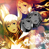
-The yellow/pink colouring is a little sickly. Ashe has a strange green patch on her hair. The text is blurry and the overall icon is too crowded.
-The coloured image is a little too sharpened; the black and white crops are distracting.
-The black/white circles in the middle of the icon is too dark and you could have balanced the black/white picture more out, the contrast should have been better.
3.
-the overall icon is blurred, The cropping emphasises the gap between Basch and Balthier
+An interesting crop enhanced the impact of the simplicity of the icon while the use of varying textures maintained a unique quality.
4.
+Love the misty, high-contrast effect
+This one's a bit dark, so you can't see the detail very well. I still like it, but it seems like it needs some text or something to give it a focal point.
-The icon is too dark and the images look oversharpened.
-The picture is too dark and it's difficult to see anything on that icon.
5.
-The aspect ratio seems a little off and the light textures don't help the icon much, I would say that the icon may have been better without it.
-The coloured image is a little too sharpened; the black and white crops are distracting.
+I really love the color scheme and texure use in this one. It's unique and eyecatching. :)
+This icon is fabulous! The texture is lovely, the contrast and the brightness is well balanced and the colors are gorgeous.
New challenge up soon :)