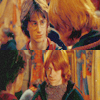
Tutorial #2 ft. Harry Potter and Ron Weasley
Requested by the lovely
mkiux. <33 [for the icon im using]
I tried to recreate it, though it doesn't look like the original, does it?
Turn this into
First, crop your base and duplicate it once. (It depends on your base. If its too dark, you might want to duplicate it twice or more, and you'll probably need one softlight layer for later on.)
Create a new Layer and fill it with E3D0A2. Set it to Softlight 95.
Go to Layers and make a new Selective Colour Layer.
Settings:
Reds: -100, 0, 15, 0
Yellows: -21, -13, 4, 0
Neutrals: 21, 2, -33, 0
Make another one.
Settings:
Reds: -18, 7, 6, 4
And another one.
Settings:
Reds: 0, 0, 0, -8
Neutrals: 5, -3, -4, 6
Blacks: 18, 0, 0, 0
Create a new layer and fill it with E6E6E6 and set it to Colour Burn 100.
Go to Layers and make a new Curves Layer
Settings:
RGB: 80, 78
Then, make a Colour Balance Layer:
Settings:
Midtones: 9, 13, 29
Highlights: 0, 0, -17
Make a Selective Colour layer.
Settings:
Reds: -29, 0, 5, 6
Neutrals: 10, -5, -10, 0
A new Curves Layer. (// means another point)
Settings:
RGB: 114, 136//74, 93
Green: 147, 158//66, 67
Blue: 224, 225//75, 82
Set to Normal 50
And finally a Brightness/Contrast layer.
Settings:
Brightness: -7
Contrast: -5
As i said at the beginning, you might want to add a softlight layer above your screen layers so the icon wontlook too washed out.
This tutorial is mostly for warm, yellowish icons, preferably screencaps.
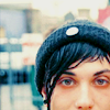
Icons made by the same tutorial.