41. ask the maker
Requested by lady_kingsley and the example icon requested by anassa_anemou at Ask The Maker 6.0

For this guide I'm going to assume you have a good understanding of Photoshop and a basic understanding of how to make gifs, if not this is a great tutorial that covers the bare-basics.
Planning
To start with you want to have a general idea of how you want your icon to look. It's harder to play around with composition, textures and colouring after you've animated because you'll need to consider each frame not just each layer, furthermore each filter and layer you add is going to be adding to the file size, so it's good to plan to what will keep that icon under 40kb.
My tips for colouring and composition that will aid in smaller file sizes:
- Use negative space. The more of your icon that doesn't move the smaller the resulting file.
- Borders for animated clips are a great idea to preserve image quality without resulting in a huge file.
- Try to limit your textures to one or two as more tones = more kb.
- Make your colouring feature as few colours as possible, and always consider greyscale a valid option. After optimization having more colours and tones will result in a grainy low-quality icon if you're not careful. Just because you are making a gif icon doesn't mean you automatically get a free-pass to make your icon very low quality.
- High contrast is great because of the loss of detail during optimization and it also helps lower the number of tones in the icon.
In my example I'll be using my concept was to have the character 'devoid of emotion', and since I wanted to work with tv-static for a while at that time I decided that it would be a great way to demonstrate my concept. I decided that I would have the character's face as tv-static as the face is the part of the body that primarily displays emotion and I chose Castiel from Supernatural as the character due to his characteristic clothes, so he could be recognised without his face.
Concept sketch:
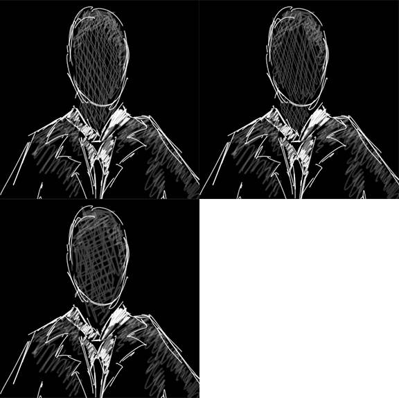
You can see that I'm employing negative space and greyscale, as well as keeping as much of the icon stationary as possible to keep the file size small.
Construction
For the tv-static in the example icon I've gone to google and typed in "tv-static", refined the search to animated and this caught my eye. I'll be using this as my screencap, it already has good contrast and a nice dark background so I can be sloppy with my editing.
Now I'm going to create a mask to put over the static with the face as transparent to do this:
- Crop the screencap (I like to work in 100x100 but you can always do this step last)
- Desaturate using your preferred method (I use a black and white gradient map)
- Lighten and increase the contrast of the image using your preferred method(s) (I use curves and do it all in one step)
- Smooth out any pixelated edges using a blur tool
- Clean up the background
- Merge all layers if they are not already merged and duplicate. Erase the character's face (I find having a brightly coloured layer underneath allows me to see where I've erased easier)
This process:
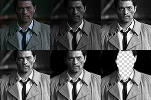
Open your tv-static gif in another window and move all the layers in order across to your icon (I crop the gif first so I have more control over the static size), make the mask layer the top layer and reanimate using the same time lapse per-frame as the original gif (I increased mine from 0.0 to 0.01 because I find 0.0 too fast)
The result:

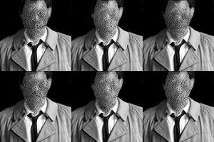
I found this a little flat so I added a new layer and painted in some shadows and highlights where they were in the original screencap. I blended them in using the smudge tool and set to 70% opacity
The result:
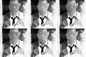
Problem was now I found this a little boring so I added this texture and this texture (I can't remember who made them sorry!) both set to screen and used the burn tool to clear away some areas that were a little grey and saved for web!
Result:
Optimizing your gif
"But Hannah", you ask, "what do I do if my icon is too big for Livejournal standards?"
Well dear person reading this guide, let me suggest some ways to compress your file!
Change the number of colours in optimization
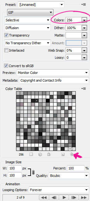
Circled in pink is the common number of colours you can select for your gif. The more colours the greater the file size. Keep in mind that once you start to decrease this number you will lose image quality as Photoshop fills in those gaps with similar colours or tones. I recommend never going less than 64 for a greyscale icon (32 if you have lots of negative space) and for colour 128 (though I do think 256 is ideal).
Another things you can do is to remove individual colours from the palette. In the grid in the 'save for web' window you can select shades that are identical to others and remove them (remember to leave one behind!) by clicking the trash can. This won't make a huge difference to the file size, however if you are only over by 1kb this is a great way to get under the limit and have little to no quality difference.
Cut out some frames!
It might feel like you need all those frames in your animation, but really in clip icons you can usually get away with heaps less. Once the icon is cropped look at two individual frames and assess how much subtlety in movement you really need. For icons I will usually half the number of frames by deleting every second one, slowing the animation speed and assessing how the gif functions.
I ask myself:
- is the animation jumping?
- is the animation too short to still be visually effective?
- is the change in frame rate evident to someone that doesn't know what you've done?
If I can answer no to these questions then I proceed, if not, there is always the undo button!
Detailed setting in 'save for web'
I rarely play with these because I'm a very lazy iconner but incase you wanted to know about them:
- LOSSY: this function discards visual information. I recommend having this set below 20% otherwise your icon will look grainy
- WEB SNAP: I hate this function, you don't start to decrease in file size until too much quality is lost. I'm not even gonna bother explaining it to you, keep it at 0% and be merry.
- DITHERING: this is the imitation of missing colours using those in the palette. Most of the time I can't tell the difference between 0 and 100% to be honest
- TRANSPARENCY: Keep this ticked; visually the transparency makes no difference and keeps the file size smaller (it makes areas that don't move transparent so the previous frame is visible, the alternative is Photoshop will fill the area with colour, adding to the file size)
Change the icon itself
Try greyscale, borders, re-cropping to have more negative space and think about removing textures or colour layers that are not making a huge difference.
And that is all I really can think to say about gif icons.. If you have questions please ask as I can always add the response into the guide for everyone else :)
For this guide I'm going to assume you have a good understanding of Photoshop and a basic understanding of how to make gifs, if not this is a great tutorial that covers the bare-basics.
Planning
To start with you want to have a general idea of how you want your icon to look. It's harder to play around with composition, textures and colouring after you've animated because you'll need to consider each frame not just each layer, furthermore each filter and layer you add is going to be adding to the file size, so it's good to plan to what will keep that icon under 40kb.
My tips for colouring and composition that will aid in smaller file sizes:
- Use negative space. The more of your icon that doesn't move the smaller the resulting file.
- Borders for animated clips are a great idea to preserve image quality without resulting in a huge file.
- Try to limit your textures to one or two as more tones = more kb.
- Make your colouring feature as few colours as possible, and always consider greyscale a valid option. After optimization having more colours and tones will result in a grainy low-quality icon if you're not careful. Just because you are making a gif icon doesn't mean you automatically get a free-pass to make your icon very low quality.
- High contrast is great because of the loss of detail during optimization and it also helps lower the number of tones in the icon.
In my example I'll be using my concept was to have the character 'devoid of emotion', and since I wanted to work with tv-static for a while at that time I decided that it would be a great way to demonstrate my concept. I decided that I would have the character's face as tv-static as the face is the part of the body that primarily displays emotion and I chose Castiel from Supernatural as the character due to his characteristic clothes, so he could be recognised without his face.
Concept sketch:

You can see that I'm employing negative space and greyscale, as well as keeping as much of the icon stationary as possible to keep the file size small.
Construction
For the tv-static in the example icon I've gone to google and typed in "tv-static", refined the search to animated and this caught my eye. I'll be using this as my screencap, it already has good contrast and a nice dark background so I can be sloppy with my editing.
Now I'm going to create a mask to put over the static with the face as transparent to do this:
- Crop the screencap (I like to work in 100x100 but you can always do this step last)
- Desaturate using your preferred method (I use a black and white gradient map)
- Lighten and increase the contrast of the image using your preferred method(s) (I use curves and do it all in one step)
- Smooth out any pixelated edges using a blur tool
- Clean up the background
- Merge all layers if they are not already merged and duplicate. Erase the character's face (I find having a brightly coloured layer underneath allows me to see where I've erased easier)
This process:
Open your tv-static gif in another window and move all the layers in order across to your icon (I crop the gif first so I have more control over the static size), make the mask layer the top layer and reanimate using the same time lapse per-frame as the original gif (I increased mine from 0.0 to 0.01 because I find 0.0 too fast)
The result:
I found this a little flat so I added a new layer and painted in some shadows and highlights where they were in the original screencap. I blended them in using the smudge tool and set to 70% opacity
The result:
Problem was now I found this a little boring so I added this texture and this texture (I can't remember who made them sorry!) both set to screen and used the burn tool to clear away some areas that were a little grey and saved for web!
Result:
Optimizing your gif
"But Hannah", you ask, "what do I do if my icon is too big for Livejournal standards?"
Well dear person reading this guide, let me suggest some ways to compress your file!
Change the number of colours in optimization
Circled in pink is the common number of colours you can select for your gif. The more colours the greater the file size. Keep in mind that once you start to decrease this number you will lose image quality as Photoshop fills in those gaps with similar colours or tones. I recommend never going less than 64 for a greyscale icon (32 if you have lots of negative space) and for colour 128 (though I do think 256 is ideal).
Another things you can do is to remove individual colours from the palette. In the grid in the 'save for web' window you can select shades that are identical to others and remove them (remember to leave one behind!) by clicking the trash can. This won't make a huge difference to the file size, however if you are only over by 1kb this is a great way to get under the limit and have little to no quality difference.
Cut out some frames!
It might feel like you need all those frames in your animation, but really in clip icons you can usually get away with heaps less. Once the icon is cropped look at two individual frames and assess how much subtlety in movement you really need. For icons I will usually half the number of frames by deleting every second one, slowing the animation speed and assessing how the gif functions.
I ask myself:
- is the animation jumping?
- is the animation too short to still be visually effective?
- is the change in frame rate evident to someone that doesn't know what you've done?
If I can answer no to these questions then I proceed, if not, there is always the undo button!
Detailed setting in 'save for web'
I rarely play with these because I'm a very lazy iconner but incase you wanted to know about them:
- LOSSY: this function discards visual information. I recommend having this set below 20% otherwise your icon will look grainy
- WEB SNAP: I hate this function, you don't start to decrease in file size until too much quality is lost. I'm not even gonna bother explaining it to you, keep it at 0% and be merry.
- DITHERING: this is the imitation of missing colours using those in the palette. Most of the time I can't tell the difference between 0 and 100% to be honest
- TRANSPARENCY: Keep this ticked; visually the transparency makes no difference and keeps the file size smaller (it makes areas that don't move transparent so the previous frame is visible, the alternative is Photoshop will fill the area with colour, adding to the file size)
Change the icon itself
Try greyscale, borders, re-cropping to have more negative space and think about removing textures or colour layers that are not making a huge difference.
And that is all I really can think to say about gif icons.. If you have questions please ask as I can always add the response into the guide for everyone else :)