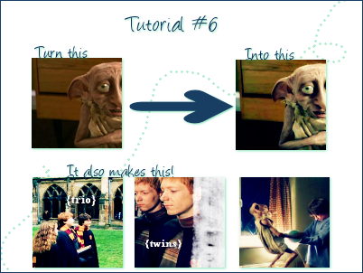
Tutorial #6

Colorbalance - Made in PSP9 - Translatable
1. Grab a base. Resize it. Crop it.

<
2. These next couple steps I stole from another tutorial and sadly I can't remember which so if this looks familiar then that's why.
At this blue layer at Exclusion 100

>>

3. Yellow at Softlight 100

>>

4. Duplicate your base and bring it to the top at Screen 100

>>

5. Copy merged on top layer and set it to Burn 80

>>

6. Everybody's favorite colorbalance layer!
Midtones: -19 -6 20
Shadows: -77 -37 0
These settings are very sensitive to your picture. I think I pretty much brought up the cyan and magenta levels in "shadows" with my other icons so keep that in mind.

7. Copy merged on top layer Set it to Softlight 100 (varies) and in this icon I gaussion blurred it with a radius of 2 (also varies). This adjusts the gross pinkesque naked babyness going on with Dobby.

>>

Notes:
If it's not bright enough then duplicate the screen layer and vice versa
In step seven sometimes it looks better to only copy the base and not the whole thing.
The burn layer can vary depending on the saturation of the image. Play with that.
Basically play with everything.
I would largely appreciate it if you could find the time to comment if you found the tutorial useful and I would love it even more if you could show me your results :)
I made a batch of icons with this method found here: Only the HP icons