011 - by request
A coloring tutorial! A couple of you asked nicely and I kept saying yes I'd make one but along the line forgot. Or got lazy. Or just didn't care to. Giving away your tricks is a big no no but then I realized that I'm being hypocritical since if not for tutorials that people share so we can end up recycling (don't lie!), I wouldn't have come up with my own style either. This is how we learn. =p
So here goes... beware though, I haven't written a tutorial in ages so if this isn't clear just give me a heads up.
Samples:


//notes.
1. First of all, the real secret is this is actually more of a combination of the tutorials I've read/tried over the last few months (since I started experimenting with coloring). In fact I used three different settings from three different iconmakers. I give them full credit. If they ask that I take this down though, I shall have to abide by their wishes.
2. This won't work for all caps. Which is why you shouldn't be afraid to deviate.
3. EXPERIMENTATION IS THE KEY.
4. Do not repost. You can use some of the coloring I've done then post them on your own tutorial if you came up with something brilliant. Just make sure you didn't just copy all the steps and added a few of your own. That's just lame!
5. Be familiar with Photoshop settings. I'm using CS3 at the moment but I suppose there's no real difference. The layout just looks different. =p I guess this is translatable but since I've never used PSP, I can't help anyone with that.
Okay enough babbling. Let's start.
uno.
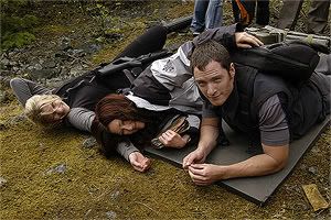
Resize to working size you're comfortable with. Sharpen as you downsize. From 1450px, I went down to 500px. I sharpened as I made it smaller.
dos.
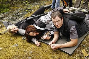
Duplicate the original twice. The topmost changed to Screen and the middle changed to Soft Light. Opacity are as follows: 100% and 40% respectively. This varies depending on how dark your cap is. Sharpen the Screened layer if necessary.
tres.
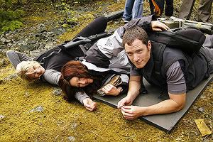
Add +30 Saturation between the original layer and the Soft Light one. Keep it to Normal and don't change the opacity.
quatro.
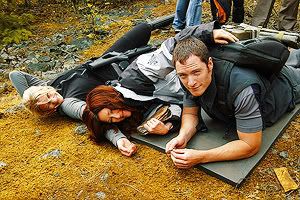
Use this Selective Coloring settings by icons_are_hot:
Reds: C:-100 Y:+30
Yellow: C:-75 Y:+8
Neutral: C:+22 B:+10
Set blending mode to Color.
cinco.
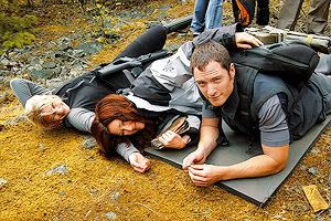
Next is a Curve I made. Since I'm using CS3, I'm still unfamiliar with how to present the new improved Curves so just download the settings here. xD Duplicate the layer twice. The topmost is set to Luminosity at 100% Opacity, while the middle set to Color at 20%.
seis.
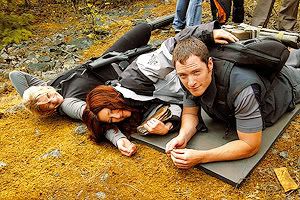
Then create a Color Balance layer with these settings:
Midtones: +59 0 -47
Shadows: +7 0 -11
Set to Color at 30% Opacity.
siete.
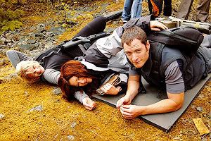
Next, another Curves layer. This time by brasaremean. Just download here. Set to Soft Light at 60% Opacity.
ocho.
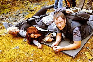
Second to the last! I think everyone's mostly using this. A Color Balance layer by maybetomorrow. Everyone's going for yellow-brownish colors so yeah. It just brightens it up for me.
Midtones: +26 0 -44
Highlights: -25 0 +44
Keep it to Normal at 80% Opacity.
nueve.
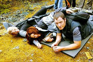
Lastly, my very own color balance to even things out.
Midtones: -24 0 +9
Shadows: -22 0 -12
And you're done! At the end you can just add whatever you like to mess around with the coloring some more. Like if you want to brighten out the green, whip out the Selective Coloring or Hue/Saturation.
Hopefully that helps.
----
Btw, PIMPING new elite comm:
farscape_elite
So here goes... beware though, I haven't written a tutorial in ages so if this isn't clear just give me a heads up.
Samples:
//notes.
1. First of all, the real secret is this is actually more of a combination of the tutorials I've read/tried over the last few months (since I started experimenting with coloring). In fact I used three different settings from three different iconmakers. I give them full credit. If they ask that I take this down though, I shall have to abide by their wishes.
2. This won't work for all caps. Which is why you shouldn't be afraid to deviate.
3. EXPERIMENTATION IS THE KEY.
4. Do not repost. You can use some of the coloring I've done then post them on your own tutorial if you came up with something brilliant. Just make sure you didn't just copy all the steps and added a few of your own. That's just lame!
5. Be familiar with Photoshop settings. I'm using CS3 at the moment but I suppose there's no real difference. The layout just looks different. =p I guess this is translatable but since I've never used PSP, I can't help anyone with that.
Okay enough babbling. Let's start.
uno.

Resize to working size you're comfortable with. Sharpen as you downsize. From 1450px, I went down to 500px. I sharpened as I made it smaller.
dos.

Duplicate the original twice. The topmost changed to Screen and the middle changed to Soft Light. Opacity are as follows: 100% and 40% respectively. This varies depending on how dark your cap is. Sharpen the Screened layer if necessary.
tres.

Add +30 Saturation between the original layer and the Soft Light one. Keep it to Normal and don't change the opacity.
quatro.

Use this Selective Coloring settings by icons_are_hot:
Reds: C:-100 Y:+30
Yellow: C:-75 Y:+8
Neutral: C:+22 B:+10
Set blending mode to Color.
cinco.

Next is a Curve I made. Since I'm using CS3, I'm still unfamiliar with how to present the new improved Curves so just download the settings here. xD Duplicate the layer twice. The topmost is set to Luminosity at 100% Opacity, while the middle set to Color at 20%.
seis.

Then create a Color Balance layer with these settings:
Midtones: +59 0 -47
Shadows: +7 0 -11
Set to Color at 30% Opacity.
siete.

Next, another Curves layer. This time by brasaremean. Just download here. Set to Soft Light at 60% Opacity.
ocho.

Second to the last! I think everyone's mostly using this. A Color Balance layer by maybetomorrow. Everyone's going for yellow-brownish colors so yeah. It just brightens it up for me.
Midtones: +26 0 -44
Highlights: -25 0 +44
Keep it to Normal at 80% Opacity.
nueve.

Lastly, my very own color balance to even things out.
Midtones: -24 0 +9
Shadows: -22 0 -12
And you're done! At the end you can just add whatever you like to mess around with the coloring some more. Like if you want to brighten out the green, whip out the Selective Coloring or Hue/Saturation.
Hopefully that helps.
----
Btw, PIMPING new elite comm:
farscape_elite