old tutorials!
old tutorials, just the ones i like : D
----------------------------------------------------------------
----------------------------------------------------------------
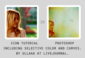
first of all, this is tied to the 3rd tutorial in this list : D. i suggest you to read that one, too 'cause we use the same coloring.
so for example, if i write 2b, it means that the layer comes after the layer 2 which is on the another tutorial.
i won't be copying and pasting stuff 'cause this would be really long .___.
this is mainly using textures and layer mask.
(about the textures, if you know any of those makers i'm missing, please tell ^__^)
1a. create a new canvas, 100x100px.
open your picture, crop and resize it to size you want. copy and paste this to the blank canvas. (or duplicate > click the layer on right > duplicate the layer > select the right file on drop down-thingy.)
place it wherever you want.
result:
b. create a layer mask to your picture which is on blank canvas. layer > layer mask > reveall all
make sure you've got the layer mask "box" selected (you can see the white border around it.)
choose a brush. then the colors: black erases, white brings it back.
it's useful if you erase too much, you can always get it back : D
result:
c. i duplicate the layer three times.
1. screen 100%
2.screen 100%
3. screen 47%
result:
notice that you don't probably need these, my picture is dark and the coloring/textures makes it darker, so if it is dark after all, duplicate then.
now comes layers 2, 3, 4 from the other tut.
4b. add this texture:
by who?
set to multiply 100%
result:

then comes layers 5-14.
14b.
this texture:
by spooky_window
multiply 9%
c.
by kiho_chan
color burn 100%
d.
by kiho_chan
darken 32%
e.
by kiho_chan
multiply 19%
f.
by who?
multiply 48%
g.
by piemin
soft light 100%
h.
by piemin
screen 100%
(this can look horrible, skip this or rotate the texture that the light part isn't on your picture.)
i.
by treasuresex
multiply 27%
then layer 15.
15b.
by who?
multiply 87%
tadaa, you're done :---D
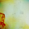
that was easy.
other icons using similar technique:
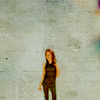
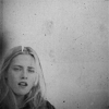
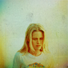
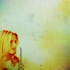
other textures to use:
by tralala_icons
by chaoticfae
by bea_lost
by tove_91
by who?
by who?
by gothic_mischief
by bambinainnero
DOWNLOAD .PSD AT DA
-----------------------------------------------------------------
----------------------------------------------------------------

so three coloring tutorials.
all of these start in the same way, end is different.
so make sure to add the first five steps to every coloring : D
choose your base, crop and resize. i used pics of emily browning for these tuts ^__^
so lets start.. this is like "the base" for every coloring.
1. new color fill layer.
bright orange, #ef7c21, set to soft light 100%
this makes your base orangeis.
2. another color fill.
#a1c1be, soft light 100%
3. color fill with dark blue, #0b102c, set to exclusion 100%
4. color fill with dark red, #462a13, exclusion 54%
5. then duplicate your base and drag it to the top. set it to color 100%.
now your icon should look something like this:

now the "actual" colorings..
the first.
from: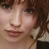
to: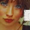
this doesn't work with "blank" pictures, they will turn out badly < ___ <
for example: this isn't a good picture for this one.
6. color fill. light blue, #d2f2ff. color burn 100%
7. selective color layer.
reds: -63, 0, 44, 40
yellows: 0, 0, 54, 0
cyans: 100, 0, 0, 0
blacks: 0, 0, 0, 21
duplicate this layer.
8. color fill, #1a0608. exclusion 100%
9. curves layer.
1st point: output:77 input:75
2nd point: output:142 input:130
10. selective color layer.
reds: 0, 0, 100, 100
yellows: 0, 0, 100, 0
greens: 100, 0, 0, 0
cyans: 100, 0, 0, 0
neutrals: 7, 0, 0, 0
blacks: -10, 0, 0, 0
11. add this texture:
(by another_trauma )
set to screen 100%. move, rotate if you want.
12. i added "E" with times new roman, set to italics.
and you're doneee. (i enhanced her eyes, we'll get back to that at the end of these tutorials.)
((this may turn your icon out really yellow and ugly, edit the selective color layers and lower the yellows ^__^))
so the second coloring.
from:
to: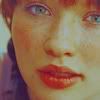
6. selective color layer
reds: -41, 0, 100, 48
yellows: 0, 0, 100, 0
cyans: 100, 0, 0, 0
whites: 10, 0, 0, 0
7. color fill. #c8edfc. multiply 100%
8. selective color.
reds: -59, 0, 100, 0
yellows: 0, 0, 100, 0
cyans: 100, 0, 0, 0
9. color fill. #210505, exclusion 100%
10. selective color.
reds: -33, 0, 100, 51
yellows: 0, 0, 36, 0
cyans: 100, 0, 0, 0
neutrals: 0, 0, 0, -18
11. color fill, #e9ddff. set to multiply 100%
and this is ready : > (plus the enhancing to the eyess.)
so the last tutorial.
from: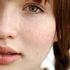
to:
6. color fill, #060823. exclusion 100%
7. curves layer.
1st point: output:58, input:82
2nd point: output:120, input:132
8. color fill. #fcddbe, multiply 14%
9. selective color.
reds: 10, 29, 42, 29
yellows: 0, 0, -68, 0
neutrals: 20, 0, 0, 0
10. another selective color layer.
reds; -6, 0, 16, 41
yellows: 0, 0, 68, 0
cyans: 100, 0, 0 ,0
11. i added "emily", times new roman set to italics.
and you're ready!
now, how to enhance the eyes.
create a new layer.
select a brush, soft round, size around 1px to 7px, depending on you and the size of your eye/s.
then start brushing.
choose the color you want to use and brush, i suggest you to use many colors : D it can look preet amazing.
i used for emily's eyes green, blue, cyan, brown, a bit of yellow, orange and red.
at some point, i usually blur what i've done to make it look smoother. and then i add the lighter parts.
for example, in the first tut, i added a little bit of yellow.
you can leave this layer to normal, but i suggest you to try multiply/color burn/ screen/ color dodge/ soft light/ color.
or of course you can duplicate your layer, and set them to different blending modes.
for example, in the first tut i duplicated the layers and set both to color dodge.
i guess that's it.
phew.
download .psd's at deviantart
it's a zip file including all three.
------------------------------------------------------------------
----------------------------------------------------------------
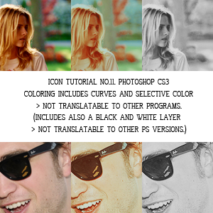
1. choose and prepare your base. crop and resize.
this coloring works for many types of images, just try!
for example:
to
to

to
or
and with photographs, too:

>>
>>
this is my base:
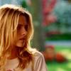
(i won't be posting the result after every step, just sometimes when the change is big/looks weird/awful :---D)
2. we start with a color fill layer.
fill with #cabd96 and set this layer to soft light, opacity 62%
this makes your icon lighter.
3. another color fill.
this time with light blue, #c7d6da, set to multiply, opacity 100%
now your icon is dark again, whoaa, what's the point? :--D
4. selective color layer.
reds: -59, 0, 0, 0
yellows: 0, 0, -45, 0
whites: 0, 0, 0, -23
this makes the reds pop out more.
5. curves layer. to make your icon brighter :---D
settings: (output, input)
channel: RGB
1st point: 109, 79
2nd point: 140, 110
3rd point: 196, 165
channel: red
1st point: 100, 100
2nd point: 150, 142
this layer looks like this

6. hue/saturation layer.
master: saturation +16
7. again a selective color layer.
reds: -100, 0, 100, -43
yellows: 0, 0, 0, -49
now my icon looks like this:
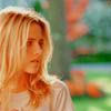
awful? we'll fix it.
8. selective color layerrr.
reds: -100, 0, 100, 100
yellows: -3, 0, -48, 0
greens: 100, 0, -100, 100
cyans: 100, 0, -100, 100
blues: 100, 0, -100, 0
whites: 13, 0, -27, 0
neutrals: 6, -1, -3, 10
the result is this:

even more awful than it was on the last step? : D
9. let's fix it. color fill layer.
dark red, #3c1919, set to exclusion, opacity 100%
result:
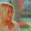
looks better, doesn't it?
10. brightess/contrast layer.
brightness: -14
contrast: 42
11. another fill layer.
light blue, #e1fcfb, set to soft light, opacity 100%
again, this makes your icon lighter.
see?
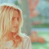
12. another color fill.
with pinkish color, #f3d6d6, set to color burn, opacity 81%
this makes your icon "warmer"
13. another brightness/contrast layer.
brightness: -15
contrast: 9
14. selective color layer.
reds: 14, 26, 19, 0
cyans: 100, 0, 0, 0
blues: 100, 0, 0, 0
neutrals: 2, -15, 11, -11
see the change?

15. another selective color layer.
reds: 0, 0, 0, 67
the result is this:

you can skip this layer and you can also skip layer 17 and 18, if it looks better. tryy!
16. now let's make the icon black and white.
well, only cs3 has b/w layer, so who have earlier versions, sowwy : <
reds: 27
yellows: 81
17. curves layer
settings. (output, input)
1st point: 91, 79
2nd point: 149, 118
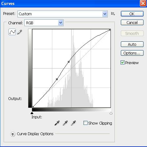
result:

18. and the last step! this texture:

(dunno who made it)
set to multiply, opacity 20% (play with the opacity.)
finished icon:
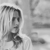
TIPS.
2. if your icon turns out really bright after all steps, duplicate your base and set it to multiply, play around with the opacity. for example:

to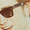
and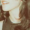
to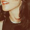
(the duplicated base was set to multiply.)
3. also if your icon needs more contrast, duplicate the base and set it to soft light and play with the opacity.
4. sharpening (filter>sharpen, if your icon looks too sharpened, go edit> fade sharpen) might make your icon look really good. sharpen just the base. so don't flatten your image before sharpening. for example:
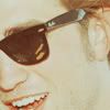
to
well, i guess that's it.
other icons with this tut:

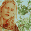




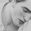
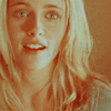


DOWNLOAD .PSD AT DEVIANTART
it doesn't include b/w layer because i wasn't sure if it works with lower versions of ps.
comments are loved and they make my day!
i'd love to see your results!
if you have any questions about the tut, i'll try to answer : >
-----------------------------------------------------------------
----------------------------------------------------------------

1. this time i'm using a photo from twilight the movie as my base (this)
i want there to be more in the top part, so i crop it like this: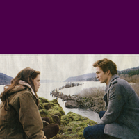
(press shift when selecting > the area will be a square.)
then i choose rectangular marquee tool (
). select a slice from the top part of your picture:
click on the selection on right and select layer via copy.
next select the created layer with the slice and hit ctrl+t (this should work on ps cs2 and cs3, don't know about others.). it selectes the slice.
then stretch the selection, to the top of your icon, or however you say it.
like this: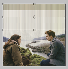
hit enter.
now flatten your image.
resize it to 100x100px.
(actually, that doesn't look really good, because i had to do it again, but i guess you get the thing?)
((blurring the top part might help to make it look better.))
if your base is dark, duplicate it and set to screen, play around with the opacity. (i did this.)
so my base is this: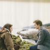
2. now the coloring.
we'll start with a curves layer. (layer>new adjustment layer>curves)
settings:


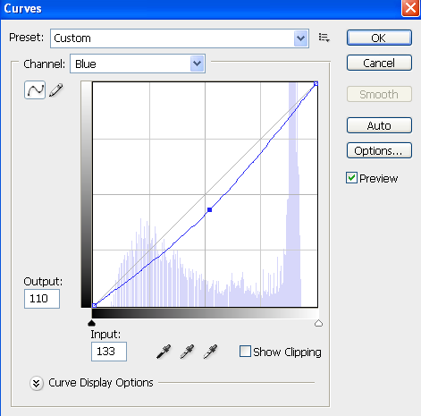
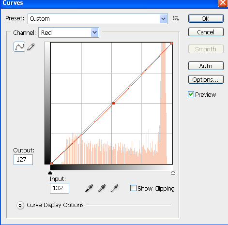
result:
3. color fill. (layer>new fill layer>solid color)
fill with #f7cfcf, set this layer to color burn 100%
result:
4. color balance layer. (layer>new adjustment layer>color balance)
midtones: 0, 0, -10
result: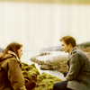
5. another color balance layer
midtones: -23, -9, 22
result:
6. add this texture:
by tove_91
set to multiply 100%
(i rotated this texture.)
result:
7. another texture:
by xswaniconsx
set to multiply 100%
result:
(i rotated this texture, too.)
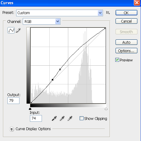
8. now the icon is too dark so... another curves layer.
settings:

result: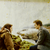
mmkay. now you can stop here or continue.
9. well, in cs3 there is black and white layer, i used it. (layer>new adjustment layer> black and white)
if you don't have it, you can use grey fill layer which you set to color and then create a brightess/contrast layer and play around with the settings.
my B/W layer settings:
reds: -10
yellows: 75
and i left others as they are.
result: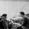
10. i want the top part of my icon to be darker, so a gradient layer! first, select black, and make sure it is the topper color (
)
then go layer>new fill layer> gradient.
my settings are these:
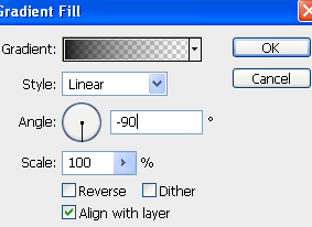
set this layer to soft light, change the opacity if you want.
i wanted to move the darker part a bit more up, so i rasterized the layer. (click the layer on right and click rasterize layer.)
then select move tool and move the layer.
result:
11. edward is a bit too dark now, so i create another gradient fill layer.
settings: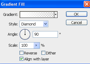
set to soft light, change the opacity if you want.
i rasterized this layer and moved it.
my layer looks like this: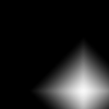
(you can also smudge this layer.)
result: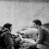
12. and the last step! add this texture by lifeisdolce . set to screen 100%.
make it smaller > hit ctrl+t and shrink it and move where you want.
and the finished icon looks like this:
download .psd: http://www.box.net/shared/924ozjo08o
-----------------------------------------------------------------
----------------------------------------------------------------
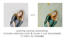
1. choose your base. i think this works with quite many kind of photos, here are a few examples:
>
>
(those were created using just the first six layers.)
crop and resize to 100x100px.
if you want to have "empty" background, i suggest you to make a layer mask.
duplicate your base, and make the background layer white or light grey.
create a layer mask (layer>layer mask>reveal all). choose a brush and brush parts which you want away using black. if you brush too much, using white color when brushing brings them back.
also when you hit ctrl+t, you can make the picture smaller.
if your base is dark, duplicate it and set to screen.
2. now the coloring.
start with a fill layer. (layer>new fill layer>solid color).
fill with dark green, #07300b. set to exclusion 100%. at this point, your icon looks pinkish and greenish, but that's what it is supposed to look.
3. another fill layer. this time dark blue, #0f0931, set to exclusion 100%
4. and again, fill with dark red, #2f0606, set to exclusion 100%
now your icon looks greyish, but we'll fix that.
5. selective color layer. (layer>new adjustment layer> selective color)
reds: -100, 0, 29, 17
yellows: 0, 0, -23, 0
cyans: 100, 0, 0, 0
blues: 100, 0, 0, 0
whites: 0, 0, 0, -14
neutrals: 6, 0, 4, 11
blacks: 0, 0, 0, 14
6. again a selective color layer.
reds: -49, 0, 0, 45
yellows: 0, 0, 37, -64
cyans: 100, 0, 0, 0
neutrals: 0, 0, 0, 7
7. another selective color layer : D
reds: -18, 0, 10, 1
yellows: 0, 0, -18, 0
cyans: 28, 0, 0, 0
neutrals: 0, 0, 0, -6
blacks: 0, 0, 0, 9
well, still grey.
8. texture time! this texture:
by tove_91 set to multiply 100%
9. duplicate layer 8, and set it to color burn 47%. you may not need this, but this brings a little bit contrast.
10. again a texture:
(don't know who has made it). set to multiply 100%
11. curves layer. (layer>new adjustment layer>curves)
settings like these..
first point:
second point: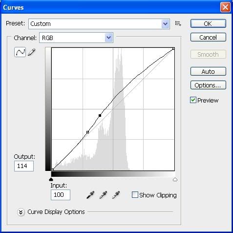
12. again selective color layer.
reds: -49, 0, 28, 10
cyans: 100, 0, 0, 0
whites: 66, 0, 0, 0
set this layer screen 58%
13. another selective color layer.
reds: -88, 0, 0, 0
yellows: 0, 0, 31, 0
cyans: 100, 0, 0, 21
blacks: 0, 0, 0, 13
and you're done!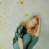
add textures/brushes/text etc, if you want.
a tip?
change the opacity of the first color fill layer, it could look good in some cases.
other icons using similar technique:
----------------------------------------------------------------
----------------------------------------------------------------
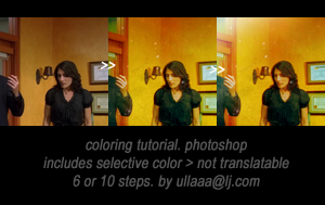
from: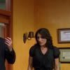
to: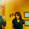
1. choose your base.
in this tut i'm using a screen cap featuring cuddy from house md.
crop and resize it to 100x100px.
2. mine base was dark, so i duplicated it and set this layer to screen 100%.
you may not need this or if your base is really dark you may repeat this step as many times as you want.
3. next we add a texture. this:
by: xswaniconsx set to multiply 74%. this gives your icon a little scratchy look.
4. new selective color layer. (layer>new adjustment layer>selective color)
reds: -100, 0, 0, 0
yellows: 0, 0, 100, 0
whites: 100, 0, 0, 0
neutrals: 0, 0, 63, 0
5. another texture. this light texture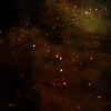
(by: http://www.haudvafra.deviantart.com/ i think?) set to screen 80%.
i rotated this texture a bit, hit ctrl + t and rotate, if you want. i also erased the borders a bit.
6. new color fill layer (layer>new fill layer>solid color)
fill with light blue, #d0f4f7 and set this layer to color burn 100%.
this gives a bit contrast.
7. you're ready if you want. you may stop here or you may continue. it's up to you : DD
i want the top of my icon to be lighter so...
create a new layer, take a brush, choose a soft rounded, size around 45. take white color and brush the part which you want to be lighter. set this layer to soft light, play around with the opacity.
my layer looks like this:
(except no grey background : D)
8. create another layer, brush with white color. the area which i brushed on the previous layer, looks a bit boring, so i brush with white the top of it. (if that makes sense..) leave this layer to normal, but you may change the opacity.
no you should have lighter part and a bit whiter part.
my layer looks like this: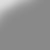
and together layers 7 & 8 look like this: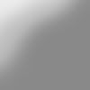
9. now, duplicate the selective color layer from step 4 and drag it to the top.
set this layer to multiply 14%
10. now, duplicate the previous layer and set it to normal. my opacity is 49%, but you may change the opacity.
and--- you're done! you can add more textures, text etc. whatever you want.
questions? ask!
other icons using similar coloring:




----------------------------------------------------------------
----------------------------------------------------------------

first of all, this is tied to the 3rd tutorial in this list : D. i suggest you to read that one, too 'cause we use the same coloring.
so for example, if i write 2b, it means that the layer comes after the layer 2 which is on the another tutorial.
i won't be copying and pasting stuff 'cause this would be really long .___.
this is mainly using textures and layer mask.
(about the textures, if you know any of those makers i'm missing, please tell ^__^)
1a. create a new canvas, 100x100px.
open your picture, crop and resize it to size you want. copy and paste this to the blank canvas. (or duplicate > click the layer on right > duplicate the layer > select the right file on drop down-thingy.)
place it wherever you want.
result:

b. create a layer mask to your picture which is on blank canvas. layer > layer mask > reveall all
make sure you've got the layer mask "box" selected (you can see the white border around it.)
choose a brush. then the colors: black erases, white brings it back.
it's useful if you erase too much, you can always get it back : D
result:

c. i duplicate the layer three times.
1. screen 100%
2.screen 100%
3. screen 47%
result:

notice that you don't probably need these, my picture is dark and the coloring/textures makes it darker, so if it is dark after all, duplicate then.
now comes layers 2, 3, 4 from the other tut.
4b. add this texture:

by who?
set to multiply 100%
result:

then comes layers 5-14.
14b.
this texture:

by spooky_window
multiply 9%
c.

by kiho_chan
color burn 100%
d.

by kiho_chan
darken 32%
e.

by kiho_chan
multiply 19%
f.

by who?
multiply 48%
g.

by piemin
soft light 100%
h.

by piemin
screen 100%
(this can look horrible, skip this or rotate the texture that the light part isn't on your picture.)
i.

by treasuresex
multiply 27%
then layer 15.
15b.

by who?
multiply 87%
tadaa, you're done :---D

that was easy.
other icons using similar technique:
other textures to use:

by tralala_icons

by chaoticfae

by bea_lost

by tove_91

by who?

by who?

by gothic_mischief

by bambinainnero
DOWNLOAD .PSD AT DA
-----------------------------------------------------------------
----------------------------------------------------------------

so three coloring tutorials.
all of these start in the same way, end is different.
so make sure to add the first five steps to every coloring : D
choose your base, crop and resize. i used pics of emily browning for these tuts ^__^
so lets start.. this is like "the base" for every coloring.
1. new color fill layer.
bright orange, #ef7c21, set to soft light 100%
this makes your base orangeis.
2. another color fill.
#a1c1be, soft light 100%
3. color fill with dark blue, #0b102c, set to exclusion 100%
4. color fill with dark red, #462a13, exclusion 54%
5. then duplicate your base and drag it to the top. set it to color 100%.
now your icon should look something like this:

now the "actual" colorings..
the first.
from:

to:

this doesn't work with "blank" pictures, they will turn out badly < ___ <
for example: this isn't a good picture for this one.
6. color fill. light blue, #d2f2ff. color burn 100%
7. selective color layer.
reds: -63, 0, 44, 40
yellows: 0, 0, 54, 0
cyans: 100, 0, 0, 0
blacks: 0, 0, 0, 21
duplicate this layer.
8. color fill, #1a0608. exclusion 100%
9. curves layer.
1st point: output:77 input:75
2nd point: output:142 input:130
10. selective color layer.
reds: 0, 0, 100, 100
yellows: 0, 0, 100, 0
greens: 100, 0, 0, 0
cyans: 100, 0, 0, 0
neutrals: 7, 0, 0, 0
blacks: -10, 0, 0, 0
11. add this texture:

(by another_trauma )
set to screen 100%. move, rotate if you want.
12. i added "E" with times new roman, set to italics.
and you're doneee. (i enhanced her eyes, we'll get back to that at the end of these tutorials.)
((this may turn your icon out really yellow and ugly, edit the selective color layers and lower the yellows ^__^))
so the second coloring.
from:

to:

6. selective color layer
reds: -41, 0, 100, 48
yellows: 0, 0, 100, 0
cyans: 100, 0, 0, 0
whites: 10, 0, 0, 0
7. color fill. #c8edfc. multiply 100%
8. selective color.
reds: -59, 0, 100, 0
yellows: 0, 0, 100, 0
cyans: 100, 0, 0, 0
9. color fill. #210505, exclusion 100%
10. selective color.
reds: -33, 0, 100, 51
yellows: 0, 0, 36, 0
cyans: 100, 0, 0, 0
neutrals: 0, 0, 0, -18
11. color fill, #e9ddff. set to multiply 100%
and this is ready : > (plus the enhancing to the eyess.)
so the last tutorial.
from:

to:

6. color fill, #060823. exclusion 100%
7. curves layer.
1st point: output:58, input:82
2nd point: output:120, input:132
8. color fill. #fcddbe, multiply 14%
9. selective color.
reds: 10, 29, 42, 29
yellows: 0, 0, -68, 0
neutrals: 20, 0, 0, 0
10. another selective color layer.
reds; -6, 0, 16, 41
yellows: 0, 0, 68, 0
cyans: 100, 0, 0 ,0
11. i added "emily", times new roman set to italics.
and you're ready!
now, how to enhance the eyes.
create a new layer.
select a brush, soft round, size around 1px to 7px, depending on you and the size of your eye/s.
then start brushing.
choose the color you want to use and brush, i suggest you to use many colors : D it can look preet amazing.
i used for emily's eyes green, blue, cyan, brown, a bit of yellow, orange and red.
at some point, i usually blur what i've done to make it look smoother. and then i add the lighter parts.
for example, in the first tut, i added a little bit of yellow.
you can leave this layer to normal, but i suggest you to try multiply/color burn/ screen/ color dodge/ soft light/ color.
or of course you can duplicate your layer, and set them to different blending modes.
for example, in the first tut i duplicated the layers and set both to color dodge.
i guess that's it.
phew.
download .psd's at deviantart
it's a zip file including all three.
------------------------------------------------------------------
----------------------------------------------------------------

1. choose and prepare your base. crop and resize.
this coloring works for many types of images, just try!
for example:

to


to


to

or

and with photographs, too:

>>

>>

this is my base:

(i won't be posting the result after every step, just sometimes when the change is big/looks weird/awful :---D)
2. we start with a color fill layer.
fill with #cabd96 and set this layer to soft light, opacity 62%
this makes your icon lighter.
3. another color fill.
this time with light blue, #c7d6da, set to multiply, opacity 100%
now your icon is dark again, whoaa, what's the point? :--D
4. selective color layer.
reds: -59, 0, 0, 0
yellows: 0, 0, -45, 0
whites: 0, 0, 0, -23
this makes the reds pop out more.
5. curves layer. to make your icon brighter :---D
settings: (output, input)
channel: RGB
1st point: 109, 79
2nd point: 140, 110
3rd point: 196, 165
channel: red
1st point: 100, 100
2nd point: 150, 142
this layer looks like this

6. hue/saturation layer.
master: saturation +16
7. again a selective color layer.
reds: -100, 0, 100, -43
yellows: 0, 0, 0, -49
now my icon looks like this:

awful? we'll fix it.
8. selective color layerrr.
reds: -100, 0, 100, 100
yellows: -3, 0, -48, 0
greens: 100, 0, -100, 100
cyans: 100, 0, -100, 100
blues: 100, 0, -100, 0
whites: 13, 0, -27, 0
neutrals: 6, -1, -3, 10
the result is this:

even more awful than it was on the last step? : D
9. let's fix it. color fill layer.
dark red, #3c1919, set to exclusion, opacity 100%
result:

looks better, doesn't it?
10. brightess/contrast layer.
brightness: -14
contrast: 42
11. another fill layer.
light blue, #e1fcfb, set to soft light, opacity 100%
again, this makes your icon lighter.
see?

12. another color fill.
with pinkish color, #f3d6d6, set to color burn, opacity 81%
this makes your icon "warmer"
13. another brightness/contrast layer.
brightness: -15
contrast: 9
14. selective color layer.
reds: 14, 26, 19, 0
cyans: 100, 0, 0, 0
blues: 100, 0, 0, 0
neutrals: 2, -15, 11, -11
see the change?

15. another selective color layer.
reds: 0, 0, 0, 67
the result is this:

you can skip this layer and you can also skip layer 17 and 18, if it looks better. tryy!
16. now let's make the icon black and white.
well, only cs3 has b/w layer, so who have earlier versions, sowwy : <
reds: 27
yellows: 81
17. curves layer
settings. (output, input)
1st point: 91, 79
2nd point: 149, 118

result:

18. and the last step! this texture:

(dunno who made it)
set to multiply, opacity 20% (play with the opacity.)
finished icon:

TIPS.
2. if your icon turns out really bright after all steps, duplicate your base and set it to multiply, play around with the opacity. for example:

to

and

to

(the duplicated base was set to multiply.)
3. also if your icon needs more contrast, duplicate the base and set it to soft light and play with the opacity.
4. sharpening (filter>sharpen, if your icon looks too sharpened, go edit> fade sharpen) might make your icon look really good. sharpen just the base. so don't flatten your image before sharpening. for example:

to

well, i guess that's it.
other icons with this tut:
DOWNLOAD .PSD AT DEVIANTART
it doesn't include b/w layer because i wasn't sure if it works with lower versions of ps.
comments are loved and they make my day!
i'd love to see your results!
if you have any questions about the tut, i'll try to answer : >
-----------------------------------------------------------------
----------------------------------------------------------------

1. this time i'm using a photo from twilight the movie as my base (this)
i want there to be more in the top part, so i crop it like this:

(press shift when selecting > the area will be a square.)
then i choose rectangular marquee tool (

). select a slice from the top part of your picture:

click on the selection on right and select layer via copy.
next select the created layer with the slice and hit ctrl+t (this should work on ps cs2 and cs3, don't know about others.). it selectes the slice.
then stretch the selection, to the top of your icon, or however you say it.
like this:

hit enter.
now flatten your image.
resize it to 100x100px.
(actually, that doesn't look really good, because i had to do it again, but i guess you get the thing?)
((blurring the top part might help to make it look better.))
if your base is dark, duplicate it and set to screen, play around with the opacity. (i did this.)
so my base is this:

2. now the coloring.
we'll start with a curves layer. (layer>new adjustment layer>curves)
settings:


result:

3. color fill. (layer>new fill layer>solid color)
fill with #f7cfcf, set this layer to color burn 100%
result:

4. color balance layer. (layer>new adjustment layer>color balance)
midtones: 0, 0, -10
result:

5. another color balance layer
midtones: -23, -9, 22
result:

6. add this texture:

by tove_91
set to multiply 100%
(i rotated this texture.)
result:

7. another texture:

by xswaniconsx
set to multiply 100%
result:

(i rotated this texture, too.)
8. now the icon is too dark so... another curves layer.
settings:


result:

mmkay. now you can stop here or continue.
9. well, in cs3 there is black and white layer, i used it. (layer>new adjustment layer> black and white)
if you don't have it, you can use grey fill layer which you set to color and then create a brightess/contrast layer and play around with the settings.
my B/W layer settings:
reds: -10
yellows: 75
and i left others as they are.
result:

10. i want the top part of my icon to be darker, so a gradient layer! first, select black, and make sure it is the topper color (

)
then go layer>new fill layer> gradient.
my settings are these:

set this layer to soft light, change the opacity if you want.
i wanted to move the darker part a bit more up, so i rasterized the layer. (click the layer on right and click rasterize layer.)
then select move tool and move the layer.
result:

11. edward is a bit too dark now, so i create another gradient fill layer.
settings:

set to soft light, change the opacity if you want.
i rasterized this layer and moved it.
my layer looks like this:

(you can also smudge this layer.)
result:

12. and the last step! add this texture by lifeisdolce . set to screen 100%.
make it smaller > hit ctrl+t and shrink it and move where you want.
and the finished icon looks like this:

download .psd: http://www.box.net/shared/924ozjo08o
-----------------------------------------------------------------
----------------------------------------------------------------

1. choose your base. i think this works with quite many kind of photos, here are a few examples:

>


>

(those were created using just the first six layers.)
crop and resize to 100x100px.
if you want to have "empty" background, i suggest you to make a layer mask.
duplicate your base, and make the background layer white or light grey.
create a layer mask (layer>layer mask>reveal all). choose a brush and brush parts which you want away using black. if you brush too much, using white color when brushing brings them back.
also when you hit ctrl+t, you can make the picture smaller.
if your base is dark, duplicate it and set to screen.
2. now the coloring.
start with a fill layer. (layer>new fill layer>solid color).
fill with dark green, #07300b. set to exclusion 100%. at this point, your icon looks pinkish and greenish, but that's what it is supposed to look.
3. another fill layer. this time dark blue, #0f0931, set to exclusion 100%
4. and again, fill with dark red, #2f0606, set to exclusion 100%
now your icon looks greyish, but we'll fix that.
5. selective color layer. (layer>new adjustment layer> selective color)
reds: -100, 0, 29, 17
yellows: 0, 0, -23, 0
cyans: 100, 0, 0, 0
blues: 100, 0, 0, 0
whites: 0, 0, 0, -14
neutrals: 6, 0, 4, 11
blacks: 0, 0, 0, 14
6. again a selective color layer.
reds: -49, 0, 0, 45
yellows: 0, 0, 37, -64
cyans: 100, 0, 0, 0
neutrals: 0, 0, 0, 7
7. another selective color layer : D
reds: -18, 0, 10, 1
yellows: 0, 0, -18, 0
cyans: 28, 0, 0, 0
neutrals: 0, 0, 0, -6
blacks: 0, 0, 0, 9
well, still grey.
8. texture time! this texture:

by tove_91 set to multiply 100%
9. duplicate layer 8, and set it to color burn 47%. you may not need this, but this brings a little bit contrast.
10. again a texture:

(don't know who has made it). set to multiply 100%
11. curves layer. (layer>new adjustment layer>curves)
settings like these..
first point:

second point:

12. again selective color layer.
reds: -49, 0, 28, 10
cyans: 100, 0, 0, 0
whites: 66, 0, 0, 0
set this layer screen 58%
13. another selective color layer.
reds: -88, 0, 0, 0
yellows: 0, 0, 31, 0
cyans: 100, 0, 0, 21
blacks: 0, 0, 0, 13
and you're done!

add textures/brushes/text etc, if you want.
a tip?
change the opacity of the first color fill layer, it could look good in some cases.
other icons using similar technique:


----------------------------------------------------------------
----------------------------------------------------------------
from:
to:
1. choose your base.
in this tut i'm using a screen cap featuring cuddy from house md.
crop and resize it to 100x100px.
2. mine base was dark, so i duplicated it and set this layer to screen 100%.
you may not need this or if your base is really dark you may repeat this step as many times as you want.
3. next we add a texture. this:

by: xswaniconsx set to multiply 74%. this gives your icon a little scratchy look.
4. new selective color layer. (layer>new adjustment layer>selective color)
reds: -100, 0, 0, 0
yellows: 0, 0, 100, 0
whites: 100, 0, 0, 0
neutrals: 0, 0, 63, 0
5. another texture. this light texture

(by: http://www.haudvafra.deviantart.com/ i think?) set to screen 80%.
i rotated this texture a bit, hit ctrl + t and rotate, if you want. i also erased the borders a bit.
6. new color fill layer (layer>new fill layer>solid color)
fill with light blue, #d0f4f7 and set this layer to color burn 100%.
this gives a bit contrast.
7. you're ready if you want. you may stop here or you may continue. it's up to you : DD
i want the top of my icon to be lighter so...
create a new layer, take a brush, choose a soft rounded, size around 45. take white color and brush the part which you want to be lighter. set this layer to soft light, play around with the opacity.
my layer looks like this:

(except no grey background : D)
8. create another layer, brush with white color. the area which i brushed on the previous layer, looks a bit boring, so i brush with white the top of it. (if that makes sense..) leave this layer to normal, but you may change the opacity.
no you should have lighter part and a bit whiter part.
my layer looks like this:

and together layers 7 & 8 look like this:

9. now, duplicate the selective color layer from step 4 and drag it to the top.
set this layer to multiply 14%
10. now, duplicate the previous layer and set it to normal. my opacity is 49%, but you may change the opacity.
and--- you're done! you can add more textures, text etc. whatever you want.
questions? ask!
other icons using similar coloring: